5 tips to build trust with your About Us website page
About Us - one of the most visited & expected pages on your website
Use your About page well.
Having built over 40 websites (and counting) in the last few years, one of the things that surprised us is that whatever the industry our client is in the stats on each site confirm the 'about us' or 'our team' page is usually the most visited page after the home page!
Equally frustrating, is when we've stumbled across a small business website and want to know more about it; perhaps who runs the company or how they got going.
It's a bit of a frustration not being able to find out more - we like to see who we are buying from.
The same is true on social media; there are so many lovely accounts with no information about who the account belongs to, usually with an obscure @ handle.
So here are some tips to help you refine or review your own 'about us' page.
We are a brand studio based in Torquay, South Devon, offering branding, website design & brand video to creative businesses across the UK - this is part of our series of website tips (alongside branding and video), and you can find out more about our website design services for businesses.
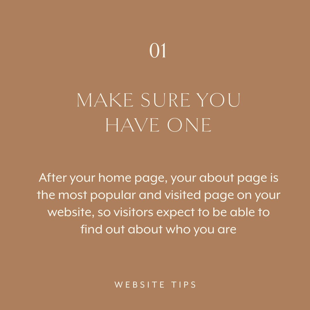
1. Make sure you have an about us page
After your home page, your about page is the most popular and visited page on your website, so visitors expect to be able to find out about who you are.
Here are a few things you can do practically:
Make it visible in your navigation - your About Us page should be clearly-accessible in the menu system at the top of the page
It’s also good practice to add it to the ‘doormat’ in the footer area of your site, to catch people who may have missed it if they are on their way out
Use a simple paragraph structure:
Introduction, reiterating who you are, what you do and where you are based
A brief history of how and why you got to where you are
Some of your interests and passions
Your future vision for making a difference
Plus, don’t forget a call to action like ‘get in touch’ or read your latest blog
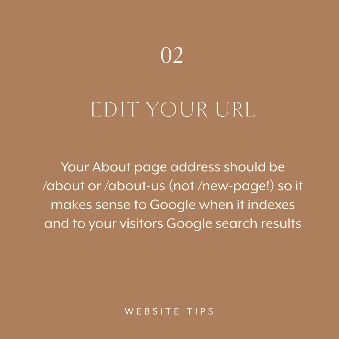
2. Edit the URL
Your About page address should be /about or /about-us (not /new-page1 !) so it makes sense to Google when it indexes it; as well as to your visitors in Google search results.
Here are a few things you can do practically:
No surprise here: do a quick audit - literally now! - and check your URLs
If you’ve used /about or /about-us on a non-critical page, swap it over or add a redirect
If you’re on Squarespace 7.0, be careful how you structure index pages
3. Curate your highlights
No one wants to read your life story nor do they want to read a CV, but they will be interested in your interests and passions.
These are the things that set you apart from your competitors.
Here are a few things you can do practically:
Don’t just talk about a hobby, but think how it feeds into your work, makes you unique or could connect with your ideal client
Think about what is appropriate and helpful for your brand - not all your interests will necessarily help build your online brand!
Keep it updated! Life changes, so don’t forget to add or trim your about story to suit where you are in your journey
4. Include brand photography
An half-day with a professional photographer will elevate your personality and impact as a brand by x1,000! Plus it's so lovely to see a friendly face!
Here are a few things you can do practically:
Be creative - this doesn’t need to be at a desk or in an office!
Think about the aesthetic and style that puts you and your business in the best light
Photographers love this sort of project, so ask a photographer for some input
Be prepared to build a relationship with a photographer - good visuals are extremely valuable to your business
5. Build trust
People buy from people - it's about trust - so use your About page to be warm, personal, approachable and interesting
Include you or your core team on the page - those whom clients are most likely to engage with
Make sure you’re smiling and don’t be afraid to inject a bit of humour
Use this as a benchmark and a template for how you present your business elsewhere
These are our tips to help you get started with customer profiles and we’d love to hear any of your thoughts or reflections. Do head over to the corresponding post on Instagram to join the conversation and share your opinion.
If you’d like to receive our studio e-mail which we (usually) send out on a Tuesday, pop your details in below.
We share website and branding tips; insights into brands we create; behind the scenes in our studio; as well as interesting events. Plus there are no silly marketing antics!


