Portfolio
The projects showcased here reflect not only our studio style, but also the journeys our clients have taken. From creative to hospitality and lifestyle brands, we craft identities and websites that feel like home—thoughtful, beautiful and designed to help businesses grow with confidence and clarity.
Tamara Malms | Interior Design
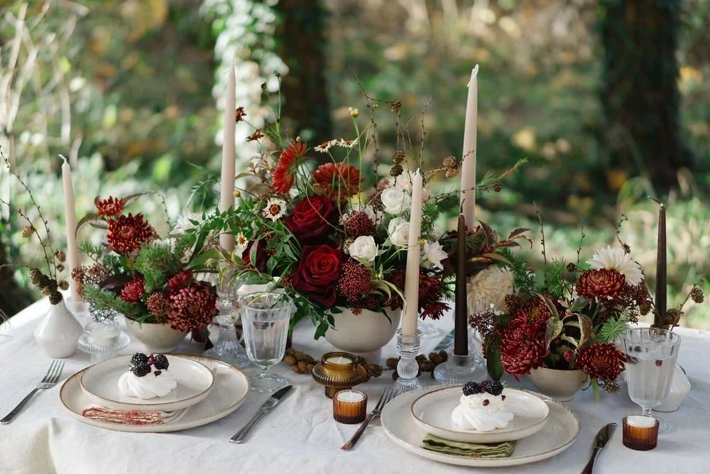
The Rose Shed | Floral Design
Greenwild | Garden Design & Build
Atelier Stone | Marble Stone Studio
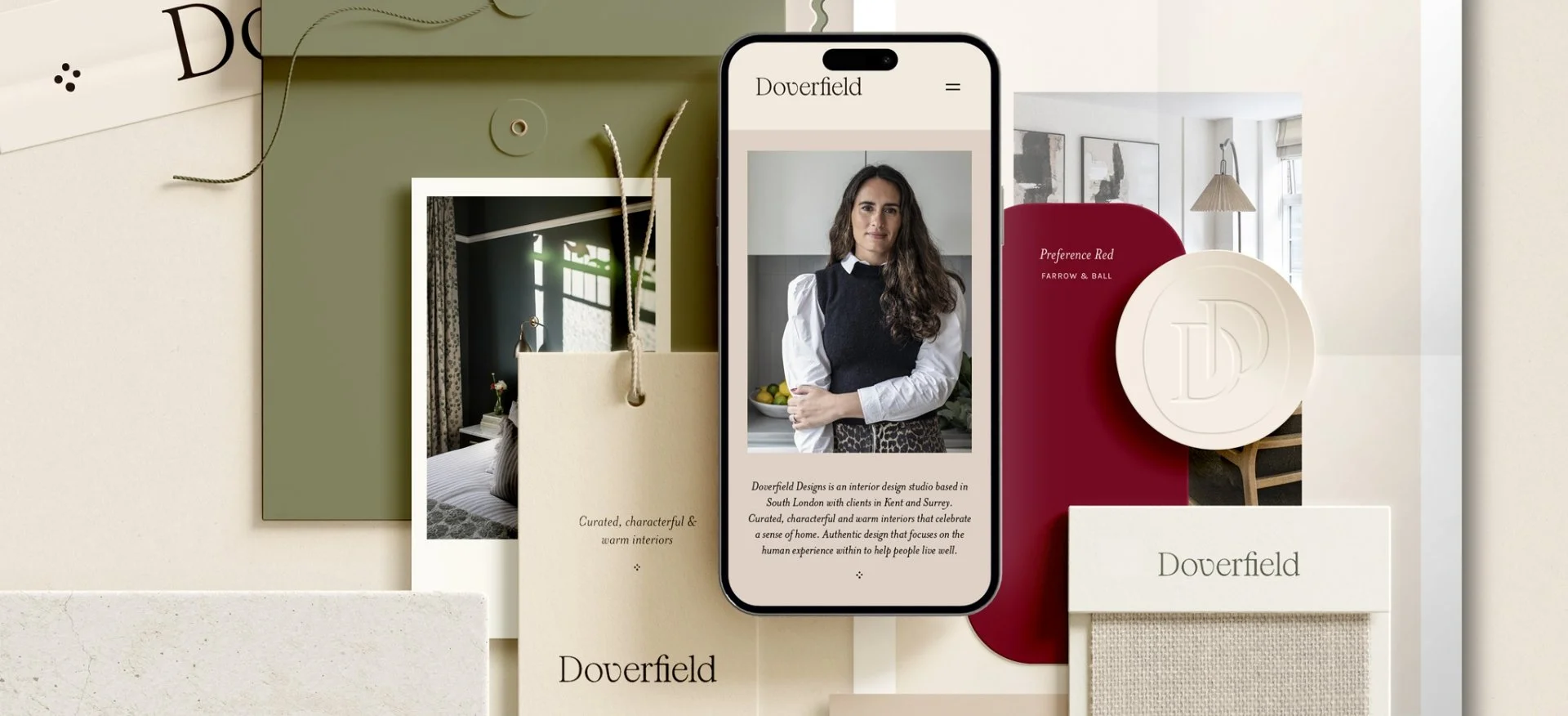
Doverfield Designs | Interior Design
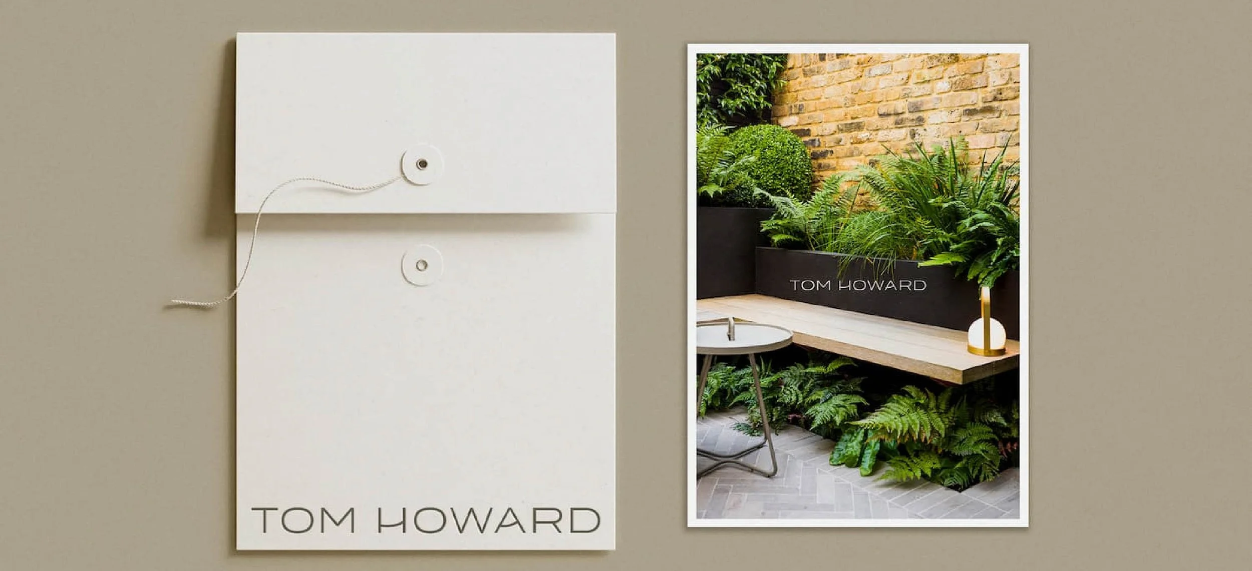
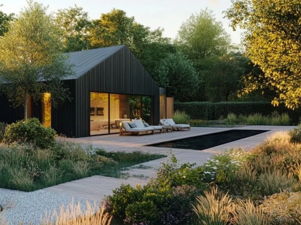
Tom Howard | Garden Design
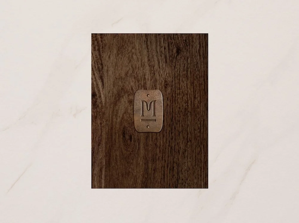
Middlethorpe Interiors | Interior Design
Colin Boggon | Landscape Design
Spotlight Property Staging | Property & Estate
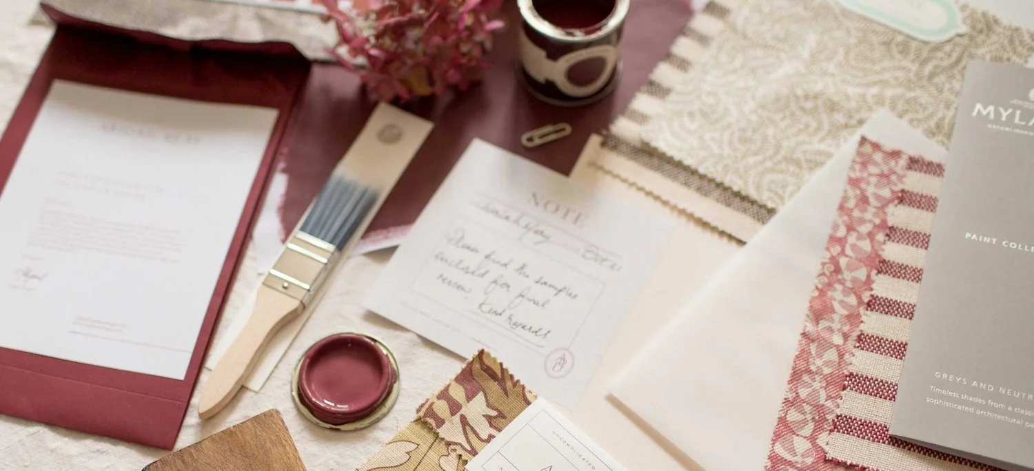
Abigail Reay | Interior Architecture & Design
Let’s work together
The first step is simple: reach out. From our base in Devon, we work with creative, hospitality and lifestyle brands across the UK and beyond. Together we’ll uncover what makes your business unique and shape a brand or website you’ll feel proud to call your own.