Blog
Inside our blog, you’ll find resources created to guide and inspire—from branding clarity to website strategy and design advice. Whether you’re planning a future project or refining what you already have, these articles are here to help you grow your business with confidence.
Colour blue: is it a safe bet for business branding?
Why the colour blue is such a popular choice for small businesses in their branding; but how to work with blue to stand out from the corporate crowd in your branding.
The English Oak: 6 lessons for a strong brand
The English Oak is the quintessentially British tree. We’ve reflected on this mighty tree and put together six branding lessons that you can learn to help make your business brand strong and enduring.
Is pink branding a strong choice for my business?
Will I regret using pink in my branding? Find out about the colour pink and whether or not it can work for your business brand
January blog ideas: New Year inspiration for interior brands
Discover fresh January blog ideas for interior brands: Explore trends like biophilic design, decluttering & sustainability to inspire clients in the New Year
December blog ideas: Inspiration for festive interior design content
Get inspired with December blog ideas for interior brands. Boost your SEO with festive interior design content to grab readers attention and boost web traffic
3 reasons to use the colour green confidently in branding
Why the colour green is an excellent choice for small businesses in their branding; plus we unpack its colour psychology and the power brands can harness through green.
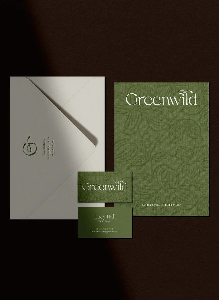
Foil blocking & embossing: Premium print finishes explained
Discover why luxury print still matters. Explore foil blocking, embossing, sustainable materials, and expert tips for brands wanting elevated, tactile print
What's the minimum word count for an SEO-performing blog?
Discover the ideal blog length for SEO! Explore how word count impacts Google rankings, engagement, and performance to create high-ranking, valuable content
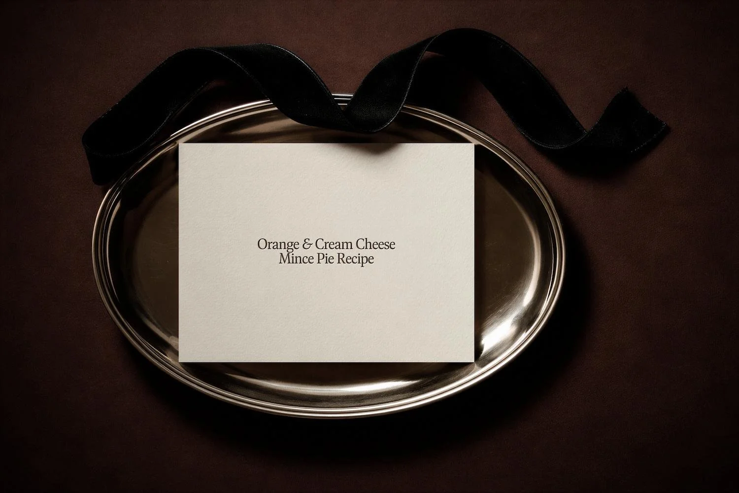
Decadent orange & cream cheese mince pies (2026 recipe)
Indulge in this twist on the Christmas classic: a mince pie recipe with orange & cream cheese; a rich and zesty delight that elevates the timeless flavours
Stop blending in: Brand photography tips to be memorable
Discover how intentional brand photography can make your business memorable, attract ideal clients, and elevate your visual identity online
16 areas to update when you rename your brand
It’s easy to get caught up in the excitement of rebranding your business, including a new name, but there is a long list of things that goes with that, so don’t get caught out.
November blog ideas: table setting, parties & cosy nights in
Spark November blog ideas for home brands: boost your SEO with inspo on table settings, festive parties and cosy night content to engage and attract readers
Best size for your website images, how to do it & why it’s important
Do you upload massive images on your website and walk away? Don’t be that person! Images are important and need to be optimised before uploading - we show you how to go about it.
Want a magnetic brand strategy? Build it on your beliefs
A winning brand strategy isn’t just about logos—it’s about beliefs. Discover how leading with your opinions makes your brand magnetic, trusted and unforgettable
October blog ideas: Autumn aesthetic, wreaths & Halloween
Creative October blog post ideas for interiors & garden websites to attract clients & boost SEO: Autumn aesthetic, wreaths & Halloween
Essential website questions business owners ask first (2026)
Answers to the big website questions small business owners ask—from website SEO to AI, design to DIY. Weekly, actionable, jargon-free advice that gets results
How much is Squarespace VAT on its hosting? (2026 guide)
A breakdown of the true cost of Squarespace VAT on its website hosting plans, including VAT. An up to date guide to help you plan for your Squarespace website
Transform your branding with a compelling tone of voice
Discover why your brand’s tone of voice is as vital as its design & why matching your words to your visual identity makes your branding stronger and memorable


