Tips for a great garden design website at RHS Chelsea 2026
How to get your website ready as a garden designer for RHS Chelsea and the gardening season: we know Spring is peak season for garden brands in the horticultural world. In and around the The RHS Chelsea Flower Show, demand for garden services and products and website traffic spikes. If you’re a garden designer, landscape gardener, landscape architect or in the horticultural services world, we want to help you get your garden business website ready for Spring. Perhaps you’re lucky enough to be at RHS Chelsea show - the unofficial start to the garden season in the UK which attracts a huge audience on-site, on social media, TV and online in its own right.
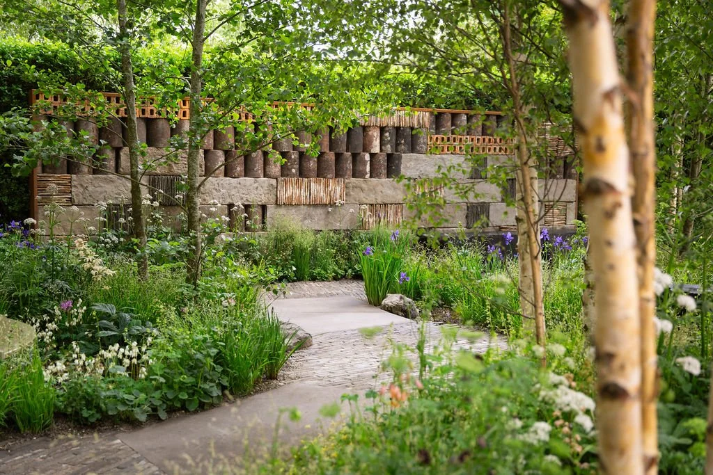
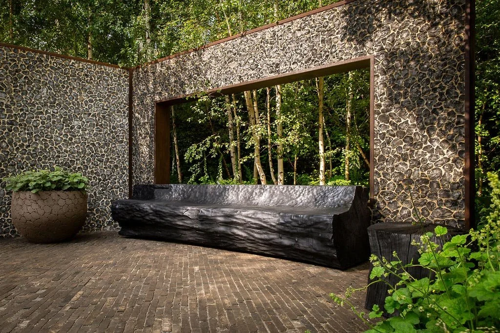
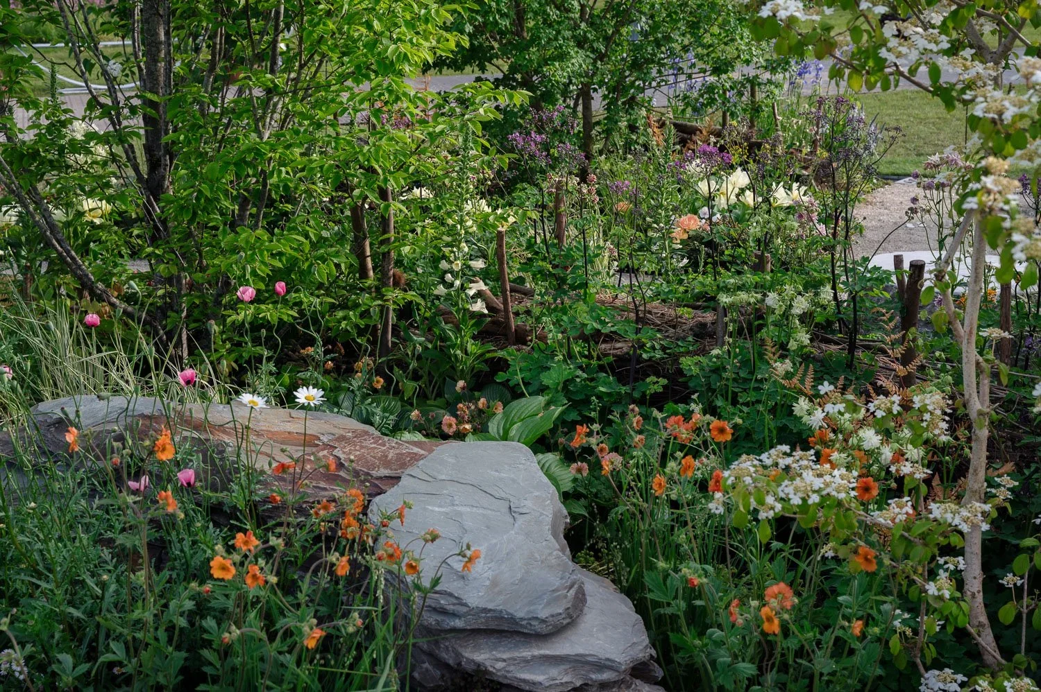
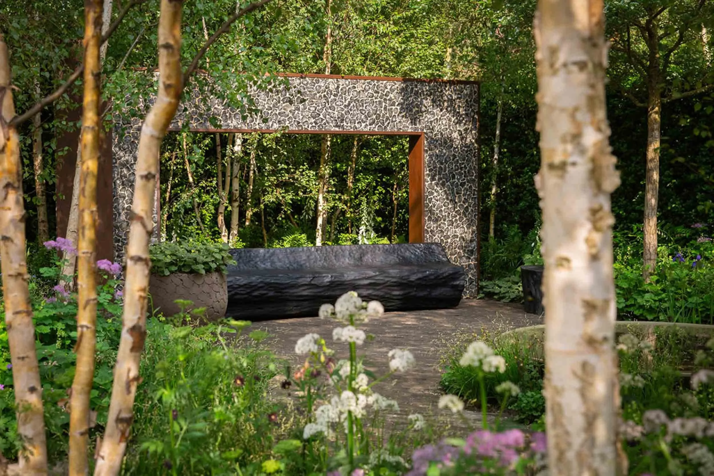
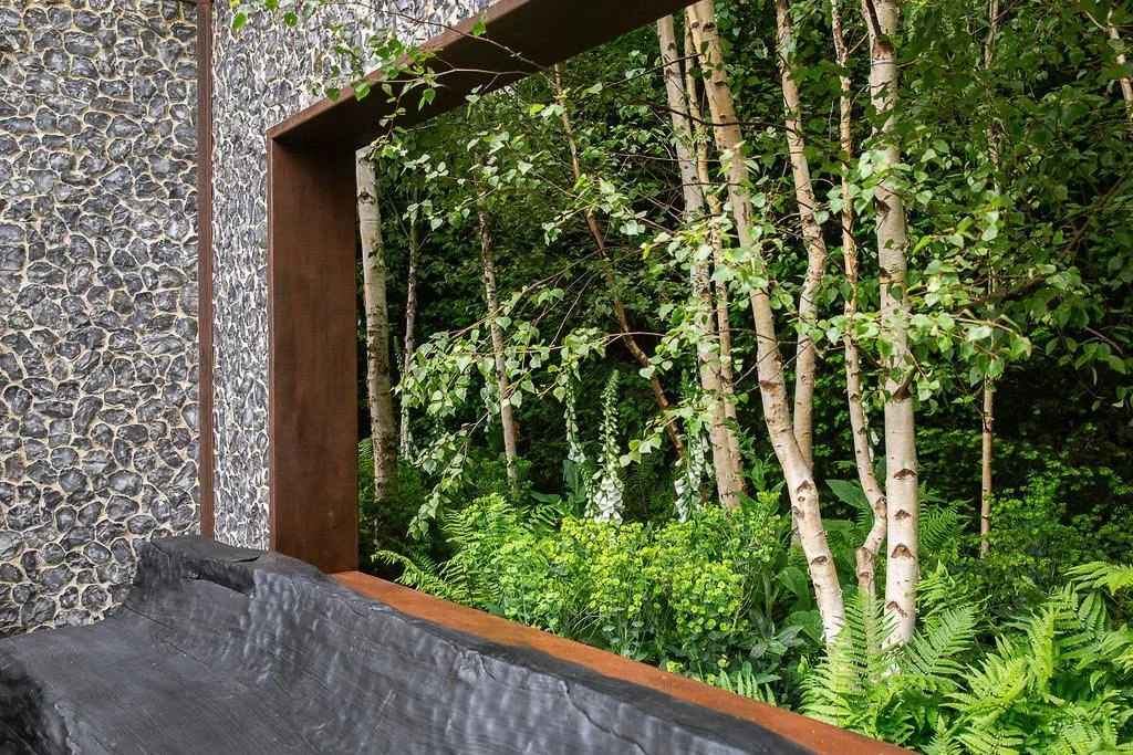
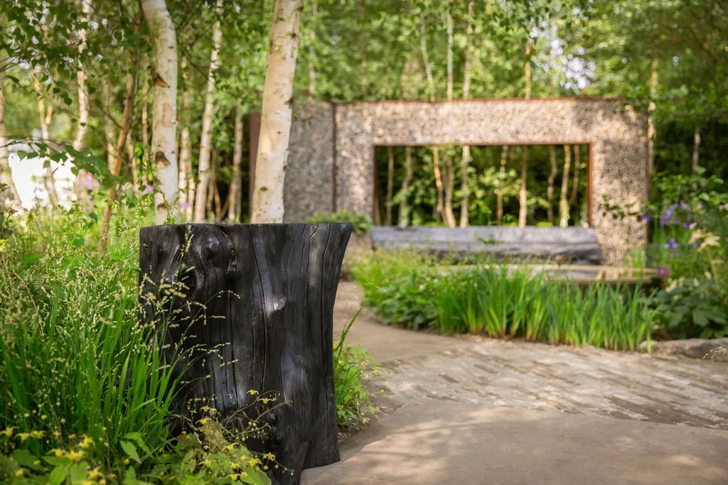
Garden design by Ula Maria for RHS Chelsea: ‘Muscular Dystrophy UK Forest Bathing Garden’ | Garden design photography by Kat Weatherill
Introducing what a great garden design website looks like if you're going to RHS Chelsea
With on-site attendance averaging just under 160,000, the Chelsea Flower Show is the perfect opportunity for garden brands to use their websites to take advantage of a huge surge in interest; engage with clients; and sell their products and services. Plus, you don’t specifically need to be at the show to do this.
In this series - leading into Spring and the RHS show season, starting with RHS Chelsea - we want to help you get ready for the gardening season with your business website. Even if you’re not in the garden industry, the following posts are a great template for how to prepare your website for a surge of interest around a campaign or prominent event.
Every year we visit the websites of lots of the garden designers in the Show and are consistently shocked that so many do not prepare for the event by sorting out their websites - what a missed opportunity!
In this first blog of the series, we’re getting back to basics and want to help you get your website ready for RHS Chelsea with a website 101 for garden designers.
Top takeaways for improving your garden design website ahead of RHS Chelsea
Prepare your garden design website ahead of RHS Chelsea traffic surges
Make sure your site clearly communicates who you are, what you do and where you work before the Chelsea Flower Show season begins — because visibility and enquiries spike around this event.Make contact easy from every page
Place clear enquiry options (forms, phone, email) in the header, footer, workshops, portfolio sections and blog posts so interested clients can effortlessly reach you.Refresh your portfolio to reflect the work you want to attract
Update your featured garden design projects with high-quality images and highlight the benefits you delivered — not just the features. This helps attract the right clients for bespoke commissions.Be explicit about services and specialisms
Clearly describe the services you offer (design, planting plans, consultations) and the problems they solve — making it easier for visitors and AI systems to match intent with your content.Use strong calls to action (CTAs) that guide visitors to enquire
Label CTAs with action phrases like “Book a design consultation” or “Get your garden design quote” throughout your site so that referral traffic from RHS Chelsea converts into enquiries.Clarify your location and project scope early in the content
AI summaries and human readers alike reward clarity — state your service areas (e.g., UK-wide or regionally) and client types (high-end garden designers) near the top of your homepage and blog.Add structured internal links to related garden design resources
Link to other posts in your Chelsea marketing series, newsletters, and portfolio pages so readers stay engaged longer and AI crawlers see depth and relevance.Set up a newsletter capture to turn Chelsea traffic into followers
Adding mail-list signup forms to high-traffic spots helps you engage with people interested in garden design long after the show and increases repeat visits.Include schema-friendly elements like FAQs and key benefits lists
Use concise FAQs (e.g., “What services do garden designers need at RHS Chelsea?”) and benefits lists to help Google generate rich results and AI answer boxes. (This can be implemented via FAQ schema.)Tie your Chelsea insights to your website design expertise
Conclude the blog with a short section that connects RHS Chelsea preparation to building websites that convert — show how professional design increases enquiries, credibility and conversions. This sets up a natural next step to contact Wildings Studio.
1. Make it easy for people to contact you via your garden design website
According to Gardens Illustrated, coverage of the Chelsea Flower Show is massive:
Approximately 15 hours of footage of the show is broadcast on BBC1 and BBC2 throughout [the] show week with average audience figures for BBC1 primetime programmes alone reaching just under 3 million viewers.
This prominent coverage to the masses produces a huge amount of interest directed towards featured garden designers, contractors and suppliers, which drive the public to businesses’ websites (and this includes business to business (B2B) interest too).
The Show focusses people’s attention on their garden like nothing else. People are looking for garden designers to help them revamp their garden or to find a featured product - often this will lead them to your website.
The same goes for all the supporting garden and horticultural suppliers and related services and products that go into the Chelsea Flower Show (which is why this series is applicable on principle to so many other events or campaigns).
The question is, have you made it easy for people to get in touch with you via your website if they want to sort out their garden or make a purchase?
A good garden designer’s website will make it easy for website visitors to get in touch with you so that you can then take their enquiry further.
How to help people contact you via your garden design website
Here are a few things you can do to make it easy for people to contact you as a garden designer via your website:
Make sure you’ve got a good contact page on your website with a clear, simple enquiry form (only take the most important information)
If you don’t have an enquiry form, make sure your e-mail address is available or your key contact details such as mobile phone or landline number
If you’re not sure whether to choose a mobile or landline number, go for a landline, as it looks more professional (not that you can buy a ‘virtual’ landline number via Twilio and then forward calls to your mobile)
Test your website enquiry form so that new enquiries get to your inbox or the right person rather than disappearing into the ether or spam folders! We recommending doing this on a monthly basis as it’s such a critical part of the sales and marketing process
Ensure that it is easy to find your contact page on your website - usually it will be in the main navigation and the footer at a minimum
Other ways to improve your ‘contact-ability’ as a garden designer
Include a map on your website contact page so that people can place where you are in relation to them - the current trend is to use local businesses, so make sure this is obvious
Update your Google Business Profile (was Google My Business)
This means that when people search for you on Google, all your contact details are up to date and consistent with your website (including opening times)
Setup an automated confirmation e-mail when people make an enquiry so that they know you’ve received their enquiry, plus it’s really helpful to have a record of the enquiry if they need to follow you up
Other places to add an enquiry link back to your main website contact page include:
Header
Footer
Announcement bar
End of portfolio pieces
End of blog posts
About page
Social media profiles (more on this in How to up your Instagram game at RHS Chelsea Flower Show)
2. Update your garden design portfolio on your website & show off your work
Now that you’ve got all those eyeballs looking at you and your garden design business (or landscape gardener or landscape architect), it’s a great opportunity to show your website visitors the best of what you can do.
Ahead of the Chelsea Flower Show or your big industry event, update your website portfolio or case studies so you’ve got high-quality recent examples of your amazing work.
Now’s a good time to remove client projects from your website that are perhaps a bit old, a little tired or don’t fully reflect the kind of work you want to doing going forwards.
Top tip: the type of work you showcase will likely be the type of work you attract. If you want to change direction or work with different clients, show off appropriate items.
If you feel like you don’t have loads of projects in your portfolio, less is more.
Three really good quality projects are sufficient to get across your vibe, aesthetic and style.
The more you work with one type of client, the more likely you will be to work with similar ones in future.
This is why you want to avoid attracting the ‘wrong’ type of client, whether in terms of budget, expectations, location etc.
If you’re really stuck for what to include in your portfolio, consider creating a few passion projects.
Passion projects are fictitious specimen pieces that allow you to take off the constraints and push the boundaries.
Crucially, they are excellent at attracting clients to your particular style.
How to show off your work as a garden designer on your website portfolio
Make your portfolio easy to find in the main navigation on your website
Use high-quality images, ideally by a professional photographer, which will give you a consistent style
If you provide a service, try to contextualise the benefits you bring with the imagery or talking about the impact you brought a client
Think benefits instead of features - focus not on what you did, but what you did for your client
Let the imagery speak for itself, but a handful of short paragraphs on the services you delivered and for context is a good approach
Keep your portfolio up to date - don’t rest on your laurels and assume old work still cuts the mustard!
3. Tell people how you can help them as a garden designer on your website
Forgive us if this is obvious, but have you updated your services page recently?
Are you absolutely clear into which part of the horticultural services industry you fit?
Are you a:
Horticultural supplier
Some people assume garden design includes all of the above, which is based on feedback from a garden designer we have worked with.
Is it obvious what you offer to clients and the pain points or problems that you address?
If you’ve answered ‘no’ to any of the questions above, now is a good time to revamp your services page.
What might be clear and obvious to you is not necessarily intuitive to someone new to your line of work. The point is that they could become a client, so what can you do to smooth that process?
If you’ve got a particular specialism with the garden services context, your services page is a good place to make that evident.
For example, do you provide lighting designs, planting plans or do you offer a comprehensive, all-in service?
If it is the whole package, have you included the particular services within that offering?
Again, don’t assume anything!
You’re not patronising anyone, you’re making it really easy for some to choose you above all your competitors.
How to create a great garden design services page on your website
Try and stick to a maximum of three or four services - too much choice is confusing and makes it hard to know what you’re really good at
Focus on your benefits, rather than listing exhaustive features - show how you solve problems that clients may have
Avoid including too much detail - a services page should build trust and show expertise; leave the nitty gritty to once you’ve got an enquiry
Show your face - this is a great way to build trust with potential clients, which increases the likelihood of enquiries
Include a section on the overall process and what it’s like to work with you - help your clients to visualise how great it will be to engage you!
4. Make it easy for people to engage with you as a garden designer
After you’ve done all the hard work at the Chelsea Flower Show, don’t fall at the final hurdle on your website.
If people have arrived on your site, read through your services, browsed your portfolio and want to take you on, what next?
Is it obvious what they need to do now and where they need to go?
This is what’s known as a Call to Action (CTA) and usually comes in the form of a button that leads to your contact page.
By including CTAs throughout your site in key places, you’re not patronising people, you’re providing them with a helpful handrail to complete their desired outcome.
Normally, the next step will be to get in touch with you via phone or e-mail to discuss a product or service.
You need to make it easy for people to take that key action of getting in touch with you at the end of the journey they started with the Chelsea Flower Show and led them to your doorstep.
If it is not obvious what or where someone should go in order to engage you, you create friction and uncertainty with your visitors.
This forces them to have to think what to do next or hunt around to find the next piece of the jigsaw puzzle.
The more you introduce these negative feelings of friction and uncertainty the more likely it is people will give up and go elsewhere.
How to create a strong user journey on your garden design website
Think about the top action you want visitors to take on your website - normally it’ll be something like ‘get in touch’
Use this CTA consistently across your website so that you’re driving your desired outcome and increasing the likelihood of enquiries
Sometimes you might want to point people to your portfolio or a blog - this is perfectly fine too, but make sure your top CTA is in the top areas like your services page
Don’t forget to test all the internal links on your site and that your CTAs link properly to your contact page
As well as being good for visitors, Google also favours this for Search Engine Optimisation (SEO) and frowns when there are dead-ends on websites
Wildings is a website design agency in Devon. Based in Torquay in South Devon we design standout websites for small businesses like garden designers, interior designers, florists and architects (garden, interiors and lifestyle brands). In this series, we’re looking at how to market your small garden business or brand off the back of the RHS Chelsea Flower Show or the Spring rush. This one is all about first steps in sorting our your website, as we want you to get the most out of it! Or explore the rest of our series, Chelsea Flower Show: Marketing for garden designers & garden brands →
5. Be clear on what you do & for whom as a garden designer
As people go away from the Chelsea Flower Show freshly inspired and follow up with you, they will want to confirm you as their garden designer or landscaper of choice.
It’s really important that you make it obvious where you are based, where you work and what your remit is.
For example, if you are a London garden designer, and tend not to take on projects outside the London area, that needs to be obvious.
If your work is residential or commercial, this is key information that needs to come across otherwise it could lead to wasted time and frustration for you or your website visitors.
If you can get that key information across quickly when someone lands on your website, it gives them a mental green light to continue browsing your site.
The more quickly and more certainty you can give someone a green light on your website, the more likely they are to submit an enquiry and go to the next phase with you.
How to get across the vital info as a garden designer on your website
Include a clear, succinct summary of who you are and what you do at the top of your homepage
Reiterate this information on your most-visited pages, which tend to be your About and Contact pages
Add a map and info on where you are based to your contact page to help people visualise where you are
Add an Frequently Asked Questions are on your contact page which includes your project radius and any geography-specific info
Anything else on how to improve your garden design website for RHS Chelsea & Spring?
That’s it for our website 101 in part 1 of our website design tips for garden designers series, to help your business make the most of the Spring surge in gardening or if you’re at the Chelsea Flower Show. If you’d like to get more helpful tips from us or visual inspiration, follow @wildings.studio on Instagram; or read more of our garden designer-focussed blogs on website design below.
Read more about ensuring your website is tip top for the Chelsea Flower Show:
About the author:
Simon Cox is the co-founding director (along with his wife, Rachael Cox) at Wildings Studio, a branding, website design and content marketing studio in Torquay, UK. He’s the writer and editor of the Wildings Studio blog which you’re currently reading. Simon is also responsible for the Wildings Studio content marketing services. Simon blogs regularly on topics to do with the core Wildings Studio services on branding, website design and content marketing (blogging). He’s passionate about helping small business develop great content that answers the questions people type in Google in order to get found online (SEO).
In this article:
Introducing what a great garden design website looks like if you're going to RHS Chelsea
Top takeaways for improving your garden design website ahead of RHS Chelsea
Free Chelsea checklist: Help your website grow
Make it easy for people to contact you via your garden design website
Update your garden design portfolio on your website & show off your work
Tell people how you can help them as a garden designer on your website
Make it easy for people to engage with you as a garden designer
Anything else on how to improve your garden design website for RHS Chelsea & Spring?
About Wildings Studio
Thoughtful, beautiful branding and websites for design-led businesses
Wildings is a website designer for small business offering website design. Based in South Devon, UK, we deliver small business website design for design-conscious brands like garden designers, interior designers, architects, circular ethos restaurants, speciality coffee shops, organic cafés and boutique hotels.

