

5 powerful visual elements of an amazingly-designed website

An example of good (hopefully!) website design from a mockup of our homepage, incorporating the elements below, plus responsive on mobile devices
First impressions count more than ever: the visual elements of a website design can mean the difference between a potential or a lost customer. Despite the shift of marketing activity to social media, a small business’ website remains a critical benchmark by which customers judge your brand.
If your website design is on the amazing side, it can captivate visitors, drive engagement and convert enquiries into valuable revenue. However, if your website is poor, it can have the opposite effect, giving visitors an easy way to click away, putting them off or leaving them indifferent to you.
Below are the key signs of great on-page website design (& red flags of bad design) and this is part 2 of our mini-series on good versus bad website design. We’re showing you what to look out for and what to avoid when it comes to commissioning your new website or auditing your current website design.
In part 1, we explored the framework and strategic side of good website design. This time we turn to the visuals of good and bad website design on page, including elements such as photography, graphics and fonts, among other things.
Here are five powerful visual elements that can transform your website design, along with some pitfalls to avoid.
Wildings is a website designer for small businesses. Our studio is based in Torquay, Devon, and we provide small business website design for creative, hospitality & lifestyle businesses across the UK (like garden designers, interior designers, architects, floral designers and more!). If you’d like to find out more, explore our website design for small businesses or contact this small business website designer →
1. Consistent branding that shows your personality & dynamism
A recent workshop participant said that when she compared our website with other web designers in our local area, it stood out a mile. For her, it sealed her decision to come along.
In terms of great web design, that is the ideal! Why? Because the visual elements of our website design showed personality, and, crucially, that brand personality resonated and appealed to her as a visitor. This element of personality is crucial to brilliant, engaging website design.
Web design that is full of personality is a key factor in increasing your marketing impact. This is because it resonates with your audience and makes them more likely to take action.
It’s not just about good feelings; it’s about helping hitting your business goals.
Website design with personality builds trust, wins people over and makes it exciting and a joy to go to the next level with your business.
What to do to achieve consistent branding
Consistent branding is probably our number one element for establishing a strong online presence with your website (without ignoring the other elements). The impact that consistency in branding is significant: it helps reinforce your brand identity and makes your site easily recognisable.
Here are suggestions for a unified look:
A cohesive colour palette
Well-structured typography and font family choice
Animations add more dynamism to the visual branding
Personal images of the brand owners or customers (more on this below)
Dynamic elements that are triggered on scroll
How to avoid inconsistent branding
In contrast, some examples of poor design decisions that create a sense of in consistency and that fail to convey personality include:
A very flat, static design with no movement; blocky or strictly in grids
No sense of emotion - very matter of fact and perfunctory
Obviously out-dated and out of touch with current trends (although modern classic is fab and a hallmark of our design style)
Lack of brand character through heavy-reliance on standard text and image blocks
Failing to contextualise your products or services, making it hard for your audience to visualise the benefits of using them
Over-use of off-the-shelf template-type slides from Canva or other platforms that overwhelm the personality of your brand and overpower the human elements
Inconsistencies in branding, such as using different fonts or colours on different pages, can confuse visitors and weaken your brand’s impact. As a general rule, avoid using too many fonts or colours, as this can create a cluttered and disjointed appearance
Key takeaways for consistent branding
There is a ton of ways that you can bring great website design to bear on your site - it’s not just about alternating text and images. Overall, what you want to go for is a look that is nicely designed and clearly on brand.
Here are a handful of key points when considering the branding on your website:
Consistency - use a cohesive colour palette that aligns with your brand identity; this helps in creating a professional look and feel.
Contrast - ensure sufficient contrast between text and background to enhance readability; high contrast can draw attention to key elements like call-to-action buttons
Emotion - choose colours that evoke the desired emotions and responses from your website visitors; see our Colour Psychology for Business Branding →
Overuse or erratic use of colours - too many colours can make your website look chaotic and unprofessional; stick to your primary palette with a few well-chosen accent colours
Clashing colours - avoid colours that clash and make the content hard to read or unappealing
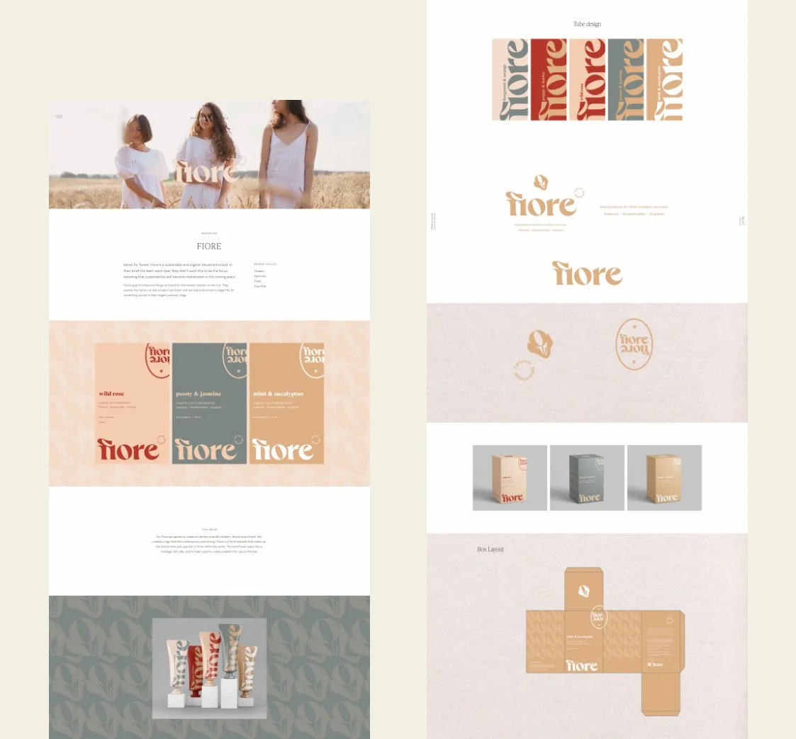
Example One
Passion project Fiore - Showcases packaging and design for a fictitious project of a sustainable deodorant brand
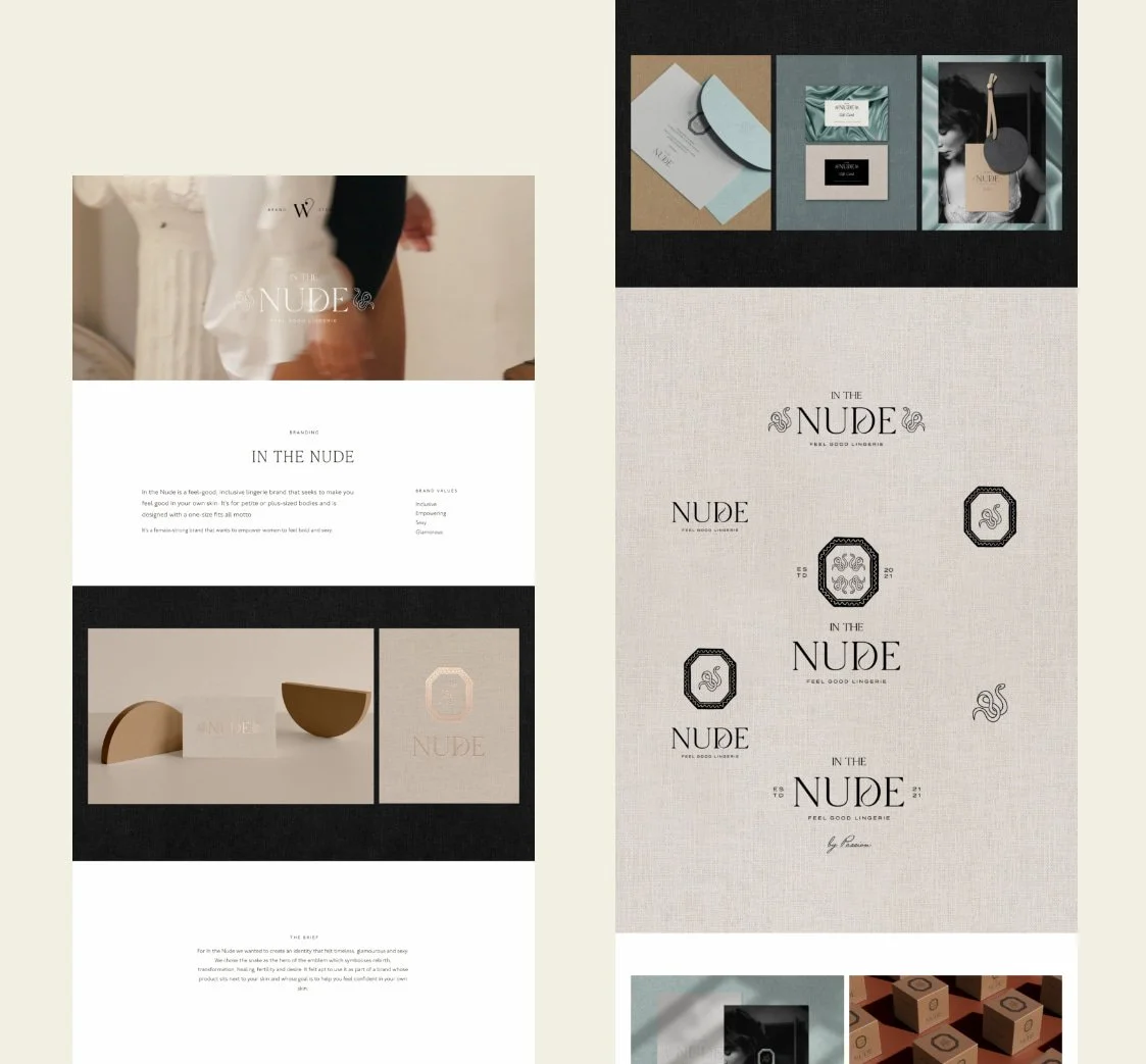
Example Two
Passion project In the Nude - Showcases stationery and design assets for a fictitious project of an inclusive lingerie brand
2. Headings & fonts: legible, nicely-scaled & used correctly
The impact of fonts and headings are criminally underrated. Everyone is aware they need them, but tend to use them a bit indiscriminately or without really understanding their impact in great website design.
In short, fonts or your typefaces feed into your overall branding, so are an important element of getting across to your audience the key things like your aesthetic, personality and character. These are all elements that feed into your website pulling its weight as an effective marketing tool.
Headings will most likely feature your font choices, but they do the job of bringing structure to your web design on page. As a website is a digital platform, people engage with it slightly differently to printed word.
Headings provide the handrails that help people move around your site. Get them wrong and they become a distraction or a turn-off.
One of the slight problems with fonts and headings is that they don’t necessarily become obvious until they are done poorly! That’s one of the signs of great website design is that it looks effortless, almost obvious, in a way.
This is why using a skilled web designer is such a good investment, as they understand how to get the very best results for you when it comes to scales, legibility and structure. It’s not a case of guesswork - there’s a system and rules that apply!
How to avoid off-kilter headings & fonts on your website
Here are a few signs when fonts and headings on your website are not cutting the mustard:
Your fonts don’t scale properly between desktop and mobile view so are totally out of proportion depending on the device you use to view the website
You’re using headings for stylistic rather than structural reasons (Google encourages users not to do this as SEO best practice and search results)
Poor choice of fonts, such as complicated script or flowery fonts, that are hard to read or using traditional serif fonts if you’re going for a young, modern brand style
Using the same font for headings and body fonts isn’t very helpful as there is a lack of contrast between sections
Adding letter spacing to body text - best practice is to set letter spacing to 0
Line height: the text should not be so close together or so far apart it is hard to read or doesn’t belong together
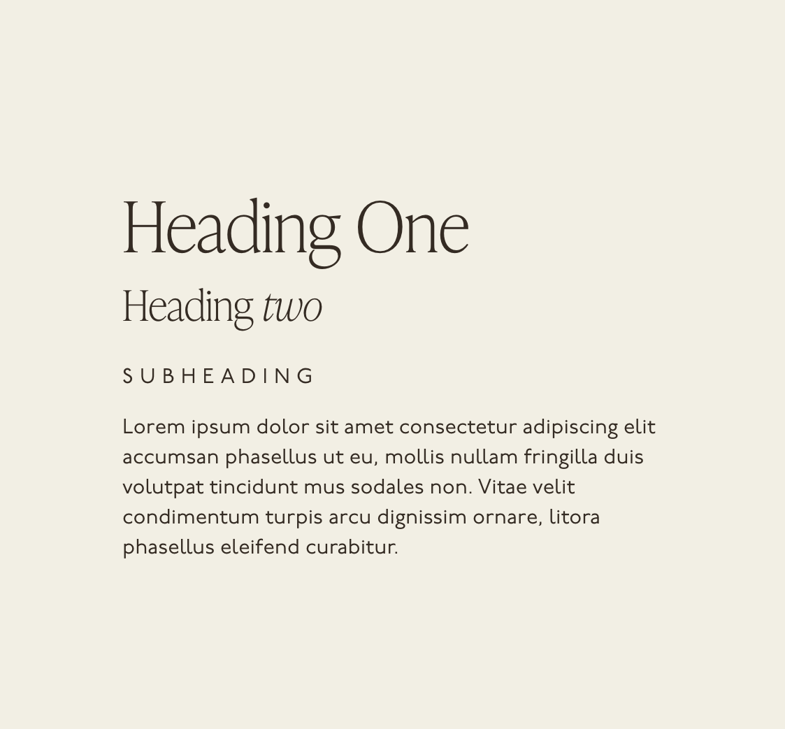
Correct
Headings and body text are complimentary. Not too many fonts used together. Body text is spaced correctly and aligned to the left
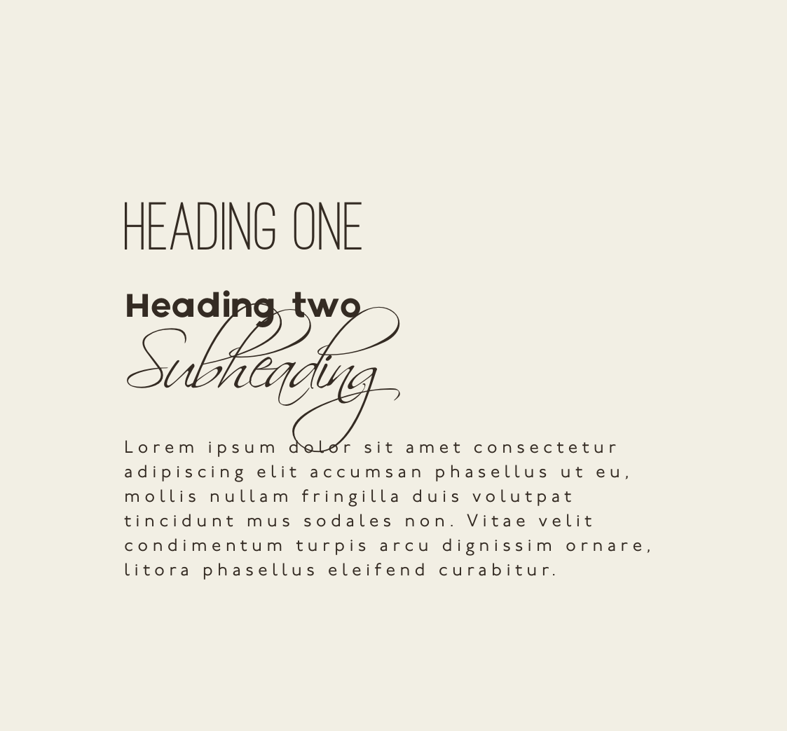
Incorrect
Fonts don’t have a coherent relationship. A script font that is not legible. Paragraph text with spacing between the letters makes it difficult to read
3. Use of striking imagery
Striking imagery is one of the top three pillars of exquisite website design alongside branding, and by striking imagery, we mean professional brand photography.
If you’re wondering, the three pillars of amazing website design are copywriting, photography and strategy, although don’t worry if you’re not quite in a position for a professional photographer, we’ve got a good alternative option for you below.
Why is brand photography so crucial to great website design? High-quality, in-context images help convey the personality of the business as well as those in it (especially helpful with service-based businesses where things can be less tangible). When personality is on display, it is attractive and people want to engage with it - the gold standard for a great website.
Brand photography is also exceptionally good for fostering a sense of trust or conveying confidence to your website visitors. When you convey trust you are more likely to secure sales and projects through your marketing. People buy from people!
To convey trust, you need to put the people and humans in your business at the heart of your brand on your website. A great photographer can show your people in a sympathetic and attractive way that is winsome to people who use your site.
If pro-photography is out of your budget or you’re not ready for a photographer, there is a good alternative. You can pull together a good set of consistent, complimentary images from royalty-free sites such as Unsplash or Pexels.
We explored how we did this in a recent branding and website project for a people development consultancy.
Read more from our blog: How to build a strong corporate brand that corporate businesses love
What to do to get striking imagery
High-quality, relevant images can make your website visually appealing and engaging. Striking imagery captures attention and conveys your brand message quickly. Here’s a few key things to look out for:
Use professional photos or high-resolution stock images that reflect your brand's personality and values
Integrate visuals that complement your content and provide a visual break for readers.
How to avoid poor imagery
Here are some signs when photography on a website has tanked:
Avoid using low-quality or irrelevant images, as they can make your site look unprofessional
Overusing stock photos can also make your site feel generic and insincere
Ensure all your images are optimised for web to prevent slow loading times, which can frustrate users and harm your search engine rankings
Relying on obviously staged, cheesy stock photography
Using those hideous stick-people images to contextualise services or scenarios rather than real people (or clip art)
Using overly-corporate photos of people in suits in the big city, which are totally out of character with the business’ audience, its brand or audience
Key takeaways for striking imagery on your website
High-quality images - use high-resolution images that are relevant and enhance the overall design; opt for authentic, high-quality images to create a professional impression
Custom graphics - incorporate custom graphics and illustrations that align with your style and add a unique touch to your website
Consistent style - maintain a consistent style for images and graphics to create a cohesive visual experience
Stock photos - overuse of generic stock photos can make the website feel impersonal and unoriginal; choose images that feel authentic and relevant
Large filesizes - optimise images to reduce file size without compromising quality to ensure fast loading times

Correct
Convey the personality of people in the business. Builds trust with the audience. Can curate a brand narrative and tell a story.

Incorrect
Stock imagery which has no connection to the people in the business. Could belong to anyone. Could be used by millions of other people.
4. Intuitive navigation & menu structure
The navigation and menu are an incredibly important part of a website. You may not think that much design goes into them, but they can be make or break for visitors staying or going.
The key principle here is that when visitors land on your website, they should be able to find the information they need and quickly. This is why your menu structure is so critical. Practically, your navigation is via the menu bar running across the top of your website, or perhaps a dropdown ‘hamburger’ style icon.
If your menu has clear and descriptive labels with logical menu items that drop down, this is the way to guide your users purposefully through your website. (Known as the user journey.)
Ultimately, a well-thought-through navigation and menu will do a few things: make for a better user experience; reduce the rate at which visitors leave (known as the bounce rate); and increase the time your visitors spend on your site. Keeping visitors on your site longer can help improve your SEO (tells Google your site is helpful and relevant) and increase your hit-rate for new enquiries or leads.
A common mistake people make with their navigation and men is throwing the kitchen sink at it or not taking the time to consider it. Overloading your menu bar with too many options can overwhelm your visitors; if they can’t find what they want, they’re more likely to leave. A good navigation anticipates the most important, most relevant and most timely things, leaving other information to be found elsewhere on your website where its required.
The key to good navigation and menu is prioritising what’s relevant at the right time so that your visitors are not left to trawl through multiple pages and unnecessary clicks.
Another common pitfall is vague words and jargon in your menu. Be clear! Your visitors should understand where each link will take them at a glance.
Overall, by incorporating an intuitive navigation and a well-structured menu into the design of your website, you will make for a better user experience, which will help you achieve the goals for your site, whether that’s enquiries, sales or otherwise.
What to do for an intuitive navigation & menu structure
An intuitive navigation system enhances user experience by making it easy for visitors to find the information they need.
Here are some suggestions:
Use clear, descriptive labels for your menu bar and dropdown labels
Organise your menu bar logically
Consider a search box to help users locate specific content quickly (optional, but worthwhile if you have an extensive website or massive blog)
How to avoid a poor navigation & menu structure
Here are things to avoid that will lead to a complex or confusing navigation structure on your site:
Overloading your menu with too many options
A cluttered or overly large menu structure
Anything that overwhelms your visitors and make it difficult for them to find what they’re looking for
Inconsistent navigation and menu across your website, creating disorientation

Correct
Tasteful animations that help the user see your flair as a business
Incorrect
Text is not legible over images when used like this. Text and images should not be saved as a JPEG because the text cannot be read by accessibility devices. This is also rubbish for SEO
5. Effective use of white space
White space is as it says - the blank space that surrounds images, text blocks and other elements on page. White space is another totally underrated visual element in great website design.
White space in website design basically allows things to breath. It also makes it easier for a visitor to read content on page and assimilate the key information. Without sufficient white space in website design, things quickly become very crowded and congested, making for a poor experience and customer journey.
Although it might be tempting to cram as much content and detail into one space as possible in the hope that it swings the balance for you, it will drive your website visitors elsewhere. We’ve talked about creating a pleasant, robust user journey in previous blogs, and white space is a great way to pace people through what’s on page and encouraging them to the next step.
Read more from our blog: Why your customer's journey on your website matters & how to influence it
With white space your website visitors also get a better feel for your brand as a whole as they can absorb all the visual elements and cues that you’ve put into it. As above, this is crucial for making a good impact on your visitors so that they engage further.
In our website design, we use a helpful approach that is focussed on stylish sections. These are discrete, self-contained segments that make up each page, which can contain text, images, quotes or graphical elements or a mixture.
Sections allow you to think strategically about your brand messaging, pain points you’re solving and critical Calls to Action. They also allow you to repeat aesthetic elements across your site for consistency. Plus, of course, you can build in white space in a regular way to allow everything to breathe.
What to do for effective white space
Consider whether you’ve got negative space or empty areas between design elements on a page, whether a blog or service page
Effective use of white space can enhance readability, which is important for landing your brand messaging
With sufficient white space, you can more easily draw visitors’ attention to key content
White space creates a clean, uncluttered look which is not only contemporary, but a good principle for impact
White space helps in reduce your visitors’ cognitive load, making the whole experience of your website more enjoyable and can increase enquiry rates
How to avoid poor white space
Avoid text or other elements that butt right up to images with no padding
Buttons with important calls to action don’t stand out and the site isn’t producing regular leads or sales
Your site analytics show that people are getting stuck or navigating away before reaching the key pages such as your contact page or checkout
Avoid cramming too much content into a small area
Don’t overload your pages with text, images or buttons which can overwhelm your visitors
Lack of white space can make your site difficult to navigate, which increases the percentage of visitors you lose
Resist the temptation to fill every inch of the screen: less is more!
Key takeaways for effective white space on your website
Clear structure - use a clean and organised layout to ensure users can easily find information; a well-structured layout enhances usability and user experience
Utilise white space effectively to create a balanced design and prevent the layout from feeling cluttered; white space helps to highlight key elements and improve readability
Cluttered design - avoid overcrowding your pages with too many elements; this can overwhelm users and make navigation difficult

Correct
The text has a line-height that makes reading comfortable. Paragraphs are nicely spaced. Button is close, but not too close. Button is just scaled to a good proportion for the text.

Incorrect
Line height too dense. No paragraphs used. Button too close to text. Proportions of button are too large.
6. Other tips for amazing visual elements to boost your website
Remember, your website needs to tick quite a few boxes, so if it looks good, but isn’t optimised for search engine searches or slow to load, it’s not doing its job properly. Here are a handful of other key considerations to make sure your website is not only designed well, but performs well too.
Responsive to mobile phones & tablets
Responsive design basically means that your site adjusts seamlessly to the size of screen a visitor is using (often different to your own), providing an optimal viewing experience on a smartphone, tablet and of course desktop. (Don’t fall into the trap of a site designed on a desktop, solely for desktop screens.)
Most internet users now engage with a website via their mobile phone, rather than a desktop computer. This is purely because of the convenience of a mobile device in the hand with internet connectivity. Your website needs to match this move to convenience with its responsiveness.
Given this trend, your website visitors generally have a smaller screen with which to view your content and navigate around. Your website needs to respond automatically to the screen size of the device of your visitors. If not, your users will be left squinting and pinching in and out on their screen, both of which are a quick way to losing traffic. What is more, Google may well penalise your site in rankings if it has a woeful mobile experience.
Remember, don’t neglect mobile users by focussing on the desktop experience. A website that looks great on a desktop but is difficult to navigate on a mobile device can frustrate visitors and lead to high bounce rates. Test your site on various devices to ensure it performs well across all platforms.
Quick site and page load speeds
Following on from above, users on mobile devices will often be using data (4G or 5G) to access your site, if they’re not on wifi - this is the nature of on-the-go browsing.
If your website take an age to load, as it is image-heavy, employs lots of plug-ins or unnecessary code, it will again put people off. Website visitors expect a website to load in a matter of seconds, so by the 10-second mark (often sooner), they’ll have bounced back to their Google search and moved on to another site.
The implications of this should be obvious - that bounce rate of visitors means lost opportunities to build followers or even sales. A visitor may have been intent on making a purchase on the go, so if your site doesn’t load quickly, that’s goodbye to a potential sale.
Good Search Engine Optimisation (SEO)
SEO touches on many of the points above and is ultimately about answering the questions people put into search engines. There are a number of other technical or behind-the-scenes that make up SEO. However, the biggest factor by far is content.
If your content is rubbish or non-existent, Google is going to find it hard to recommend your site in search engine results to users who are looking for answers or particular products and services.
As such, good design must incorporate good content - if you’re just starting out, that’s fine, but you’re going to need to feed your blog and update your site if you want to appear in search results. As above, your site needs to load quickly and be responsive for your content to have any chance of keeping people on page.
So that’s a wrap on our mini-series on good vs. bad website design (Part 1 is here, if you missed it). If you’d like to learn more from us on website design or get visual inspiration, follow @wildings.studio on Instagram. You can read more of our blogs on website design too.


