
Colour psychology for branding: choose colours that attract better clients
Colour psychology for branding: how to choose the right colour for your business
The colours you choose for your brand influence how people perceive your business before they've read a single word.
The challenge is that there is no universally "best" brand colour.
Blue can create trust, or make you look forgettable.
Purple can feel luxurious, or pretentious.
Orange can appear energetic, or budget.
The right colour depends on the message you want your brand to communicate and the clients you want to attract.
This guide explores the strengths, weaknesses and hidden risks of the most common branding colours, helping you make a more confident decision about your visual identity.
Whether you're creating a new brand or considering a rebrand, use the guides below to understand what each colour signals and when it works best.
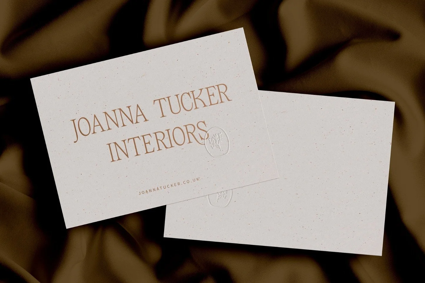
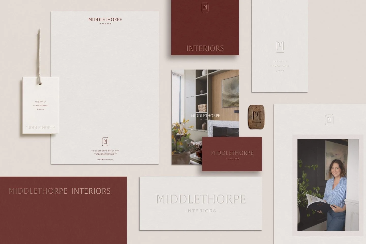
1. Brown branding: sophisticated choice or business risk?
Brown is one of the most overlooked colours in branding. Used well, it communicates warmth, dependability, craftsmanship and understated luxury. Used badly, it can feel dated or heavy. If your business values authenticity over flashiness, brown may be more powerful than you think.
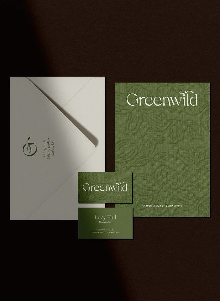
2. Green branding: authentic authority or predictable cliché?
Green is often associated with sustainability, nature and growth. The problem is that so many brands use green that it can quickly become generic. Discover when green creates trust and when it simply blends into the crowd.

3. Blue branding: trustworthy or instantly forgettable?
Blue is one of the most popular branding colours in the world. It signals stability and trust, but overuse means many blue brands struggle to stand out. Learn when blue works and how to avoid looking like everyone else.
4. Purple branding: luxury signal or brand confusion?
Purple has long been associated with wealth, exclusivity and status. It can create a premium feel, but only when supported by the right brand strategy. Otherwise it risks feeling artificial or disconnected from your audience.
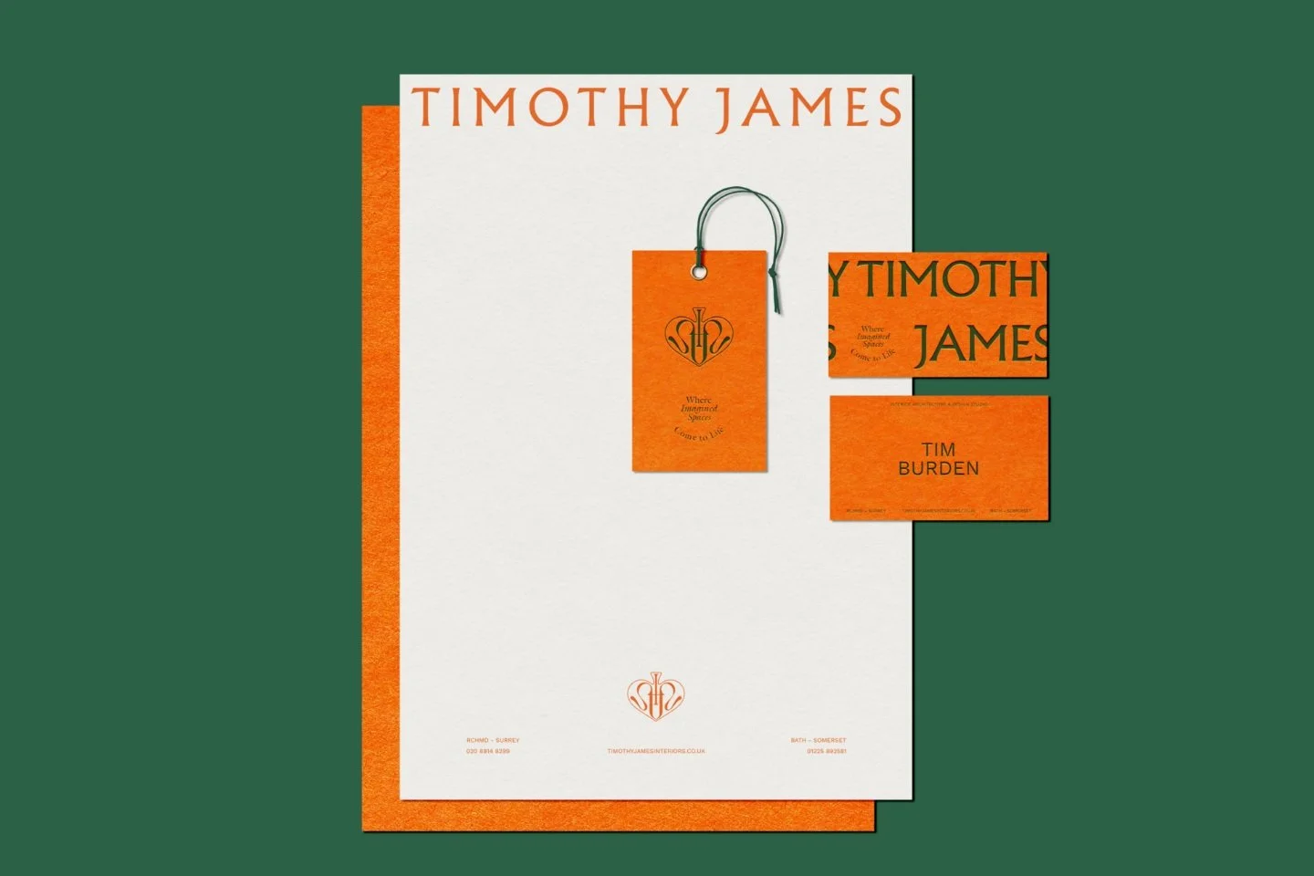
5. Orange branding: energetic luxury or budget-brand trap?
Orange grabs attention faster than most colours. Some of the world's strongest brands use it brilliantly, while others reinforce low-cost positioning. Understanding the difference is crucial.
6. Red branding: powerful authority or costly mistake?
Red is bold, energetic and impossible to ignore. It can create prestige and confidence, but it also carries strong emotional associations that require careful handling.
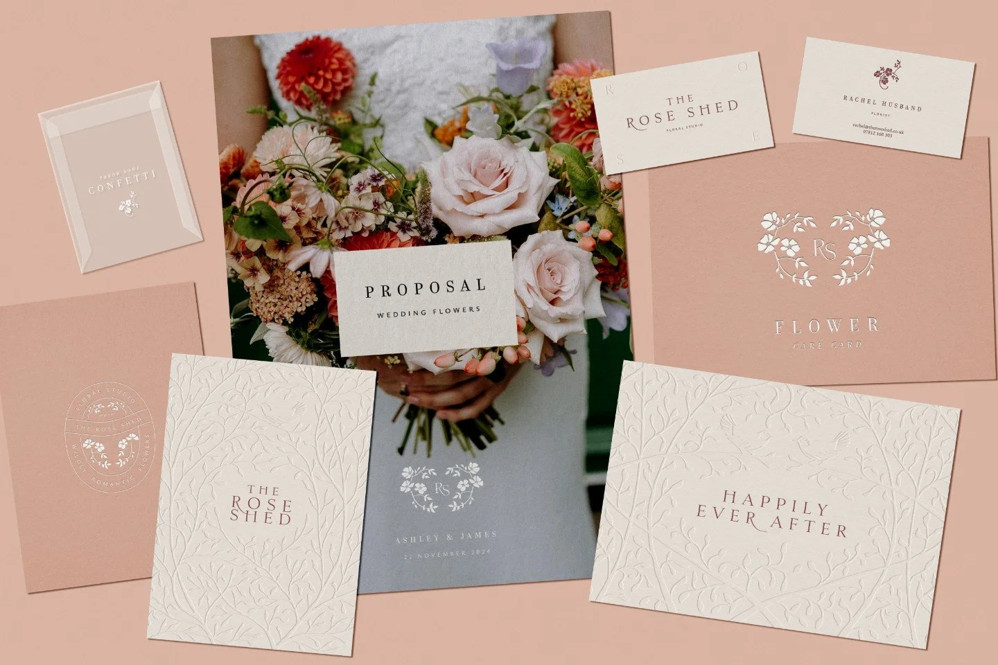
7. Pink branding: bold differentiator or costly mistake?
Pink is often underestimated in branding. The right shade can feel contemporary, sophisticated and distinctive. The wrong shade can create entirely different perceptions.
8. Yellow branding: attention - grabbing or reputation-damaging?
Yellow attracts attention quickly, which makes it both powerful and risky. Learn why some brands thrive with yellow while others struggle to use it effectively.
How to choose the right brand colour
Before selecting a colour palette, ask:
What do you want your brand to communicate?
Different colours communicate different qualities:
Blue → trust and stability
Green → growth and harmony
Purple → luxury and exclusivity
Red → power and energy
Orange → optimism and momentum
Yellow → attention and confidence
Brown → dependability and warmth
Pink → creativity and personality
What colour dominates your industry?
Sometimes the best choice is fitting in.
Sometimes the best choice is standing out.
If every competitor uses blue, choosing blue may make differentiation harder.
What kind of clients do you want to attract?
The best colour is not necessarily your favourite colour.
It is the colour that supports the positioning of your business and resonates with your ideal clients.
Branding colour choice FAQs
-
Colour is one of the first things people notice about a brand. Before a visitor reads your website copy, explores your services or understands your offer, they are already forming impressions based on your visual identity. The right colour palette can help communicate qualities such as trust, luxury, creativity or reliability, while the wrong palette can create confusion or attract the wrong audience. Colour alone will not make a brand successful, but it plays an important role in shaping perception and recognition.
-
There is no single best colour for attracting customers. The most effective colour depends on your industry, positioning and ideal audience. For example, blue is often associated with trust and professionalism, while orange can communicate energy and optimism. Rather than choosing a colour because it is popular, focus on selecting colours that reinforce your brand strategy and help differentiate your business from competitors.
-
Colours commonly associated with premium and luxury brands include black, deep purple, burgundy, navy blue, rich brown and gold accents. However, luxury is not created by colour alone. Typography, photography, layout, materials and brand positioning all contribute to a premium feel. A carefully executed brown or navy brand can often feel more luxurious than a poorly designed black-and-gold one.
-
Blue is the colour most commonly associated with trust, stability and professionalism, which is why it is widely used by financial institutions, technology companies and professional service firms. Green can also build trust through associations with growth, balance and wellbeing, while earthy tones such as brown can communicate reliability and dependability. The key is ensuring your colour palette aligns with the values and personality of your brand.
-
Yes, colour choices can create unintended associations that conflict with your brand message. For example, a luxury business using bright, highly saturated colours may struggle to convey exclusivity, while a creative brand relying on generic corporate blue could appear less distinctive. The wrong colour is unlikely to ruin a business on its own, but it can make it harder to attract the right clients and communicate the right positioning.
-
Not necessarily - sometimes using familiar industry colours can help customers quickly understand what you do, but it can also make your brand blend into the background. If every competitor uses blue, choosing blue may make differentiation more difficult. The best approach is to understand the visual conventions of your industry and then decide whether standing out or fitting in better supports your brand strategy.
-
Most brands work best with a focused colour palette of three to five colours. This typically includes a primary brand colour, one or two secondary colours and a small number of supporting neutrals. Too many colours can create inconsistency and make a brand feel less professional. A restrained palette is often easier to apply consistently across websites, social media, marketing materials and packaging.
-
Colour psychology is not an exact science, but there is strong evidence that colours influence perception, emotions and decision-making. Cultural associations, personal experiences and industry expectations all shape how people respond to colour. Rather than assuming a colour guarantees a specific outcome, businesses should use colour psychology as one part of a wider branding strategy that includes positioning, messaging, design and customer experience.