4 tips to get the graphic design right for your publicity campaign
Take your campaign up a level - get your graphic design sorted
Intro
We just finished a project for Derby-based charity, Upbeat Communities - a booklet for Refugee Week.
Front page of the Refugee Week booklet for Upbeat Communities
Refugee Week is the UK's largest festival celebrating the contribution of refugees and promoting understanding of why people seek sanctuary.
You can have a browse through it below.
We've written about things to look out for it you are planning publicity for your campaign, as well as learning points for us. This should give you a well-rounded perspective.
Page two of the booklet
1. Get your content sorted first
- I cannot emphasis how important this step is, and thankfully CEO Andrew was all over it, so it was not a worry for Upbeat Communities
- Content is key; without it, it is basically a case of style over substance
- The graphic design embellishes the content and is not a substitute for it
- You can get people to write for you - known as copywriting - but you are your brand's best advocate
- You know the details, the voice and the feel you want to put across
What we learned
- We realised early on that content gathering can make or break a project
- For Andrew we had a new, carefully-constructed content gathering form
- All the text goes in and any images the client may have
- Once submitted, we get it all collated on the back-end of our management system
- It's all there ready for the designer to go
- We use Dubsado and thoroughly recommend it
Here's the back-end view of the content gathering form on Dubsado
Page four of the booklet
2. Be flexible
This one should come as no surprise, and it works both ways - client and agency.
- We had a moment when it looked like there was far too much text
- The original brief was a tri-fold leaflet, but we advised CEO Andrew that a booklet would work better
- Fortunately, Andrew was willing to change his original vision
- We were then able to mould the content into a multi-page booklet, which came out really nicely
- The key here is communication - pretty obvious, really - between both parties
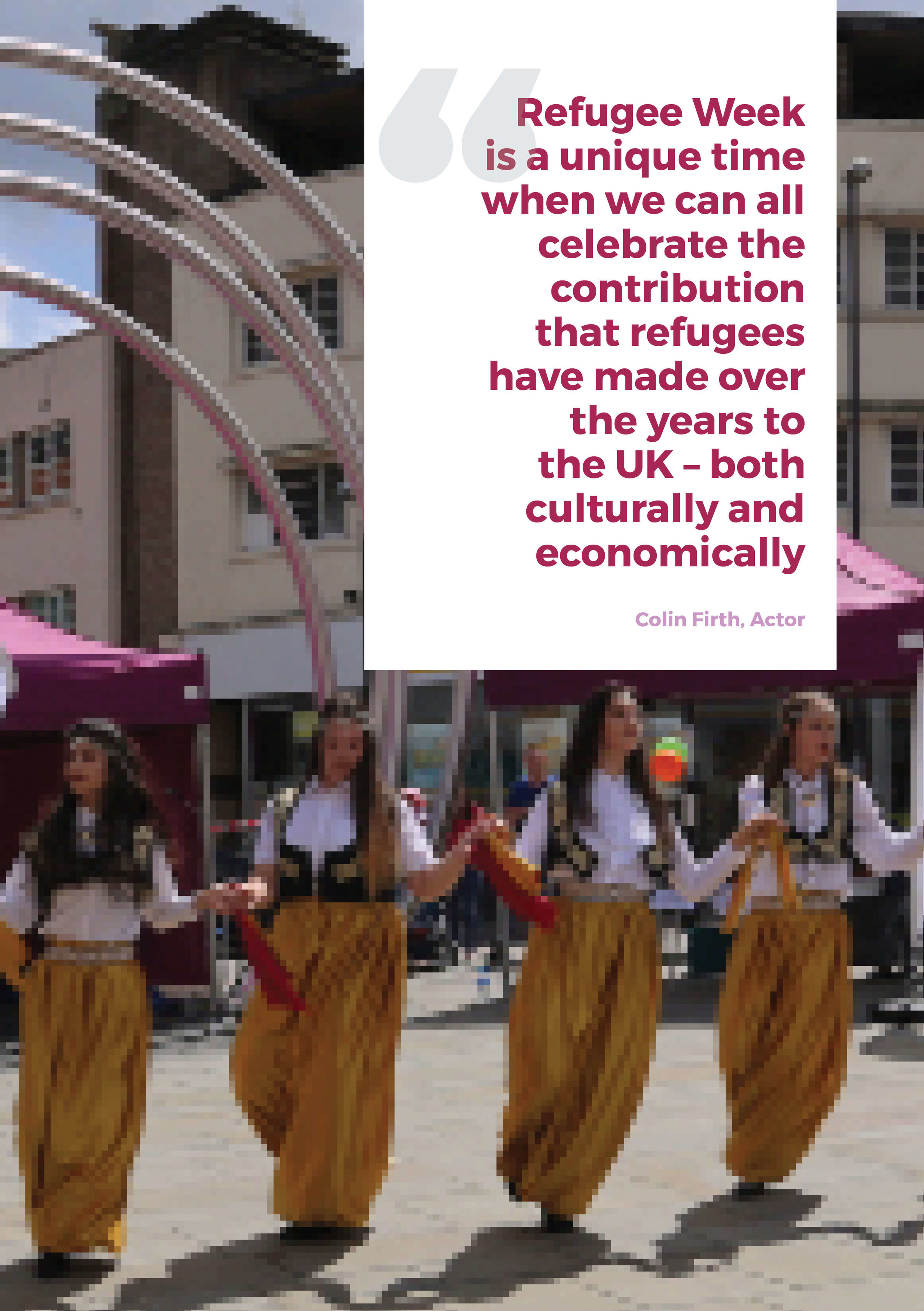
Page nine of the booklet
3. Know your budget & deadline
If you're a pro-marketer, then feel free to skip this one, but I will point out the principles here.
- Sadly most things in life cost something these days, including graphic design
- When you go to a designer the expectation is that you will cough up some dough for the privilege of the services rendered
- If you don't, things could get heated (it's called stealing, breach of contract...)
- If you do, but haven't really negotiated a package, you could be in for a nasty shock
- Marketing material is designed to help you deliver an outcome
- It therefore requires you to invest in it or have figured it into your budget
- Having a budget helps you to weigh up the return on investment; it also helps the designer decide if it is a good fit
- Being aware of timescales is equally important to delivering success
- Andrew shared his with us, and we kept our end of the bargain
What we learned
- We have built in a briefing area in our Dubsado forms so we capture timescales at the very beginning of a project
- We went straight to CEO Andrew when it became clear that there was too much text for the original format
- We had the figure for the extra cost immediately to hand so he could make a decision
- We explained clearly the situation and the options
Briefing area in Dubsado so that expectations are set and clear from the start
Page 12 of the booklet
4. Capture key data early on
- When we were starting out it was easy to assume certain details, or that both parties would remember them
- Wrong - this a recipe for scope creep and frustration
- Never assume
What we learned
- Before this project with CEO Andrew, we modified our Dubsado form to include key questions
- These will depend on your sector, but for us are to do with paper orientation, size, destination format, printing and so on
- By recording these at the start it is again something concrete to fall back on in case of confusion or doubt
We hope you've enjoyed this week's blog. If you've got a website or a branding need, do get in touch - we'd love to chat and see how we can help you!


