LoadedUK website project
Loaded UK is a charity that develops potential in young people through provision of educational activities, including outdoor challenges.
(Not to be confused with the lad mag from the '90s!)
We've been working on this website project for a while and really satisfied to see it to completing.
We gave the LoadedUK website a full facelift to increase its visual impact and clarity of messaging.
We also transferred the the hosting from Wix, and putting in place a dynamic, intuitive and user-friendly management system on Squarespace (like Derby City Mission and Bright Futures before it).
The brief
Steve approached us with the brief:
To revamp the existing website, which had become a bit tired and static
To help clarify the products and provision that LoadedUK offer
Deliver intense staff training to ensure that the team is ready to take on the website and make it its own
Old Website
New Website
Our thoughts
Here are some of the things we enjoyed about the project:
1.Capturing the brand
As you can see, LoadedUK's strapline is, 'inspiring positive change through challenge', which fits well with its focus on educational outdoor activities.
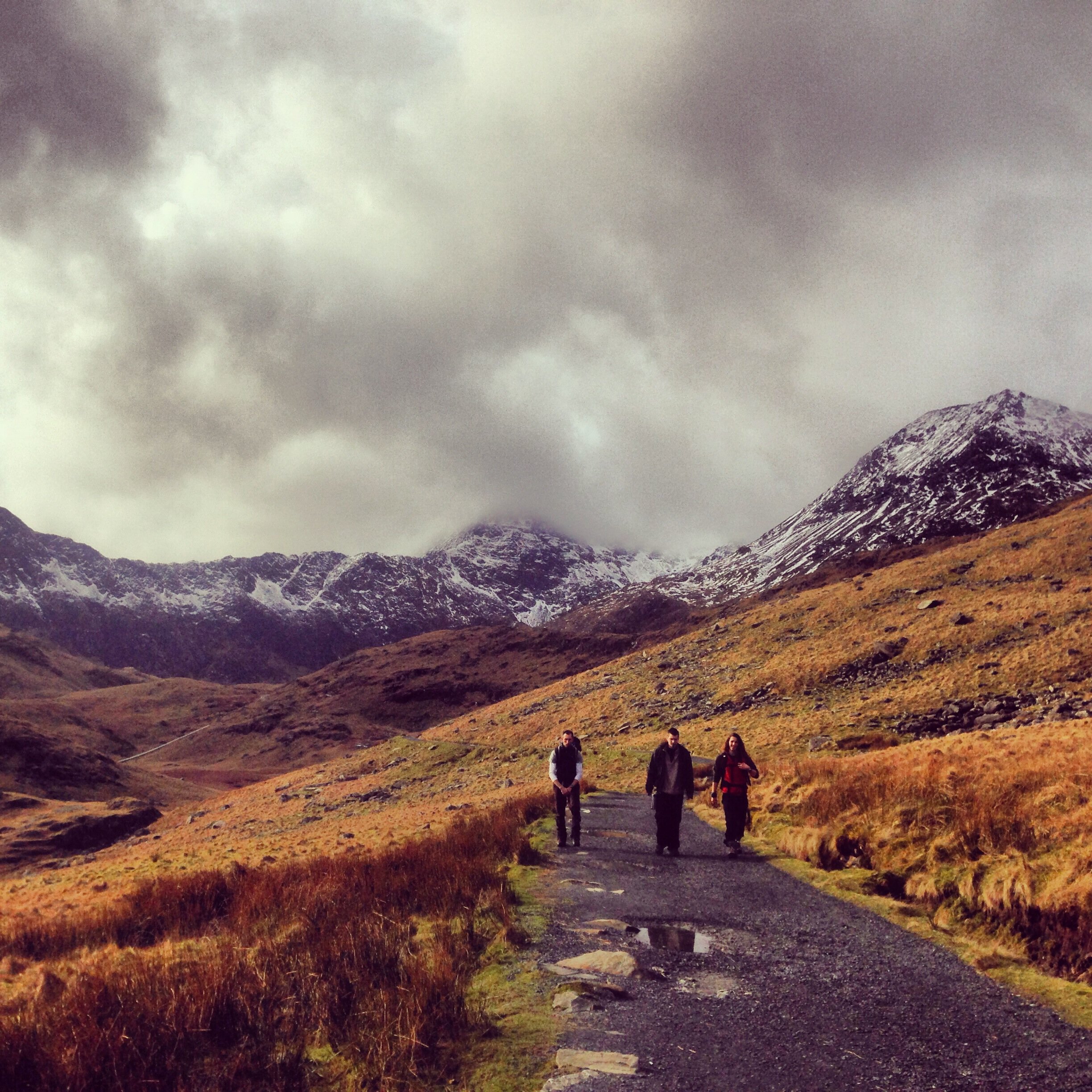
The banner image really reinforces this messaging - a broody scene of Snowdon, the highest mountain in North Wales.
The highlight is the group of three young people, on the gravel track, that contrasts the mountains with a sense of hope and perseverance.
It also underlines the challenge element of the strapline.
2. Custom icons
As per the buttons on the Across Woking website, we added a little falri with a set of custom icons on the homepage.
They don't add up to much on their own, but together these icons add to the text and reinforce the messaging in a visual way.
Breaking up text on a page, whether with icons or white space, is always a good thing, as it allows the visitor to digest key information.
3. Quote blocks!
Again, a quote block is never going to be the most important part of a website, but for its size, it adds a lot.
We used a number of quote blocks to lift the testimonials area of the website, underlining the quality provision that LoadedUK delivers.
The quote block can be deployed throughout the website, including on blogs or the homepage, if you choose.
It's not just for quoted speech too, so is a versatile tool in the toolbox!
We hope you've enjoyed this week's blog. If you've got a website or a branding need, do get in touch - we'd love to chat and see how we can help you!


