A garden designer's tips on planning small garden spaces
A glorious garden for small spaces - our reflections on the ‘Beauty in Small Spaces Garden’ at BBC Gardener's World Live. We had the pleasure of visiting Kerianne Fitzpatrick and TJ Kennedy and their show garden at BBC Gardener’s World Live. I am so excited to share more about their beautiful garden and some photos of their space.
Gardens bring us so much joy and we love spending time in the natural world whenever we can. We are currently working with Kerianne to design her brand identity and build her website and earlier this year I met Kerianne The Newt in Somerset for a day to discuss the future direction of her business. During our time together she shared that she was in the process of submitting an application to build a show garden at BBC Gardener’s World Live. And we were thrilled to be invited to see her and TJ’s vision in the flesh and experience their garden space. Let’s take a look, shall we?
“In garden arrangement, as in all other kinds of decorative work, one has not only to acquire a knowledge of what to do, but also to gain some wisdom in perceiving what it is well to let alone.”
Wildings is a website designer for small businesses. Our studio is based in Torquay, Devon, and we provide small business website design for creative, hospitality & lifestyle businesses across the UK (like garden designers, interior designers, architects, floral designers and more!). If you’d like to find out more, explore our website design for small businesses or contact this small business website designer →
“There is no “End” to be written, neither can you, like an architect, engrave in stone the day the garden was finished. A painter can frame his picture, a composer can notate his coda, but a garden is always on the move.”
The importance of zones in a small garden space
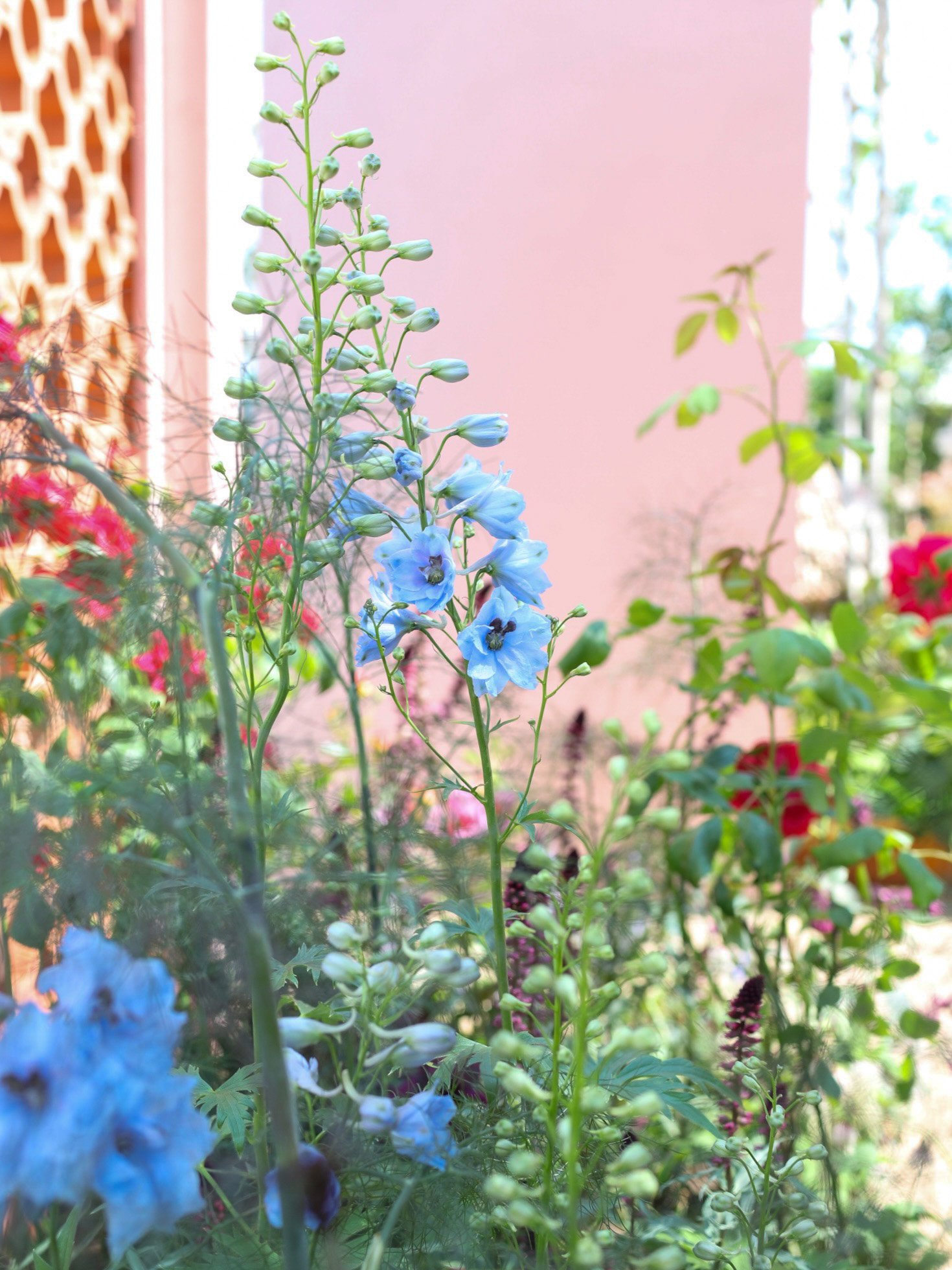
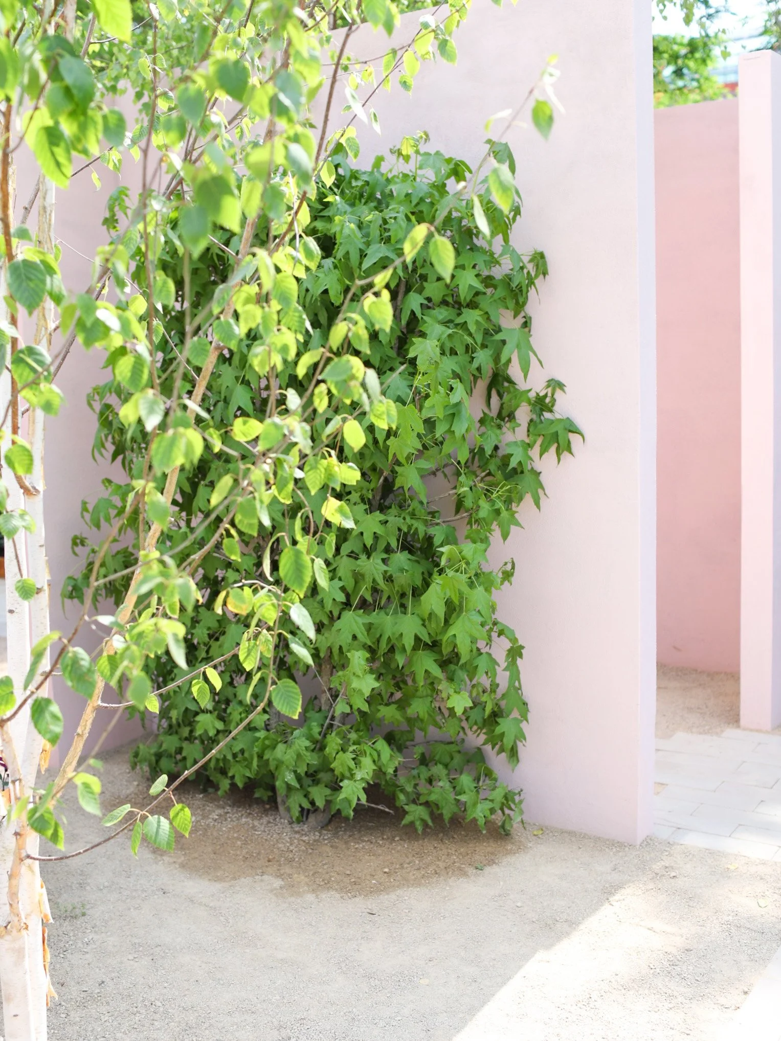
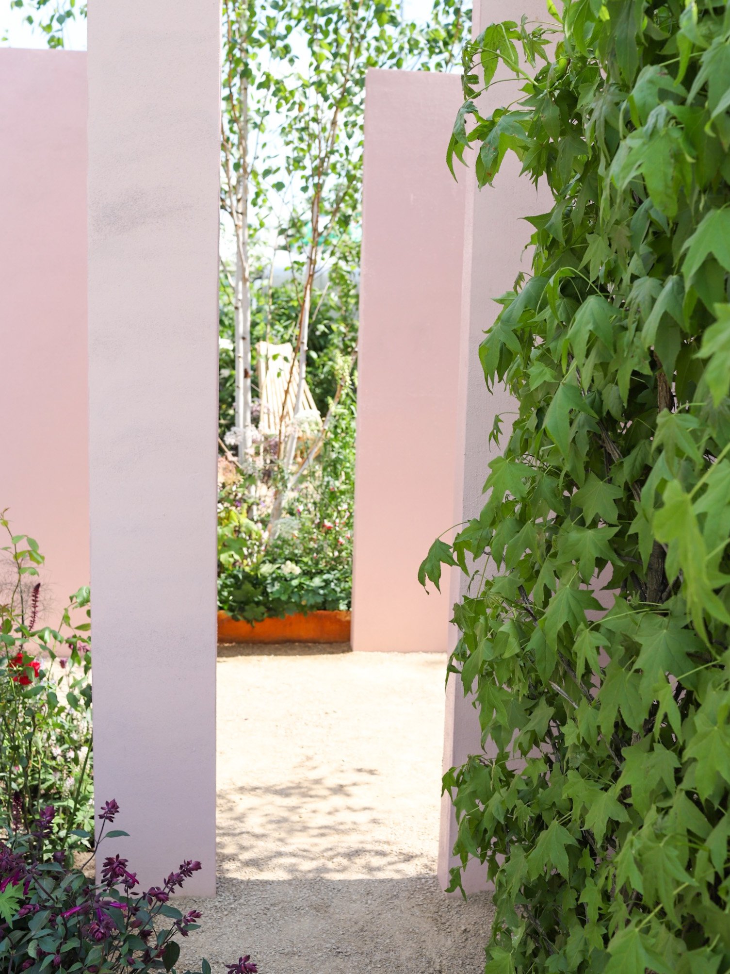
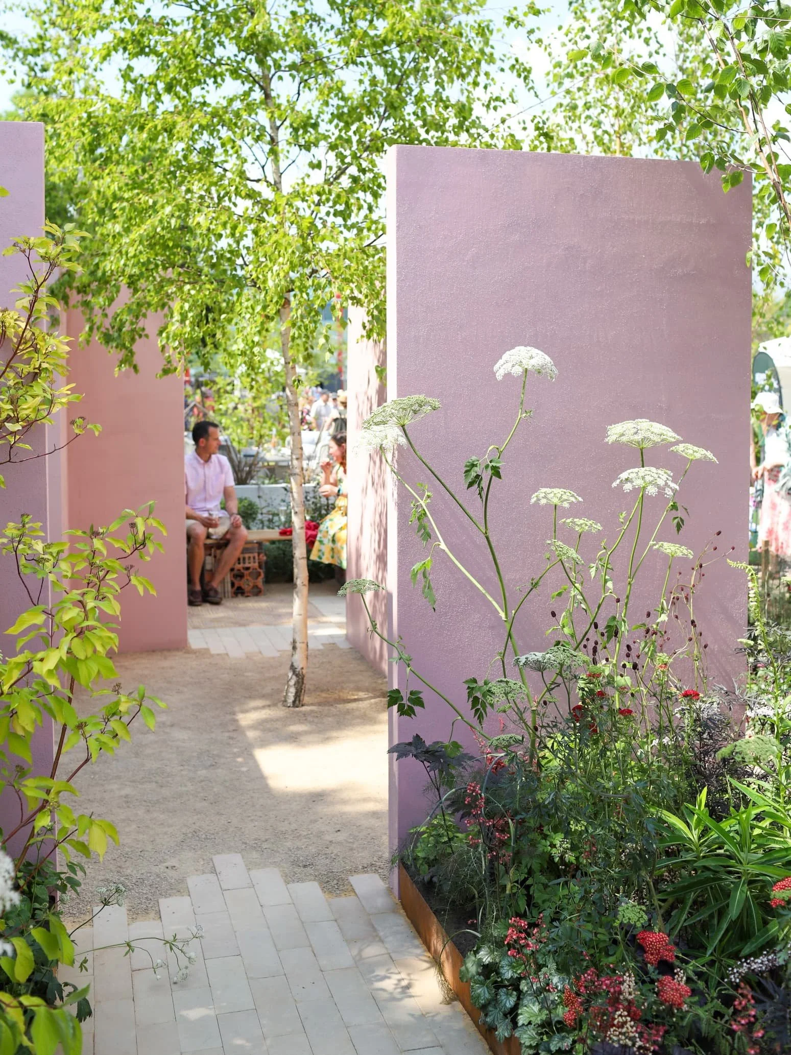
The show garden they designed, called ‘Beauty in Small Spaces’, was split into three distinct zones. Each had a different focus but the same visual language. Moving through the space, the pink colour on the wall deepens subtly from the palest hue at the front to the deepest hue in the back garden. The tonal change in colour was subtle, and I actually thought it was to do with the light until Kerianne set me straight. What I loved was there was so much to be inspired about, no matter the size of your garden, be it large or small, balcony, or courtyard, there was so much to take away. Each of the areas connects together, with clever tricks used to frame views and create snatched moments. There were a few points in each zone where you could hide, and others where you could see straight through the plot.
The three main garden zones are: the front garden, the courtyard and the back garden.
Community space in the front garden
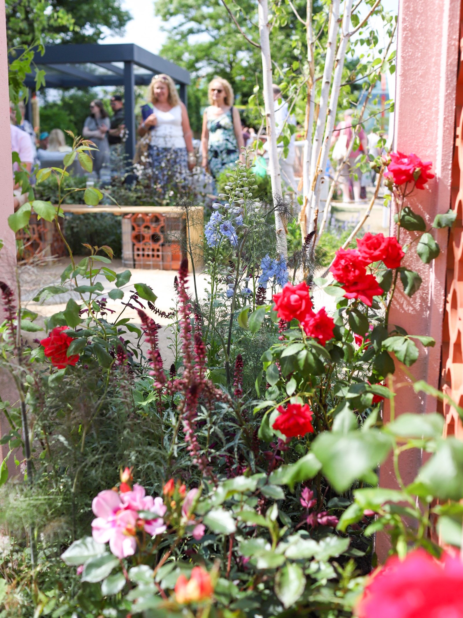
Designed with the community in mind, the space was all about connecting with neighbours and wildlife. The front garden offered a long bench for people to come and linger. Supported by gabions and filled with waste materials, there was even room for little bugs. It felt inviting and the planting that ran alongside the edge acted like a buffer, and despite being surrounded by people it felt private and intimate. Having been clearing rubbish from our garden for the last two years, there were some clever things that I could see to recycle rubbish and make it look beautiful.
There was a potting station to the side; a space to take cuttings or leave them for neighbours and friends. We loved this station and plan to build something similar in our back garden as we are too limited at the front of our house.
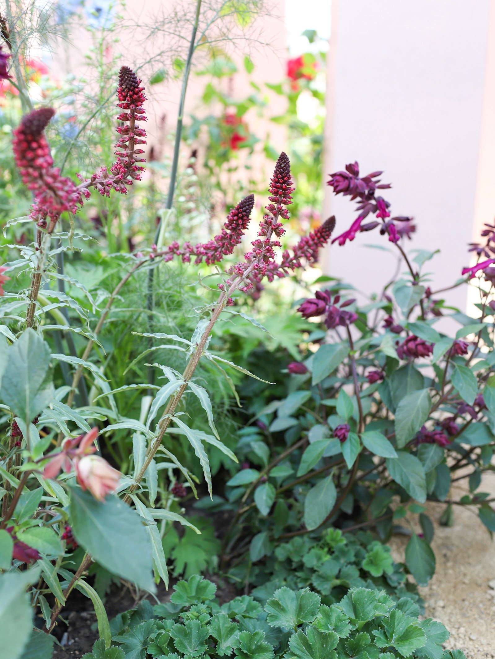
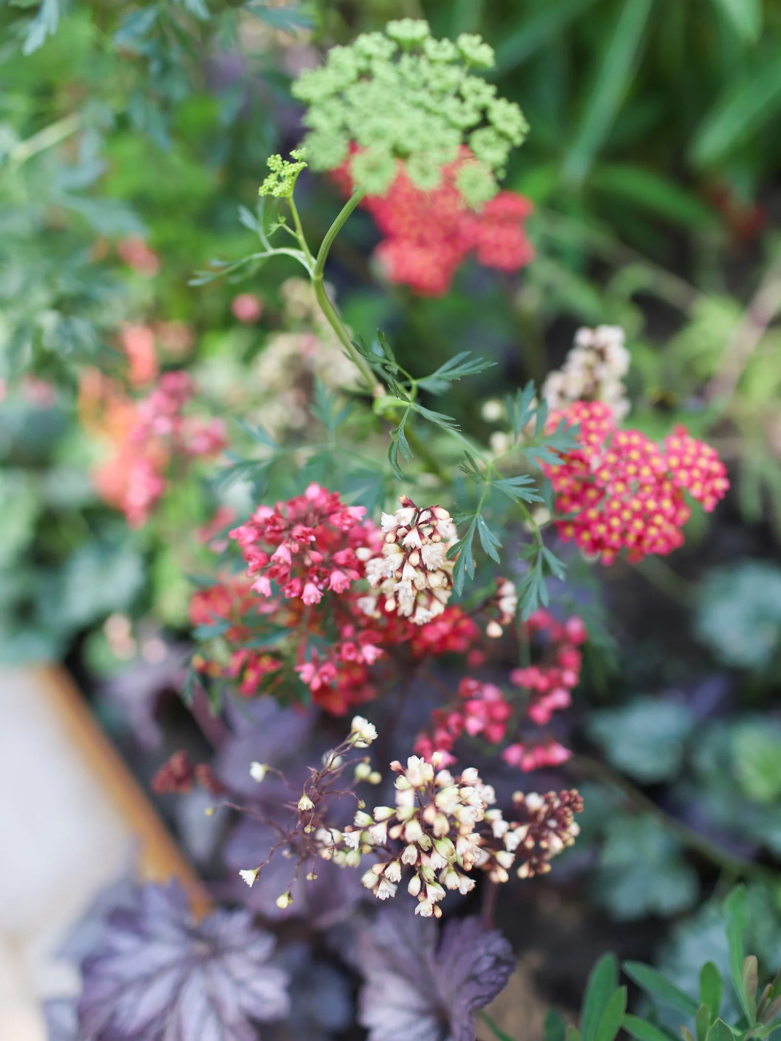
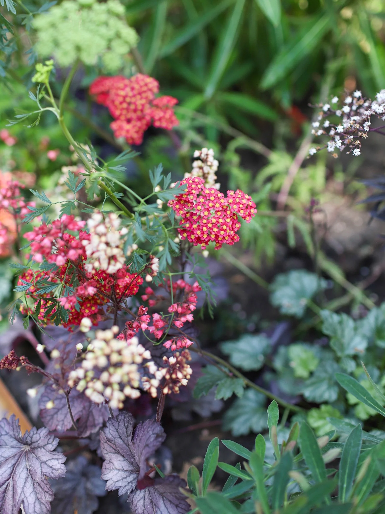
The plants selected were beautiful, and bees were buzzing around us the whole time we sat there. What was great was that they were also chosen as they are easy to take seeds or cuttings from. I really loved this idea. I was also pleased to be able to identify a particular Salvia called ‘Love and Wishes’ which I gave to my sister a couple of years ago. I had actually propagated a plant from cuttings for myself - so it felt serendipitous to see the same plant in the bed, planted with the aim of sharing.
I especially loved a section of terracotta tiles that had been laid on end in a herringbone pattern. It was no more than a metre squared, but it looked beautiful. I also loved the bound gravel that was used throughout the space. In the front garden, which was also the sunniest aspect of the plot, the gravel was used as a mulch and it looked gorgeous.
Quiet space in a courtyard garden
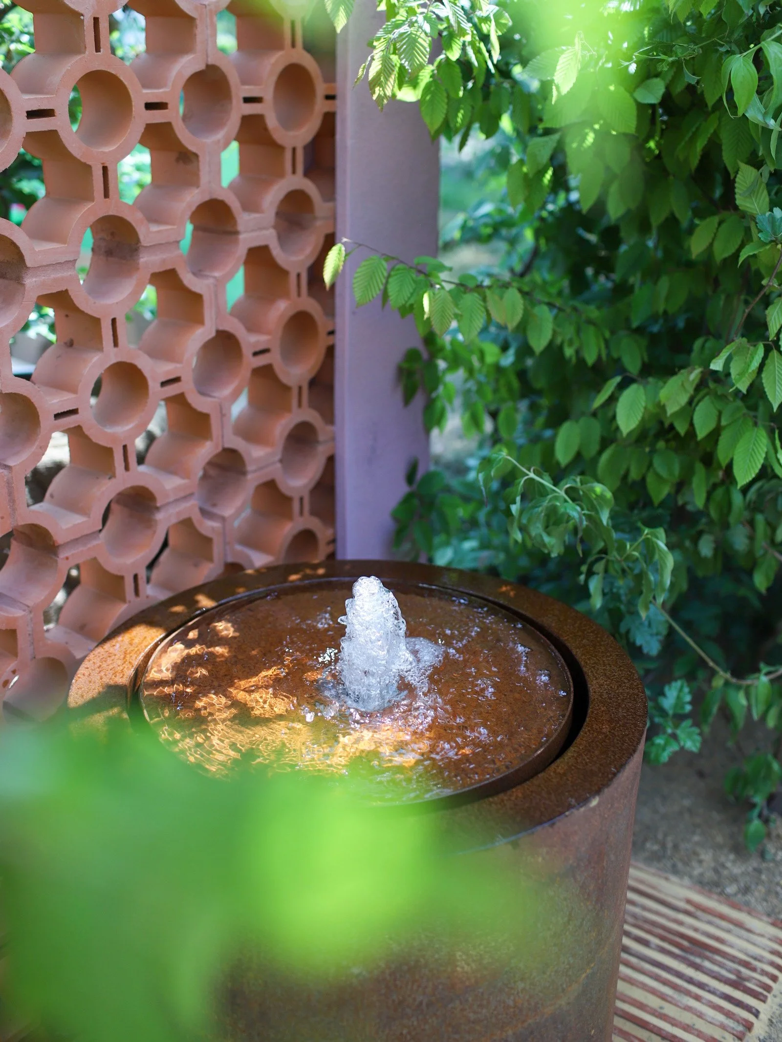
The middle area of the site was paired back and surrounded by walls. One of them was made from terracotta block tiles, reminiscent of the old concrete block work that many of us have in our neighbourhoods. What I loved was the dancing light in the most concealed area of the garden. There were still vistas through it and from the bench within, but it felt like a Moroccan courtyard - and the water feature beyond could be heard bubbling up which was incredibly relaxing.
A relaxing space in the back garden
The back space was the deepest hue of pink and had the airiest plants. Low reclining seats and a water feature meant it was a space to relax in and unwind. On our garden tour, Kerianne told us they had selected plants that wouldn’t necessarily need too much deadheading - “the last thing you want is to feel like you need to get up off your chair and tidy decaying garden plants” she told us. There were echoes in the back garden from the other two spaces like a terracotta detail on the step and the terracotta block tiles behind the water feature. I didn’t manage to snap it, but this garden had a different tree. Where the other spaces had birch trees, either single or multi-stem, the back garden boasted a Cornus Venus which looked sensational.
“A garden must combine the poetic and the mysterious with a feeling of serenity and joy.”
Top takeaways for making your garden beautiful in a small space
We really loved getting to spend a day seeing Kerianne in her element, as she shared her passion for gardens. We learnt more about the complexities of building a show garden, and what she and TJ had learnt through the process as they collaborated with one another.
As a designer in another discipline, I always like to reflect on what I can learn about the design process from others. So here are 5 key things that I took from the Beauty in Small Spaces garden that are speaking to me right now.
Use repetition, even in a small space
Repetition is strangely comforting, be that colours, structure, materials, or plants. In brand design repeating elements rather than having brand new or more elements helps brand recognition. It’s important to repeat key elements to guide people. The trick is to slightly adjust those elements for the right context to give a slightly different twist so things don’t feel flat. Repetition provides hand-holds for people as they move through each brand touchpoint.
Simplicity: avoid over-complicating your garden space
I have a knack for over-complicating things. I know that the best design is usually simple, elegant and uncomplicated. Simple design sometimes gets a bad rep - people may look at things and think “I could have done that”. But the truth is the pros make things look effortless and easy, even when they are complicated to achieve. As I looked at TJ and Kerianne’s garden, I fell into the same trap of thinking “I could do that”. I can probably copy and give things a go, but they came up with something that a novice gardener like me couldn’t even imagine and made it look easy. This was a good reminder for me to not overcomplicate my designs because simplicity prevents overwhelm and distraction and it feels attractive and desirable.
Restraint emphasises beauty in a small garden
Following on from the previous point there were a few things that really shone in the space. I think the trick is deciding what those elements will be and being confident in those choices. I know I can throw the kitchen sink at things - and I’m working on a brand revision at the moment where there were just too many elements as part of the identity. Editing out the fluff and deciding on a few elements can feel like a challenge - especially if you have magpie syndrome like me. But there was such beauty in the simplicity of the materials, the dancing leaves that cast dappled shadows on a wall of comforting pink and the plant colours (all toned to match the Pantone colour of the year 2023). It was a masterclass in restraint and this allowed each of the elements to be able to sing. I need to remember to restrain myself - sometimes less is more!
Overcome inevitable challenges with small spaces
During the build of the show garden, Kerianne and TJ had a number of things happen that didn’t go to plan. Plants and trees that hadn’t coped well in the heat during transport, the weather was endlessly hot, and they had some build challenges. In any project, things won’t always go to plan, but how you adapt in these situations can sometimes make for a better design and force you to consider things you wouldn’t necessarily have chosen.
Don’t be afraid to collaborate on your garden
TJ and Kerianne don’t run a business together, but each bought different skills to this show garden. Listening to them talk about how they had found working together was fascinating. I loved hearing how they had had to justify each of their choices to one another. If it didn’t stand up to scrutiny or they couldn’t find agreement, then they had to compromise or find a different solution. Both shared that the process had sharpened them and taught them things that they will carry going forward and I love that.
I hope you enjoyed hearing more about our visit to GWL last week and about the show garden. We look forward to sharing some of our own garden updates with you over on Instagram.
I snapped the photos in this blog and I hope you enjoy looking through them - but please don’t use them without prior consent


