Branding & website design for Surrey charity, Across Woking
Across Woking charity branding and website design case study
W'e’re a branding and website design agency in Devon, designing standout branding and websites for businesses in the homes, gardens and interiors space across the UK,
It's been a big couple of weeks for Sharing Faith Across Cultures (Across Woking), as it has treated itself to a face-lift recently.
We been working on a branding and website project for Across Woking, giving it a light refresh and putting in place a dynamic, intuitive and user-friendly site (like Derby City Mission and Bright Futures before it).
Across Woking helps ordinary, everyday Christians to love their neighbours and to be more effective in sharing the love of Jesus. It is made up of local churches in Woking working together.
The branding and website design brief
Riz and the committee approached us with the brief:
Revive and refresh the existing website, which had become dormant
Refresh the Across Woking logo and put in place some simple branding to go with it
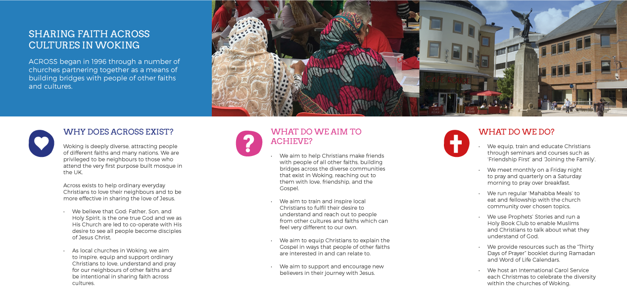
Design and publish supporting literature, including a brochure and roll-up banner
Rachael, who is our graphic designer, put together the initial designs based on conversations with the team.
Former website design for the charity
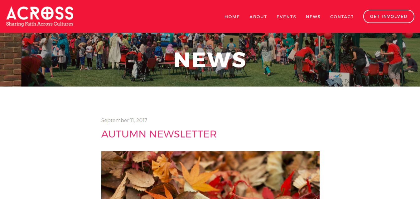
New charity website design
Our thoughts on the charity branding and website design
Here are some of the things we enjoyed about the project:
1. Easy events & news pages
Across runs a lively, well-attended calendar of events, so its events and news pages will be central to the website.
Thanks to the Squarespace platform, it now has a very simple and easy-to-use interface that means that the team can create or edit items quickly and with minimum fuss.
Functionality is high too, so contributors can duplicate posts, add video and much more (see below).
2. The small things: buttons
Sometimes it's the small things that make a difference.
For me, in the case of Across Woking, it is the shape and colour of the buttons.
I love the rounded edges and the stand-out colour, which draw the eye to the call to action, as well as blending in well with the overall branding.
3. Dead. Easy.
Making edits to text, images and layout is straightforward - it's a fact of life with the Squarespace platform!
It means teams and individuals are freed up to focus on core business, rather than wasting time and money on small edits and developers!
Within the website, we have added lots of features that Across Woking can go on to use, duplicate or adapt:
Contact forms
Buttons
Embedded videos
Downloadable files
This is only a selection of what's on offer; other elements can be deployed quickly and easy, depending on what you're after:
Grid Gallery - Add a gallery of images or videos in a symmetrical grid
Slideshow Gallery - Add a gallery of images or videos in a slideshow
Acuity - Display a client scheduler visitors can use to book appointments
Calendar - Display items in your pages, like events, as a calendar sorted by day
Code - Add custom code (like a third-party widget) or display code
Form - Add a form to collect information from visitors. This is useful for creating contact pages, surveys, signup forms, or applications
Map - Add a Google Map with a pin in your location
Menu - Display your restaurant's menu
Newsletter - Add a newsletter subscription form. This block requires a connected MailChimp account
Bar Chart - Add a bar chart
Line Chart - Add a line chart
Pie Chart - Add a pie/doughnut chart
There are many more, which can be used in a variety of ways, and some that play very specific role, which is useful, depending on the type of organisation you are running.
4. It all hangs together
It's great to see the set of branding items together, as you can easily lose perspective of the bigger branding impact when focussed on one particular area.
Here's a little slideshow of the leaflet, and roll-up banner beneath it:
So that’s a little insight into branding and website design for a UK charity. If you’d like to learn more from us on branding, website deisgn or get visual inspiration, follow @wildings.studio on Instagram. Alternatively, read more of our blogs on website design below.


