Brown branding: why it's brilliant for business (2025 guide)
Welcome to the first in our series on colour psychology for businesses’ branding
Brilliant reasons to use the colour brown in your branding
I (Rachael) grew up disliking the colour brown. I especially disliked it in the depths of winter where all I seemed to see were the muddy brown fields of Yorkshire. I also detested my ultra-brown hair - it always seemed too dull, bland and devoid of character. My siblings’ blond locks seemed immensely more appealing than my boring barnet.
Brown was a colour that seemed to follow me as I over-zealously mixed paints in school, desperate to find the perfect shade of purple, only to be disappointed that I was a master of making brown sludge rather than a regal shade of Tyrian.
Somewhere in my thirties, brown seemed to grab me. My neighbour had a wall of crazed Edwardian teapot brown-coloured tiles. I suddenly became very jealous that my house, the mirror image of hers, had no vast brown wall complete with range and beautiful subway tiles as hers did. There was a quality in the lustre that I truly fell in love with. And then, one day, I caught myself looking at the Farrow and Ball paint card contemplating painting a bathroom in London Clay, a sort of silty brown, and the floor of my studio in Tanner’s Brown, a darker almost blackish brown.
Who had I become? I was suddenly hooked on brown!
This series on colour psychology for businesses and their branding is adapted from Kassia St Clair’s excellent book, ‘The Secret Lives of Colour’. (The beautiful, sought-after hardback version is well worth getting hold of!). The best places to buy ‘The Secret Lives of Colour’ are direct from the publisher, from your local independent bookseller, from bookshop.org or – as a last resort – from Amazon. Although Amazon is cheaper and more convenient, it is not a force for good in the world of books. Please support writers, publishers and small businesses directly if you can.
Wildings is a design agency in Devon. Our studio is based in Torquay, South Devon, and we provide branding for small businesses like garden designers & interior designers in the UK. In this series, we’re looking at the power of colour psychology branding for small businesses, and this one is all about the colour brown & brown branding. We want to help you harness the amazing characteristics of colour psychology to maximise your small business brand: find the next article, ‘3 reasons to use the colour green confidently in your branding’ or explore the rest of our series on Colour Psychology for business brands →
Why is the colour brown disliked so much?
My early dislike of brown is not uncommon. In many surveys with Europeans and North Americans brown ranks as the least favoured colour reminding people of poverty, the seventies and also the contents of a nappy. But at the moment brown is making a bit of a comeback. From wallpapers, paints, and panelling to brown furniture and home accessories, brown is having a renaissance moment.
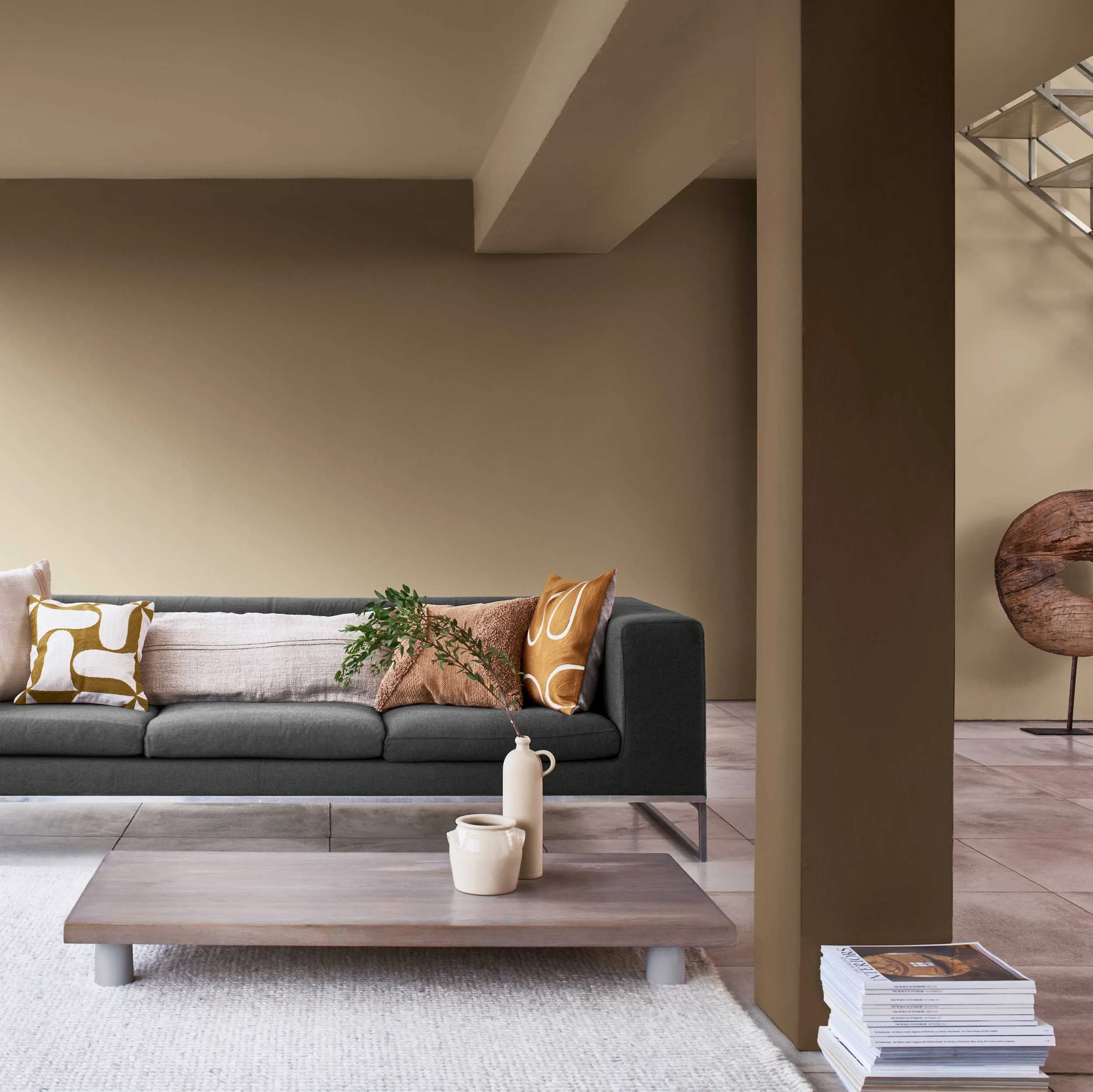
In 2021, the paint brand Dulux announced that ‘Brave Ground’, a taupe-coloured brown, was their colour of the year: Dulux Colour of the Year 2021: Brave Ground™. Critics described it as ‘melancholic’ and there were quite a few open letters of complaint on Instagram to Dulux about Brave Ground as as choice of colour of the year, likening it to the depressing COVID-19 pandemic that dominated the years following 2020.
Reasons to appreciate the colour brown
The reason Dulux, chose a browny shade was that they claimed it connected us back to nature and created a warm feeling of stability, growth and potential, providing a firm foundation for change and creativity in the home. Recently House and Garden magazine polled their followers on the use of brown in interiors and here’s what their readers said:
“The feedback was overwhelmingly enthusiastic, with most responses championing brown in any which way (“It makes everything look cool”, “I adore it – it’s cocooning and grounding” and “It’s so cosy, earthy and inviting” were some of the many comments singing brown’s praises).”
(Read House & Garden’s article on the colour brown in full.)
In colour psychology brown has many good associations, In fact, the warmth of brown is associated with reliability, healing and strength. Many people find comfort in the plainness of brown and its natural connection; its earthiness and simplicity are beautiful.
Understanding the colour brown for all its worth
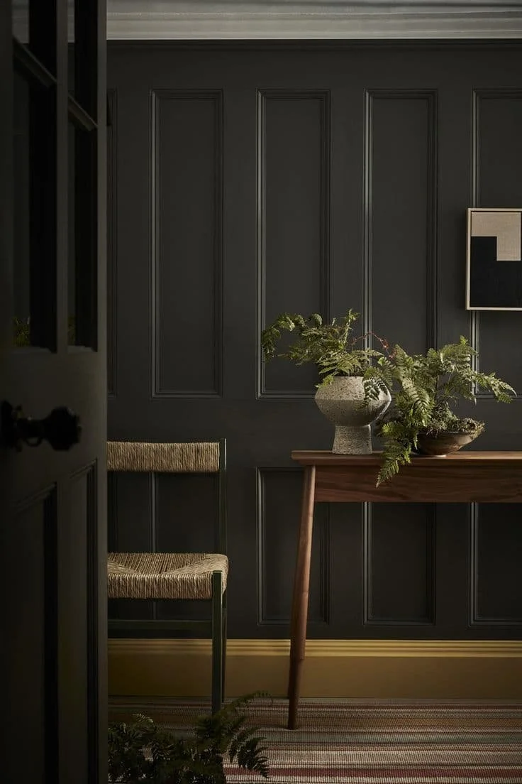
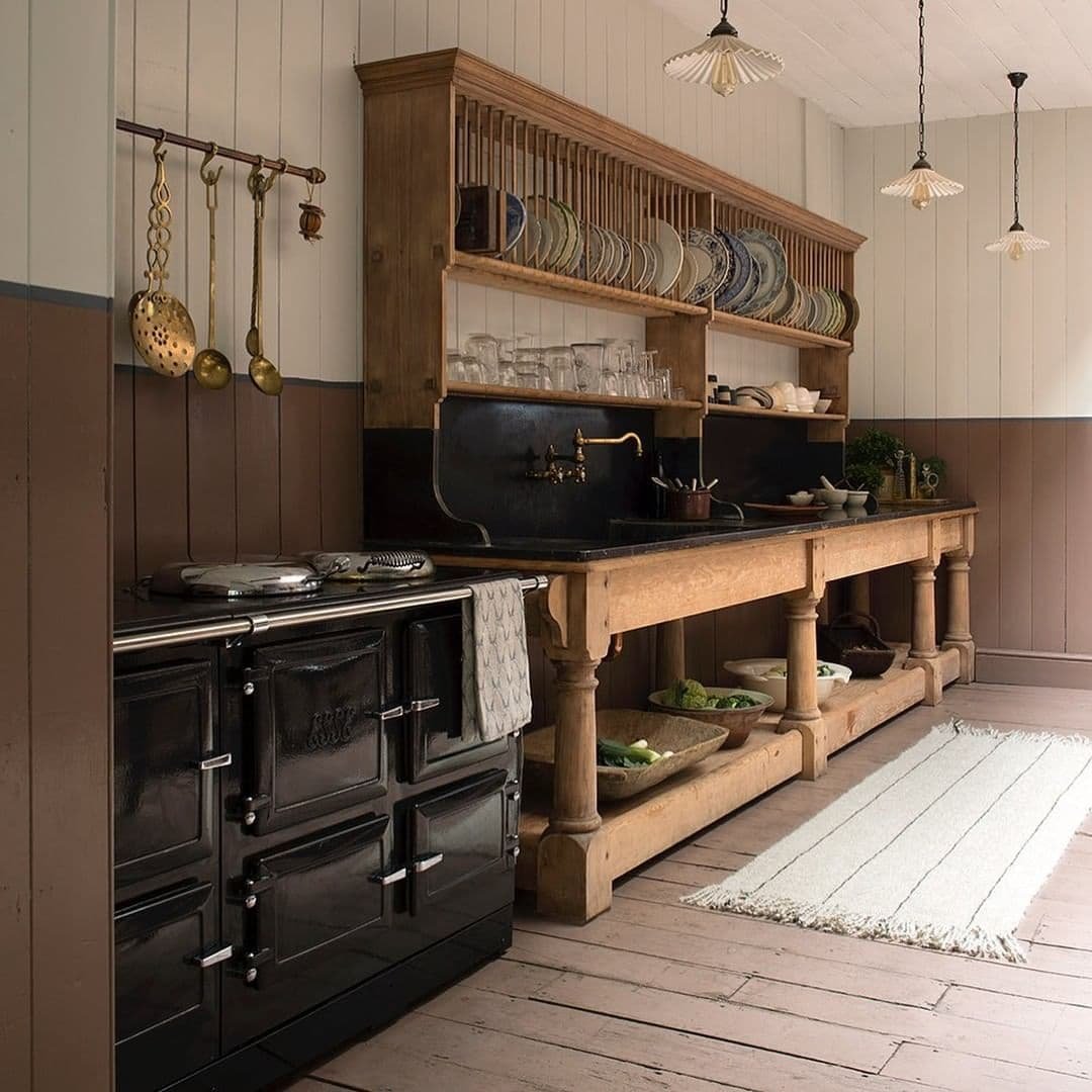
The mood board here is interactive. You can move the images around and regroup them by clicking on them. Why not take a moment to filter the images into different groups and see which ones you resonate with.
The mood board sources and image attribution can be found in our colour brown pinboard on Pinterest.
Why brown has such power in branding
Colour affects how people perceive your business. In fact, almost 90% of snap judgements are made about brands based on colour alone. Colour is a hugely helpful tool to differentiate from competitors and has the ability to affect our mood, emotions and habits. It’s a powerful communication tool that can signal and influence behaviours and how people feel about your brand or business. In fact, colour can impact purchasing habits and build customer loyalty and trust.
The colour brown can invoke deep feelings
Often people choose colours they think will invoke a particular response, you know the clichés, choose red to fire up your tribe, choose yellow to make people feel happy. But here’s the snag, colours don’t invoke a universal response. We don’t all feel the same when we look at colours, because we each bring our own assertions, feelings and worldview when we process the things we see.
“By being able to take into account the influence each tone of colour has in relation to the other colours in the palette and on the human emotion, the human psyche, we will either be having a positive or a negative experience which will be seen in how we feel, our behaviour and response. ”
So if it’s not that simple, how can colour really help?
The best thing to do is to start with how you want your ideal customers to feel when they engage with your brand. If you want to communicate earthiness, safety, solidity, dependability, or a rustic or natural feel then brown, for example, is a great pairing. Other colours just aren’t going to invoke that sense in quite the same way. That’s because we see browns in nature that convey that earthiness and rooted permanence.
When we work on brand design with small businesses in our South Devon design studio we will start with how we want our target customer to feel before we start looking at any visuals or aesthetics. How things feel then informs the visuals; only then do we have something to steer the direction. Feelings are easier to articulate and better aid the process because people buy based on how they feel. If they feel good and drawn to you then they will likely remember you.
2. Brown can express many different characters
Brown has a lot of character and nuance depending on how much yellow, red or black is used.
Brown can be cosy and warm, and convey practicality, order and reliability. But it can also be hugely aspirational and understated. If you look at the mood board above (and do click and regroup those images - it’s lots of fun!), it all feels very relaxed and effortless, there’s a calmness there, and also both a rustic quality and a restrained feel.
Tan, ash, coffee, chocolate, taupe, clay, walnut are just some of the names of brown.
“Brown suffers in part because it is not a hue, but a shade. It’s not found in a rainbow or on a simple colour wheel; making it requires darkening and greying down yellows, oranges and some impure reds, or mixing together the three artist’s primaries - red, yellow and blue. ”
3. Brown can be used powerfully in business
Often overlooked, or seen as a bit of a dull colour, brown can be used to great effect in conveying loyalty, trust, maturity and strength. It’s a confident choice for business owners to use and works especially well for brands that align around earthy, organic and natural values and offerings. If you are a brand that values reliability, responsibility and sincerity brown is a fabulous choice.
Sometimes brown can be perceived as “humourless, too serious and lacking in sophistication” (Karen Haller - The Little Book of Colour”), so it’s important to know how far to go with brown and when to use it. What we don’t want to do is overwhelm people with the wrong feeling! But, we do want to lean into the positive associations and where possible use them powerfully to convey all that is good about our brands and businesses.
What is brown colour psychology in business?
Brown colour psychology is important in business - it’s not a colour to be avoided or left out. The colour brown as it applies to business from a psychology angle is all about the characteristics of stability, reliability and warmth. We can use the colour brown in business to convey things like trustworthiness, tradition and a sense of being down to earth. I think we can all agree that these are good values to get across by using brown!
Businesses can use the colour psychology of brown to help reflect these aspects to customers, giving them a positive impression of the brand. Since brown is often associated with the earth, this makes businesses that use it seem solid and dependable. Customers who like consistency and tradition will favour a business that comes across as reliable and steady by using the colour brown.
The natural earthy tones of brown also evoke feelings like comfort, safety and a sense of home. Again, if your business customers appreciate a brand that is approachable, grounded and unpretentious, brown is an excellent choice for branding. We can use it to signal that our products or services have those qualities, which helps customers to choose your businesses in competitive markets.
A third aspect of brown colour psychology for business to consider is the way it nods to a no-nonsense and honest approach. Again, these humble qualities are increasingly valued in modern times when customers struggle to bring themselves to trust, whether it’s politicians, public figures or what’s said on social media. If your business wants to appear genuine, practical or hardworking, the colour brown is a good choice for its colour psychology.
Examples of brands using the colour brown
Before we jump in with the obvious big-name brands who use brown, I want to take a moment to shout about some independent brands here in the UK who are gaining a reputation for thoughtful objects and homewares. I find these accounts hugely inspiring, and they share stunning aspirational images.
Object Story
Object Story work with artisan makers and creators across the UK and beyond, to showcase everyday objects with a clear sense of beauty and purpose
Sharland England
Founded by Louise Roe, Sharland England is a nostalgic homeware brand specialising in wicker objects, antiques and thoughtfully handmade beautiful items that last.
Straw London
Located on the Columbia Road, fashion stylist, Emily Atrill sells a curated collection of vintage straw bags, charming homewares, tools for the kitchen and garden and gifts.
Other big-name brands using brown in their branding are: UPS, M&Ms, Hershey's, Ben & Jerry’s, Galaxy, Häagen-Dazs, Magnum (and lots of other chocolate and coffee brands), Molton Brown, Louis Vuitton, Gucci and Burberry to name but a few. If you have any further brand suggestions do let us know!
What does brown mean to you?
While there are general principles we can make about colour and what people tend to associate with them, our affinity towards colour has a lot to do with our personalities, upbringing, environment, and experiences. It’s important to remember this when approaching colour, but if you take a step back and consider how you want your customers to feel about your brand there’s a lot to love about the colour brown.
“Brown is a great alternative to black and a natural choice for businesses who want to communicate an organic, earthy vibe.”
In the main when we see brown we feel grounded, supported, wholesome, earthy, reliability and draw a sense of modest confidence sense from brands who use it as a colour. So how about you? Is brown a resounding no, or a colour you deeply resonate with?


