Is red a good colour for my business branding? (2026 guide)
Red is a brilliant choice for branding if you want to project power, prestige or high energy. It’s a high-impact hue that commands attention—but it requires a steady hand to avoid feeling overly aggressive; its deeper tones like burgundy offer a sophisticated richness. Using red effectively is about balancing that raw energy with a clear sense of purpose so you don't overwhelm the very people you're trying to attract.
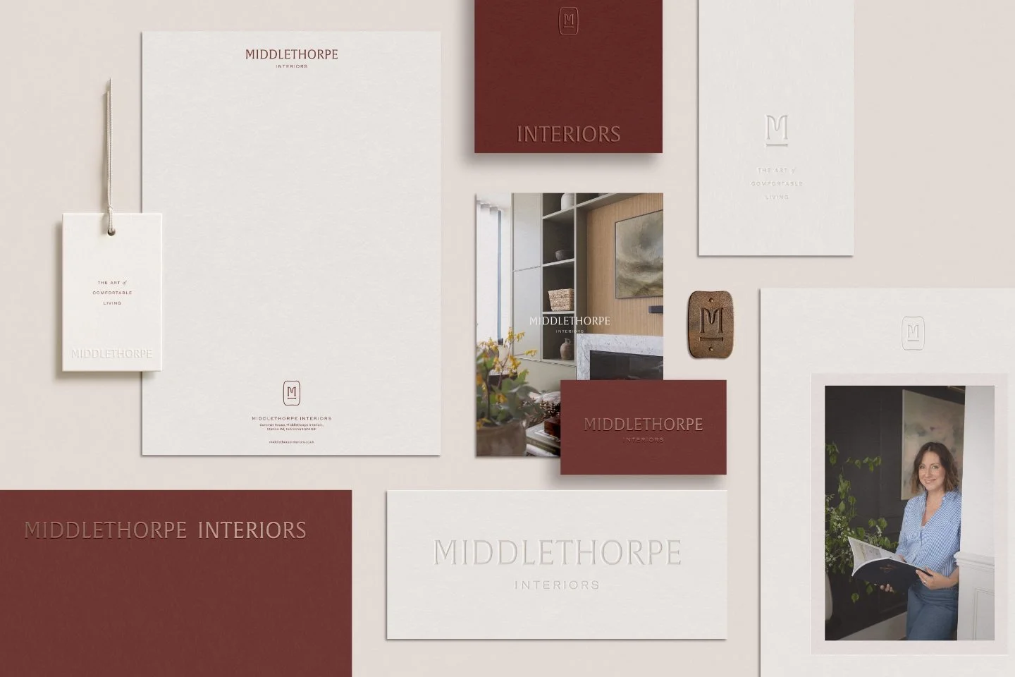
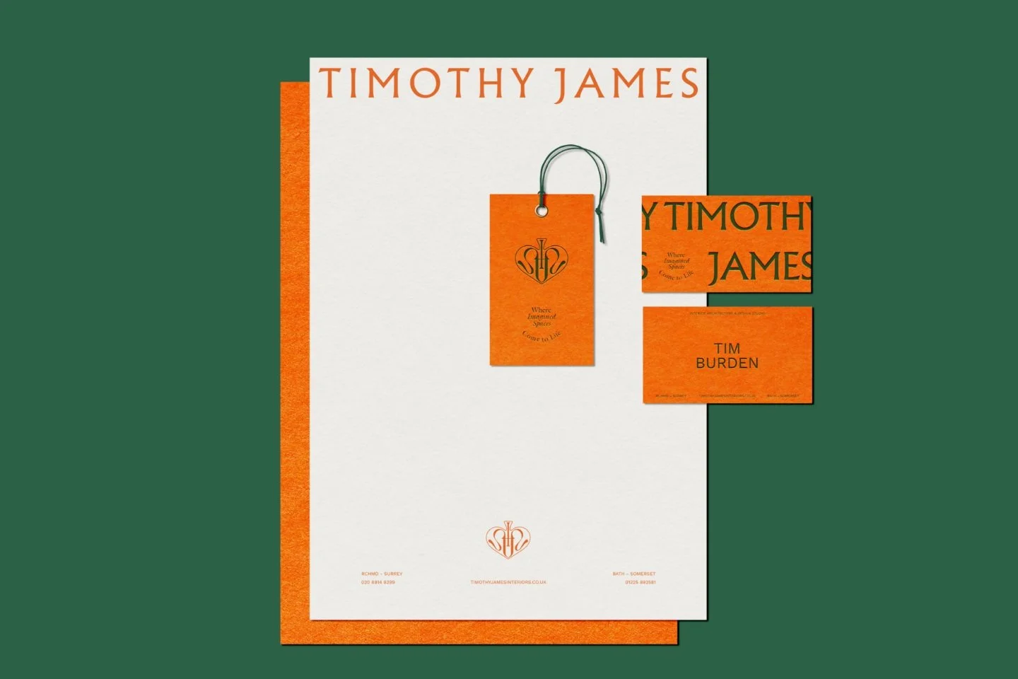
A flatlay of brand stationery for interior designer Ann from Middlethorpe Interior
Why red is a powerful choice for your business brand identity
The colour red is unmistakeable: bright, immediate and eye-catching; it is hard to ignore. For thousands of years it has influenced human society and culture, whether in royal, military or religious contexts. In essence, the colour red signifies power, prestige and dynamism in branding, which is why it is a popular, but bold, choice.
This does not necessarily mean every business brand can pull it off successfully - red has some sharply opposing associations, and some might be put off by its brightness; but we’ll help navigate you through its different facets and what they could mean for your business.
Regardless of whether it is a good choice for your business brand or not, we can learn a lot from the colour red, as many of its insights are transferrable to the other colours in this series or a potential branding project.
Read on as we dig into the colour red and explore how you can use it in the best way for your business brand.
“[Red has] a feeling of sharpness, like glowing steel which can be cooled by water”
Top ten things to remember about the colour red and your business branding
Red is one of the oldest colours in human culture, historically linked to exclusivity, power and influence
Its origins in rare, labour-intensive dyes give red an inherent prestige that still carries weight in branding today
Red symbolises energy, speed and action, making it ideal for brands that want to feel dynamic and driven
The colour also taps into deeper emotions like passion, sensuality and drama, which can help brands convey depth or allure
Red’s associations with aggression and confidence can make it a strong choice for brands wanting to project assertiveness
Brands like Virgin use red to amplify a bold, renegade identity, standing out as outsiders in their market
Coca-Cola’s use of red enhances its global brand prestige while tapping into feelings of joy, excitement and connection
Red can be polarising, with connotations ranging from power and purpose to sex and martyrdom, so it requires thoughtful application
Italy’s racing red heritage, made iconic by Ferrari, shows how red can embody purpose, speed and success in the collective imagination
Before choosing red or any colour, always start with brand strategy to ensure your colour choices align with your values and message
1. Where does the colour red come from?
We first come across the colour red in the dye used to colour clothes which date back to between 4,000 to 6,000BC, so it has been in circulation for a long time!
And, as we’ll see, it has a special place in the collective human consciousness. As with many of the other colours in our Colour Psychology series, red is derived from various sources, whether natural or artificial:
Kermes dye was used to create Scarlet (bright red hue) by crushing the bodies of beetles (similar to the shellfish that produced Tyrian purple)
Similarly, Cochineal (another bright red) came from another insect, the tiny Dactylopius coccus
Vermillion (intense deep red) is mercury sulphide, which can be extracted from the naturally occurring mineral cinnabar
Hematite (spans a variety of shades of red) is iron oxide in mineral form and easily extracted from the ground
Alazarin is a compound from the roots of the Rubia family of flowering plants (more commonly known as madder)
As with other colours in the series, the more difficult, time-consuming or hand-made the manufacture of a dye, the more exclusive and expensive it becomes (compare it with purple, for example).
In the case of the colour red, the involved nature of production led to it becoming the colour of exclusivity and power, which we’ll explore next.
Key points:
Red has deep historical roots, with natural and mineral sources dating back thousands of years
Many red dyes were rare, labour-intensive and costly to produce, giving the colour an early association with exclusivity and power
The origins of red contribute to its enduring status in human culture as a symbol of importance and influence
2. What does red mean in business branding?
In essence, red symbolises power and prestige.
By using it in your business branding you essentially align your business with these qualities it embodies.
“The finest and brightest colour... full of fire, and of a brightness which dazzles the eye.”
Whether you’re a ruler, military general or historical ‘redcoat’ in the British Army, red is strongly associated with power and aggression. It also explains why, as recently as 1999, 74% of the world’s flags are, or contain, red.
The colour red also has strong associations with blood and sex, which is why it has become the signifier of lust (and prostitution on the far edge of the spectrum). As such, in terms of branding, businesses brands that feature red prominently are seeking to capitalise on its positive attributes.
By using red, they seek to project that sense of power, prestige or perhaps aggression (in the sense of ‘get up and go’ or speed): ‘We are a powerful, prestigious brand’. Equally, a business brand might choose the colour red to tap into its carnal side; to convey drama, eroticism or depth.
Key points:
Red in branding symbolises power, prestige and a bold, commanding presence
It can communicate energy, speed and a ‘get up and go’ attitude, making it ideal for brands that want to appear dynamic and assertive
Red also carries associations with passion, drama and sensuality, offering a way to express depth or allure in your brand identity
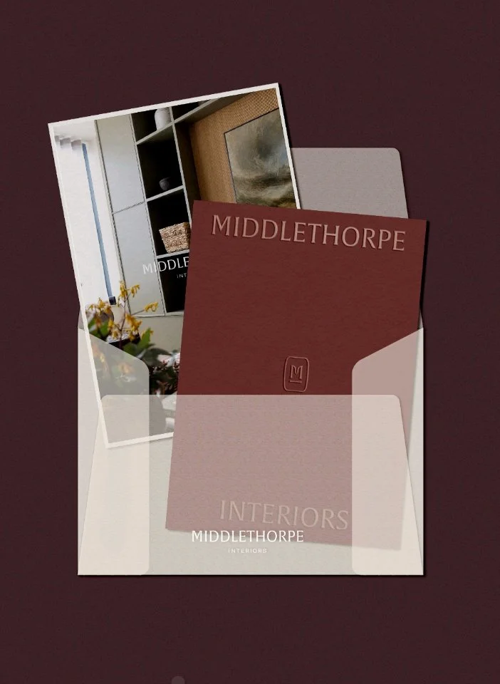
Brand stationery for Middlethorpe Interiors

Social media post mockup for Middlethorpe Interiors
3. What are some good examples of red branding?
Because of the powerful connotations you get with the colour red, there are lots of good examples of red branding to choose from.
Virgin (or Virgin Group), comprising sub-brands like Virgin Media or Virgin Atlantic, is a prime example of a business that has successfully taken hold of red’s power and prestige. In particular, the key to the success of Virgin’s use of red, is how it has used the colour to reinforce its positioning in the market: a bold, outsider, renegade brand, which is interestingly reflected in the personality of owner Richard Branson.
A second example should not come as a surprise: Coca-Cola (The Coca-Cola Company or Coke). Coca-Cola originally sourced its primary ingredients from Peru, which explains why it borrowed red from the Peru flag. Coca-Cola typically emphasises in its marketing how its brand makes people feel (joy, family, good times), but the colour red underlines its goal to be a prestige brand name.
Key points:
Virgin uses red to reinforce its bold, renegade positioning and amplify its outsider brand personality
Coca-Cola’s red is a hint of its Peruvian origins but also solidifies its status as a global, prestige brand
Choosing red can help a brand signal confidence, stand out in the market and evoke powerful emotional responses (red = blood, war & passion)
4. Is red a good colour for small business branding?
There are a lot of good things going for the colour red in branding, as mentioned, but it can be quite polarising colour: one the one hand powerful; and yet on the other hand sexual. Or, depending on how you read it, the colour of martyrdom or prostitution; two quite opposite usages!
“This potent brew of power and sexuality make the colour [red] a bold but tricky choice for brands”
Therefore, red needs careful handling as a brand colour for your business otherwise you can run the risk of conveying unintended meanings. (This is a risk with all colours.)
As a general rule, red is a very bold and eye-catching colour, so a good choice for small business brands. A great example of red in business branding comes from the motorcar racing tradition in Italy.
In 1907, the French newspaper, le Matin, announced a challenge to drive by car from Peking (now Beijing) to Paris. At that time this was unprecedented, as cars were still in their infancy.
The Italian team chose a model from Turin, in northern Italy, which had bright poppy red paintwork. Observers commented on the Italian red:
“It conveyed an immediate impression of purpose and go”
It goes without saying that it triumphed and the car’s red hue subsequently became Italy’s racing colour (compared with British Racing Green).
This set the precedent for a rich heritage of car racing in Italy, perhaps epitomised by Ferrari, which used the hue rosso corsa (racing red) for its models: such as the 1980s icon, the Type F110 ‘Testarossa’ (literally, the red head).
So, is red a good colour for small business branding? Well, the obvious, subconscious response is likely to be, ‘If it’s good enough for Ferrari, it’s good enough for me!’.
This is the power of branding at work for businesses. If your business values align with the values of red (power, prestige, purpose and drive), then it’s hard to see why red wouldn’t be a good choice.
As with any branding approach, a careful consideration of your brand strategy needs to come first before you even consider colour choices, which is the second, Brand Identity, part of the process.
Key points:
Red is bold and eye-catching but needs careful handling to avoid unintended or polarising associations
If your brand values align with power, prestige, purpose and drive, red can be a highly effective choice
Always define your brand strategy first before choosing colours to ensure they align with your brand’s core message
Using colour psychology to grow your brand
If you're curious about how specific hues can shift the way people perceive your business, you might want to read our main guide on how to use colour psychology in business branding. For design-conscious businesses like interior designers, architects and garden designers, getting the palette right isn't just about aesthetics—it's about telling your story without saying a word.
At Wildings Studio, we specialise in branding that helps lifestyle and creative businesses stand out with intention. If you’re ready to define your brand’s look and feel, we’d love to hear from you.
5. Examples of brands using the colour red
There are lots of famous brands using red, but here are some smaller brands that use red in interesting ways to draw out its various qualities! Fermoie is a British home decor brand that creates fine fabrics using sustainable approaches. Abigail Reay is a London interior architecture & interior design studio; founder Abigail loved Farrrow & Ball Preference Red paint colour, so leaned into that as a signature colour in her branding. Cloth is a British based natural dye house, creating naturally plant-dyed sustainable textiles for fashion & interiors. It’s products are free from toxins, plastics and pollutants.
Key points:
Smaller, design-led brands like Abigail Reay use deep reds (like Farrow & Ball’s Preference Red) to create a signature, sophisticated look
Sustainable textile houses use natural red dyes to show that bold colour can still be toxin-free and grounded
Whether it’s for a coffee shop or an architect, the right red can communicate a specific brand personality from the first glance
Anything else I need to know?
You’ve read this far, so is red the right colour for your business branding? That comes down to what you want your brand to project and how bold you're willing to be. Red can speak of energy, confidence and intent, but as with all colours it needs to be handled with care. If it feels like the right fit, ask yourself why. Is it about power, drama or standing out? If so, it might be worth investigating more.
If you're weighing up your options or wondering how colour could work harder for your brand, we’d be happy to help. We work with creative businesses like yours to shape branding that feels intentional, characterful and clear.
Take a look at the rest of our colour psychology for business branding series, or find us on Instagram at Wildings Studio for more ideas and inspiration.
Frequently Asked Questions
-
Red is known to increase heart rates and create a sense of urgency, which is why it’s frequently used for clearance sales or call-to-action buttons. In branding, it demands attention more than any other colour, making consumers perceive the brand as more energetic and physically stimulating. For a garden designer or architect, using red can suggest a brand that is confident and unafraid to make a statement - but only if it is the appropriate tint, tone or shade for the brand.
-
Absolutely. While bright reds can feel a bit loud and brash, deeper hues like burgundy, maroon or oxblood are heavily associated with tradition, wealth and sophistication. By choosing a more muted or darker tone, a luxury brand can tap into the historical prestige of the colour without looking garish. It’s a popular choice for interior designers or boutique hotels looking to create a sense of drama and intimacy.
-
To balance red’s intensity, many brands pair it with neutral tones like charcoal grey or deep navy. For a more organic, grounded feel—perfect for landscape architects or garden brands—pairing red with earthy browns or forest greens can soften its aggressive edge. The key is to ensure the secondary colours don't compete for attention but rather provide a calm backdrop for the red to pop.
More insights on choosing the right colours for your brand:
This series is inspired by Kassia St Clair’s excellent book, ‘The Secret Lives of Colour’. (The beautiful, sought-after hardback version is well worth getting hold of!). The best place to buy ‘The Secret Lives of Colour’ is direct from the publisher. Please support your local independent bookseller and avoid Amazon if possible. Amazon is not a force for good in the world of books and small business: Way past its prime: how did Amazon get so rubbish?
About the author:
Simon Cox is the co-founding director (along with his wife, Rachael Cox) at Wildings Studio, a branding, website design and content marketing studio in Torquay, UK. He’s the writer and editor of the Wildings Studio blog which you’re currently reading. Simon is also responsible for the Wildings Studio content marketing services. Simon blogs regularly on topics to do with the core Wildings Studio services on branding, website design and content marketing (blogging). He’s passionate about helping small business develop great content that answers the questions people type in Google in order to get found online (SEO).

About Wildings Studio
Thoughtful, beautiful branding and websites for design-led businesses
Wildings is a website designer for small business offering website design. Based in South Devon, UK, we deliver small business website design for design-conscious brands like garden designers, interior designers, architects, circular ethos restaurants, speciality coffee shops, organic cafés and boutique hotels.