Yellow branding: sunny & bright or sinful & sensationalist?
Most people associate yellow with a sort of relentless positivity that can feel a bit exhausting. It’s the colour of Post-it notes and smiley faces, after all. However, there’s a darker side to the hue that many designers shy away from discussing. In nature, yellow is a warning. It’s the stripes on a wasp or the belly of a poisonous frog. In the human world, it’s the colour of bile and caution tape. This duality is exactly what makes it so potent for a business. It’s not just "sunny"; it’s a jolt to the system that forces a person to stop and look.
If you’re aiming for a brand that’s quiet and contemplative, yellow is probably going to be a disaster. It’s a loud-hailer of a colour. It works brilliantly for brands like Selfridges, where that iconic yellow bag acts as a walking billboard across London, but it’s a risky move for a luxury spa. You’re playing with fire because yellow is notoriously difficult to pair with other colours without it looking like a hazard sign. It’s about finding that sweet spot where "energetic" doesn't accidentally turn into "annoying".
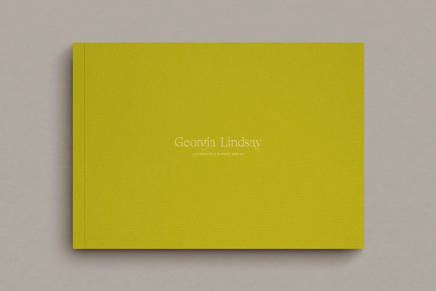
A mockup of a presentation book for Georgia Lindsay garden designer
Why yellow branding is more than just a sunny disposition for your business
Many people associate yellow with relentless positivity that can feel a bit exhausting: it’s the colour of Post-it notes and smiley faces. However, there’s a darker side to the hue that you should be aware of. In nature, yellow is a warning; it’s the stripes on a wasp or the belly of a poisonous frog. In the human world, it’s the colour of bile and hazard markings. This duality is exactly what makes it so potent for a business. Yellow isn’t just sunny; it’s a jolt to the system that forces you to stop and look.
If you’re aiming for a brand that’s quiet and contemplative, be careful with yellow. In it’s brightest form it’s like a loudspeaker; it works brilliantly for brands like Selfridges, where that iconic yellow bag acts as a walking advert across London, but it’s a risky move for a luxury spa. Yellow can be tricky to pair with other colours, which is often why you’ll see it used as a supporting accent colour. It’s about finding that sweet spot where energetic doesn't accidentally turn into annoying.
Top ten takeaway ideas on yellow in branding
Yellow is the colour of raw emotion and feelings, acting as a direct line to the viewer’s ego and self-esteem
Because it has a long wavelength, the human eye has to physically adjust to absorb yellow, creating an immediate psychological reaction
Visibility is its superpower; it’s why the construction industry and health and safety sectors claim it for ruggedness and warning
It’s best used as an accent colour for lifestyle brands to avoid overwhelming the audience with too much "noise"
High contrast is key—pairing yellow with black is the ultimate way to ensure wayfinding or messaging is impossible to miss
Yellow has a shadow side that signals illness, greed or cheapness if the wrong hue is selected
Historical pigments like Indian Yellow or Gambage carry weights of tradition and colonial history that can add depth to a brand story
In the food and hospitality sector, yellow triggers a sense of speed and youthful "live for the moment" energy
Rebellion is a valid brand strategy—yellow was co-opted by the rave culture of the 90s to subvert its innocent "smiley face" origins
Successful branding depends on strategy first; choosing a colour like yellow without knowing your market position is just guesswork
1. Where does the colour yellow come from?
As with many of the colours in this series, yellow can be found in the natural world, but humans have also sought to recreate it where deemed valuable or its extraction laborious. Either of these tended to increase its sense of exclusivity and so greatly drive up its value.
Various hues of yellow have been extracted from the earth or nature since ancient times. The colour yellow can be found variously in the world around us whether from minerals, trees and elements:
Tin lead yellow was produced by mixing lead and tin oxides
Chrome yellow came from the mineral crocoite (for more on crocus and the colour orange, see ‘How to get the best from orange for your branding: bright, vivid & urgent’)
Gambage (a bright hue) was extracted from the Garcinia tree in South East Asia
Orpiment (a canary yellow) derived from natural arsenic sulphides
It would be hard to ignore gold (not to mention rude!), which has been coveted for thousands of year and alchemists have attempted to synthesise it by artificial means since time immemorial.
Yellow has a long and rich history, when plenty of ups and downs, as you can imagine: the orpiment pigment was used in the age of the Ancient Egyptians in their wall art, whereas Imperial yellow was reserved solely for the ruling class in Imperial China for a thousand years.
The discovery of yellow as a colour in itself is similar to many other colours in this series: humans beings observed it - became notable (often highly desired) for a particular quality - then extracted and later manufactured. Moreover, in modern times you’ll often see it reinvented or perhaps twisted far beyond its initial incarnation!
“Yellow leads a roving , versatile life”
Key points:
Yellow has always bridged a gap between the natural world and human chemistry: earth minerals vs. synthetic lead-tin oxides
Historically, certain yellows, such as gold, captured something inexplicably compelling that they became symbols of exclusive imperial power or divinity
The evolution of the colour shows a shift from rare, coveted natural pigments to the versatile, sometimes loud synthetic versions we see today
2. What does the colour yellow symbolise?
The colour yellow is firmly rooted in science and psychology as a primary colour. Yellow is light and highly visible by its very nature, so is naturally the colour of the emotions, expressing the ego and creativity as well as self-esteem and optimism. In essence it is an undiluted expression of light and extroversion: think sunshine!
In practical usage, it should come as no surprise that yellow bestows these characteristics on the user or wearer, plus it has the power to evoke these emotions in the viewer, typically lifting the emotions and gaze outwards and forwards. This quality of yellow is why it’s highly prized in the right context.
As yellow was employed practically, it took on particular symbolism. The yellow of gold was seized upon as a symbol of power by kings, but also by religious institutions, such as the church to inspire divine awe and reverence.
Bear in mind that a colour’s meaning is often a product of its environment, such as Indian yellow and Gambage, both products of the British Empire and colonial rule. The importance here is not so much the hue or the method of manufacture, but the emotions and associations they convey.
Tonic water (a concoction of quinine, soda and sugar) was used medicinally in colonial India to prevent malaria. It has a long and strong association with the colour yellow, perhaps because of the connection of yellow with illness, and it’s hard to imagine tonic water now without the characteristic yellow label.
Nowadays, Indian yellow and Gambage evoke feelings of tradition, old-fashioned colonial touches and exotic subcontinent because of their history, which is still available to modern brands. We’ll explore the meaning of yellow for brands further below and how they tap into these powerful feelings.
Key points:
At its core, yellow represents extroversion, optimism and the literal lift of the spirit associated with bright sunlight
Context is everything; it can mean the divine awe of a church’s gold or the medicinal history of a tonic water label
Modern symbolism often taps into tradition or exoticism based on how the pigments were originally sourced or traded across the globe
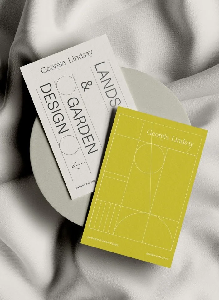
A mockup of a business card for Georgia Lindsay garden designer

A mockup of a social media post for Georgia Lindsay garden designer
3. How do businesses use the colour yellow in branding?
Because of the way the human eye absorbs light, each colour will have a different affect on the body. The longer the wavelength of the particular colour, the greater the adjustment eye makes, which in turn causes a psychological reaction. It is because colour affects our bodies and minds that businesses make use of colour psychology in their branding; and the colour yellow does this in terms of our emotions. (Whereas other colours might cause a reaction physically, in the intellect or, in the case of green, a sense of balance.)
When it comes to yellow and our emotions, we understand that it is light, bright and positive, so catches the attention and evokes a response. We can use this to understand why business brands in the following sectors lean heavily on yellow:
1. Yellow brands in the construction industry
The colour yellow is used prominently by construction brands JCB, Caterpillar and Stanley, which between them cover heavy plant machinery, construction tools and clothing and workwear.
In this context, visibility is important, so the colour yellow is used to ensure products stand out from a safety point of view. As such the brands themselves then derive a sense of safety, strength and rugged dependability from the association with yellow.
2. The use of yellow in health & safety
The colour yellow has long been associated with important information, warnings and safety. Under UK regulation, warning safety signs are required to be yellow, indicating a specific danger that may be present within a workplace.
Another reason for choosing yellow is because it is an inherently bright colour, and so when paired with black, creates a high-contrast colour combination. This is ideal when it is important to convey an important message or draw people’s attention to information they need to know or adhere to.
As such, yellow and black is the archetypal combination found in airports where safety is key, but also providing highly visible guidance (called wayfinding: the user experience of orientation and navigation in the man-man environment) for people who need to get to particular areas within a busy, sprawling complex.
3. The reality of yellow in branding
The reality of the colour yellow is that it is very bright and so can overwhelm business branding when it is the main element. This is why exclusively yellow brands tend to be relatively few, although the ones that are, tend to stand out in the mind (such as McDonalds, SnapChat, Post-It, Tour de France).
This is why yellow tends to be used as an accent colour within a wider brand palette. It doesn’t dominate or overwhelm, but brings eye-catching flashes and a sense of joy and brightness that can sit more happily alongside other values that are being communicated.
Key points:
Industries like construction lean on yellow for safety and a sense of rugged, heavy-duty dependability
Yellow functions as a psychological tool for wayfinding, helping people navigate complex environments like airports through high-contrast visibility
Most brands use yellow sparingly as an accent to inject joy and brightness without the visual fatigue of a fully yellow identity
4. What does yellow mean in a company’s branding or advertising?
When you see yellow in a company’s branding or advertising its likely there for a reason and well worth pausing to ask yourself why that might be.
We’ve pulled together a couple of categories below of businesses with yellow brands or branding to help illustrate what yellow means when companies or businesses use in their branding or advertising. These comprise of snack food, fast food, travel and delivery brands.
1. Yellow in snack food and fast food branding
Fast Moving Consumer Goods (FMCG) is the euphemistic label the industry gives to snack or junk food, and the colour yellow often features in their branding. In the food context yellow is a good choice in branding as it hints at a joyful, pleasant but speedy experience. The youthful feel of yellow is also suitable in this category, as snack food brands want to attract and appeal to a younger audience.
A few well known brands that use yellow are:
Pringles (crisps (UK), potato chips (US))
Chupa Chups (sweets (UK), candy (US))
Maggi (packeted instant noodles)
Related to the snack brands are fast food restaurants, and yellow is again used to mean similar things in their branding and advertising. In short, yellow is fast food brands’ way of saying, ‘we want you to experience a fun, uplifting and happy time with us’. Live for the moment and enjoy the experience! Yellow is not only eye-catching but also indicates the exciting and rejuvenating experience that lies within: not just through the food, but the wider journey of visiting and being in the surroundings of the brand itself.
Well-known fast food brands using yellow include:
McDonalds
Subway (note how it has introduced green to emphasis its more healthy attributes)
2. Yellow in travel and delivery branding
Travel and delivery brands use yellow in their branding and advertising in a fairly obvious and straight-forward way. Consumers desire a quick and painless experience, so the yellow in branding brands have employed the colour yellow to underline what kind of experience customers will get with them: pizzazz, lots of energy and, of course, speed.
Travel and delivery brands are among a small pool of companies other snack and fast foods to use yellow. Interestingly they often temper the brightness of yellow or use it as a complementary accent colour. This approach brings more depth and sophistication to the overall impact or is a way to add chutzpah to perhaps a more conservative palette.
Well-known travel and delivery brands using yellow include:
DHL & UPS (delivery and courier services)
Hertz (vehicle hire)
Goodyear & Pirelli (tyre manufacturers)
Key points:
For fast food and snack brands, yellow is a shorthand for speed, fun and a rejuvenating, quick-fix experience
Travel and delivery companies use yellow to promise pizzazz and high energy, ensuring they stand out in a crowded marketplace
Yellow is often tempered with darker tones or used as a complementary flash of character against more conservative brand palettes
Master colour in your branding
If you are a design-conscious brand—perhaps a garden designer, architect or interior stylist—understanding how colour impacts your reputation is vital. You can explore our deep dive into how to use colour psychology in business branding to see how these principles apply across the board.
If you’re ready to define a visual identity that truly resonates with your ideal clients, our branding service is designed to help you build a brand with both soul and strategy.
Want to discuss your brand’s choice of colour? Get in touch to start a conversation
5. How have businesses used yellow creatively in their branding?
A fascinating part of colour and brand theory is the ability to subvert it or tap into an opposing area. Opposite ends of a colour’s spectrum can have wildly opposing meanings, which can be useful in business branding.
Yellow has an obvious and superficial sunny disposition. This positive side denotes joy, radiance and beauty (or desire and divinity in the case of gold). However, every colour has its shadow side, so if we flip yellow it can signify greed, illness or sinfulness. Gold illustrates this well again: it commands attention and reverence, but coveting gold is a sign of greediness and even an affliction (think of King Midas or mythical dragons hording gold). As for humans, yellow skin is a sign of illness (think jaundice or Yellow Fever) and it’s been used culturally to marginalise groups (think the Yellow Peril).
Obviously no business brand will want to tap into the negative connotations of yellow, but it is possible to subvert yellow by taking it beyond sinfulness and illness into the realms of rebellion, which we’ll look at here.
In popular culture yellow came to prominence through smileys and emojis which users typically used to convey innocent happy emotions when writing text. Nowadays we can choose our skin colour of choice, but originally yellow simply indicated the joy and fun of being in the moment.
This sense of innocence and pure joy lent itself to the dance music revolution of the ‘80s and ‘90s: a happy culture in which the youth of the time could indulge in escapism and the euphoria of being caught up in an ecstatic moment. Inevitably, yellow was co-opted by rave culture, which turned the original innocence of the smiley into a darker, chemical-fulled symbol of rebellion. Fluorescent, saturated yellow literally embodied the chemical driving force of the movement as well as became its emblem.
This is a similar story to that found in the stories of other colours and useful for brands to know about when approaching the branding process:
Purple’s association with immorality, the anti-hero and the unusual but antiquated (including a Harry Potter reference!)
Key points:
Savvy brands can subvert yellow’s sunny reputation by leaning into its ‘shadow’ side of rebellion or chemical intensity
The 90s dance culture transformed the innocent yellow smiley into a symbol of defiant; literally ecstatic escapism
Applying yellow creatively involves understanding that yellow can represent two sides of a spectrum: for example, purity or grittiness, depending on how you use it
6. Is yellow a good colour for small business branding?
If you’re a business and wondering whether yellow is a good colour to use in your branding, the answer is highly dependent on several key factors.
As we’ve seen, when you lean too much into a colour, you can veer into its ‘shadow’ side: for yellow this could be connotations of sickness, illness or contamination. Equally, you might evoke negative historical or cultural associations that could backfire for your brand.
Despite this, a business brand might want to use the subverted side of yellow in a conscious and intentional way, which works well for outlaw brands, ones bucking prevailing trends or that want to emphasise their rebellious side.
Using gold within your branding, which is a shade of yellow, can allow your brand to choose whether to draw on the positive or negative sides of the colour. On the positive side, it can signal wealth, prosperity, desire or divinity. However, your brand might want to amplify these qualities in a more carnal way to provoke greed, envy and avarice (in the produce, of course).
As you can see, there is a fine line to walk not only when choosing a colour, but also the particular hue, tone or shade within it. Modern marketing is littered with brands that have tried to employ yellow, but failed and reverted to their old branding or undergone costly revisions.
Our advice when it comes to colour choice, including yellow, in your branding is to ensure you have undertaken a rigorous and comprehensive brand strategy process first. The insights into your ideal customers, market position and near competitors will put you in a better position to choose a colour palette that works hard and effectively for you.
Independent brands using yellow
Yellow is an emotive colour and plenty of independent brands have used yellow in their branding. Here’s three of our favourite independent brands who use yellow really well:
Glebe House Devon is a guest house in Devon, cherishing local produce, craftsmanship and seasonal rhytms
Glass Shed Studio is a Devon maker, repurposing textiles and fabrics - we love the yellow detailing in its branding and how it’s local to us in the wonderful market town of Totnes
Bloom & Wild is the original letterbox flower delivery company, delivering beautiful flowers by post
Key points:
The success of yellow depends on walking the fine line between its various associations: prosperity/greed vs. medicinal/sickness
Gold offers a more sophisticated way to use yellow’s spectrum, signalling wealth and desire for high-end lifestyle brands
A rigorous brand strategy is the only way to ensure a yellow palette works for your specific audience rather than being off-putting
Final thoughts on yellow for businesses and in branding
If you got this far, what is yellow for you: sunny and bright or sinful and sensationalist? Is it in the running as a colour for your brand? It really depends on how you want to connect with your audience. If you want to evoke positivity, creativity or energy, yellow has the power to do all that. As we’ve said time and again, like any colour, it’s important to consider how it fits with your brand’s message and values.
If you're unsure how to incorporate yellow - or any colour - into your branding, we’re here to help. From start-up businesses to established brands, we work with design-conscious businesses to create identities that stand out and resonate with your audience.
Explore the rest of our colour in branding & colour psychology series, or follow us on Instagram for more tips and inspiration.
Frequently Asked Questions
-
Yellow can be an excellent choice for design-led brands, but it requires a sophisticated touch. Instead of primary, fast-food yellows, architects and interior designers often opt for muted ochres, deep gold or Indian yellow hues. These shades convey warmth, creativity and a sense of established history without the aggressive urgency of brighter tones.
-
In hospitality, colour is a sensory cue. Yellow is known to stimulate the appetite and create a sense of movement and cheerfulness. For a circular-ethos restaurant or a speciality coffee shop, using yellow accents can make a space feel more social and energetic, encouraging a positive, in-the-moment customer experience.
-
The main risk is visual fatigue; yellow is the most fatiguing colour for the eye to process due to the high amount of light it reflects. Overuse can lead to feelings of anxiety or frustration in your audience. It’s often safer and more effective to use yellow as a secondary or accent colour to highlight key call-to-actions or brand elements.
More insights on colour psychology and branding for creative businesses:
Article name as bullets linked to post
This series is inspired by Kassia St Clair’s excellent book, ‘The Secret Lives of Colour’. (The beautiful, sought-after hardback version is well worth getting hold of!). The best place to buy ‘The Secret Lives of Colour’ is direct from the publisher. Please support your local independent bookseller and avoid Amazon if possible. Amazon is not a force for good in the world of books and small business: Way past its prime: how did Amazon get so rubbish?
About the author:
Simon Cox is the co-founding director (along with his wife, Rachael Cox) at Wildings Studio, a branding, website design and content marketing studio in Torquay, UK. He’s the writer and editor of the Wildings Studio blog which you’re currently reading. Simon is also responsible for the Wildings Studio content marketing services. Simon blogs regularly on topics to do with the core Wildings Studio services on branding, website design and content marketing (blogging). He’s passionate about helping small business develop great content that answers the questions people type in Google in order to get found online (SEO).

In this article:
Why yellow branding is more than just a sunny disposition for your business
Top ten takeaway ideas on yellow in branding
Free brand colour strategy guide
What does yellow mean in a company’s branding or advertising?
How have businesses used yellow creatively in their branding?
About Wildings Studio
Thoughtful, beautiful branding and websites for design-led businesses
Wildings is a website designer for small business offering website design. Based in South Devon, UK, we deliver small business website design for design-conscious brands like garden designers, interior designers, architects, circular ethos restaurants, speciality coffee shops, organic cafés and boutique hotels.