3 reasons to use the colour green confidently in branding
Green is the most versatile colour in branding because the human eye processes its varied hues with minimal effort, allowing it to signal balance, growth and security. By understanding the psychology of green, design-conscious businesses can move beyond aesthetics to evoke specific emotional responses: for example, the zesty optimism of spring or the grounded reliability of deep forest tones. This guide explores how to apply green strategically in your branding to align with your business’ core values and attract your ideal clients.
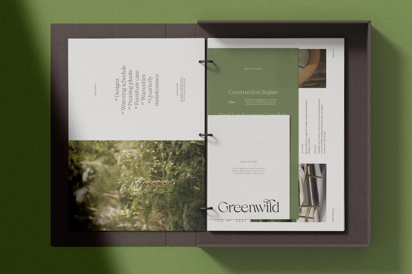
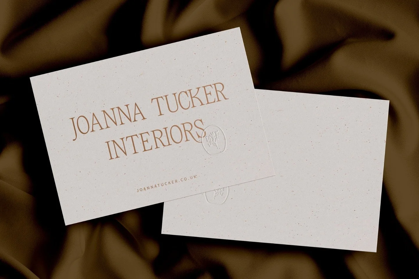
Garden design plans for Greenwild
Why the psychology of green matters for your creative business branding
There’s something rather special about the colour green in the natural world. The first flush of zingy growth in the spring as leaves unfurl and bulbs force their stems above the bare earth. As spring leans into summer those verdant hues begin to soften and bleach under the intense summer sun.
Come September those green colours take on a different hue as they begin to yellow into the olive and yellowy palettes, seeming to intensify as the autumn weather turns; and the gentle decay of the garden begins its lament into winter. As the days shorten and the flowers die back, shrubs and hedges come into their own, whether it’s the dark shade of Yew or the emerald hues of oleaster.
A few years ago we spent a bit of time in the desert of Morocco and I began to feel very low and flat. Creativity seemed to be slipping away and it wasn’t until I travelled out of the desert and started to see green and growth that I realised just how important the colour green is for me to feel passionate, creative and alive.
Ten essential takeaways for using green in your brand strategy
Visual restfulness: Green sits at the centre of the colour spectrum and requires no eye adjustment, making it the most restful colour for human vision
Evolutionary connection: Our ability to see many shades of green evolved to help us identify food sources and ripeness in the wild
Versatility of hues: Green contains more distinguishable shades than any other colour, offering brands immense variety from zesty limes to deep yews
Balance and harmony: Use green to communicate equilibrium between the mind, body and emotions
Accessibility matters: Red-green colour blindness (deuteranopia) affects 1 in 12 men, so ensure your brand remains accessible by not relying on colour alone for meaning
Cultural complexity: Green carries mixed historical associations representing luck and faith in some cultures while signifying infidelity or poison in others
Avoiding greenwashing: Be authentic when using green to signal environmental values to avoid misleading your audience
Strategic pairing: Green acts as a brilliant neutral foil that enhances the impact of other colours in your palette
Industry-specific application: For luxury brands, deep greens like emerald signify opulence while muted tones suggest sustainability and modern architecture
Consistency is key: Ensure your chosen green hue is applied cohesively across all touchpoints whether your websites or physical studio props in a photo shoot
1. How we’ve evolved to see the colour green
In some people groups and tribes around the world, green is a colour that cannot be distinguished from blue. When they see grass, trees, sky and sea, they are all green. This is especially true where there is no word to describe blue with words.
Conversely, there are others who have the ability to see hues that, to others, look exactly the same. Interestingly, they also have a lot more words in their languages to differentiate between nuanced hues on the boundaries of colours.
Green is a colour that contains more hues than any other colour. Green sits in the centre of the colour spectrum and, as such, we can process more green than any other colour. Studies show that our eyes have evolved over time in order that we can more readily identify food sources and their suitability and ripeness.
Key points:
Human vision is uniquely tuned to green because it sits in the middle of the colour spectrum
Our ancestors developed the ability to distinguish subtle green hues to identify life-sustaining food sources
The eye processes green with minimal effort which creates an inherent feeling of balance and harmony
“Green falls in the middle of the colour spectrum, and the eye requires very little to no adjustment to be able to see it. it is, therefore, a very restful colour for us, and indicative of balance and harmony.”
2. Colour blindness: the dark side of green
When I started to research colour, I knew I wanted to also discuss colour vision deficiency and colour blindness. I will do a separate blog post about that because it is important to consider how colour blindness affects design.
One in 12 men have some form of colour blindness and one in 200 women, so colour blindness is huge thing to consider when we think just how we communicate with colour!
The most common colour blindness is called deuteranopia (also known as red-green colour blindness). It makes green look redder and this happens when the red and green-sensitive cone cells have sensitivities that meet and overlap each other more than usual. The ability to see red and green as distinct colours are hindered and they appear similar and can be mixed up easily.
As you may have noticed, the colour green sits in an interesting place on the colour spectrum. It simultaneously covers the most ground, sandwiched between blue and red ; but by the same token can suffer a lack of visual accessibility.
In the second half of this blog we’re going to look at how to make the most of what green has to offer while avoiding potential pitfalls.
Key points:
Designers must account for deuteranopia which makes red and green difficult to distinguish for many people
Green occupies a large portion of the spectrum but can present significant visual accessibility challenges
A thoughtful approach to colour vision deficiency is necessary to ensure your brand is accessible
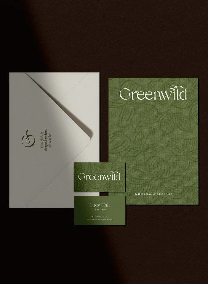
Stationery set for Greenwild garden design
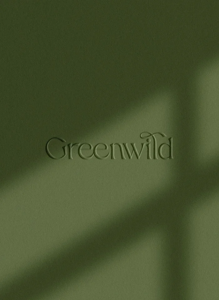
Greenwild logo on an olive green textured surface
3. The colour green: between luck & death
Green is definitely a colour of mixed associations and has a chequered past across history.
There are prominent instances where green is considered lucky: the Irish shamrock; a colour of positivity in faith groups such as Islam; and it’s seen as a colour for life and fertility.
Conversely, having green cars on the racetrack is considered unlucky; green on stage or in costumes were often considered bad luck in the theatre - it wouldn’t have been used by Shakespeare for instance! Getting married in green is also considered unlucky and in China it’s associated with infidelity.
Nowadays, in western countries, it’s now generally considered to be a positive and lucky colour, but historically, green hasn’t always had such popularity.
Recreating green using natural materials was challenging, as it’s difficult to extract without looking muddy and unsaturated.
Mixing dyes together was seen as taboo, even a little evil and demonic. Green cloth would have been created by dipping cloth in a blue vat, before a yellow and such a thing was illegal, and makers could often face severe fines or even exile from mixing dyes together.
In art, until the eighteenth century, many artists had only inferior green pigments to use for painting it wasn't until chemists started to blend green paints for artists that it became more popular. Even then pigments often reacted together and mishaps occurred:
“The particular difficulties craftsmen and consumers had without being linked with capriciousness, poison and even evil the association with poison at least had some merit after the development and explosive popularity of the new copper arsenite pigments in the nineteenth century.”
In the early part of the nineteenth century many people began to use green in their home decor, but rather sadly, the greens used contained lethal doses of arsenic. That same arsenic was also used to colour paper and used as a dye in cloth and many unsuspecting consumers began to clothe themselves and their children, and wrap their baked goods within toxic and lethal layers of the stuff leading to death and poisoning.
Key points:
Green has a chequered history ranging from a symbol of fertility and faith to a sign of bad luck in theatre
Historical green pigments were often difficult to produce or contained lethal amounts of arsenic
Mixing dyes to create green was once considered taboo or even illegal in certain European craft guilds
4. Why is green such a strategic colour in branding?
There are many businesses that use the colour green and it's easy to see why - the colour green complements the branding for a wide variety of different kinds of businesses; whether they are seeking harmony, restraint and tranquillity; or want to convey upbeat, zesty and youthfulness.
Equally, green pairs well with many other colours, acting almost as a neutral foil, enhancing the impact of other colours, and drawing out their individual qualities.
Used in large quantities, green tends to demonstrate a company’s emphasis on valuing environmental issues. Sadly, green can be used to mislead and greenwash environmentally-damaging practices too.
Given the huge versatility of green, let’s dig deeper into how your business brand can lean on it to take advantage of its qualities to reinforce your values as a small business.
1. A perfect choice for optimism, hopefulness or balance
Because of its obvious connections with nature and the environment (think spring or Easter), green is able to convey a set of positive values and emotions.
If your brand values encompass optimism, hope and equilibrium, green or one of its hues could be an excellent choice within your brand palette.
This is why colour is such an important aspect of a small business’ overall branding, as it can be used to underline the brand messaging and choice of business values a brand wants to put forward.
2. Green for brands that value security, peace or cosiness
By contrast with the more extraverted qualities we just mentioned, in another guise, the colour green can be soothing and relaxing.
This aspect of green conveys feelings such as security, peace or cosiness. It’s a trusted colour that inspired confidence, although in a different way to blue, which has much more corporate undertones.
Again, the feeling that you want for your branding and the feelings you want it to evoke in your ideal clients can be directly matched through your choice of colours. Choose the wrong colour and you could convey the opposite of a secure, peaceful or cosy brand!
3. Brands focussed on abundance, growth and vitality gravitate to green
This final facet of the colour green might seem similar to the first, in which we referred to the hopeful connotations of spring or Easter; and you wouldn’t be wrong for thinking that. This is because green covers so much ground in the colour spectrum; and is why it’s so versatile.
If we focus further on the physical aspects of the season of spring, we can quickly draw out these feelings of abundance, growth and vitality. In this sense, these values are much more evident and tangible: fresh growth, new life and life after decay.
Brands that value and want to leverage these more practical out-workings can get a huge amount of choosing a green hue within their branding. Plus, this would not be to exclude the feelings of optimism, hope or balance above, which could be supporting visual elements.
“Green communicates harmony between mind, body and emotions, and can add a lovely balance and freshness to a colour palette.”
Key points:
Green is a highly adaptable colour that suits brands seeking either tranquillity or youthful energy
It functions well as a neutral base that draws out the qualities of surrounding accent colours
Large amounts of green can signal environmental commitment though brands must be wary of greenwashing
Mastering the power of colour in your brand
If you are ready to explore how these shades impact your studio's identity, our pillar page on how to use colour psychology in business branding is an ideal place to start. We help design-conscious brands—including interior designers, architects and garden specialists—move beyond superficial aesthetics to reveal the strategic impact of their brand palette.
Whether you are looking for a comprehensive branding overhaul or simply want to align your visual voice with your core values, we can help you build a brand that feels settled and intentional.
Ready to find your footing with a fresh perspective? Get in touch with us to start the conversation.
5. How gardens & interiors brands can use green in branding
As you can tell, green is an excellent colour in branding for small businesses and we’re going to break that down further here for businesses in the gardens and interiors spaces. After that we’ll list some of our favourite examples of small businesses in the UK using green in their branding.
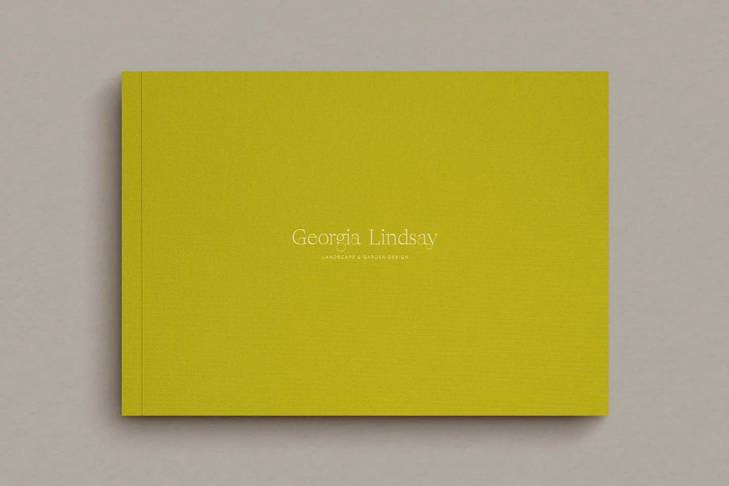
Green for garden designers’ branding
Now green may be an utterly obvious choice for a garden brand like a garden designer, or you may feel it’s been overdone. The reality is there is so much variation within the colour green itself that even a garden designer can find something fresh for their branding with green. Don’t forget that you can pair it with other colours in your branding palette for something utterly unique.
Green in a garden designer’s logo is a good way to nod to nature and growth, but obviously it needs to be handled carefully so you don’t blend in with other designers who use it blithely
Green can also be combined with earthy tones to emphasise a connection with other parts of the natural environment, such as soil and plants, giving balance to the overall branding and further interest
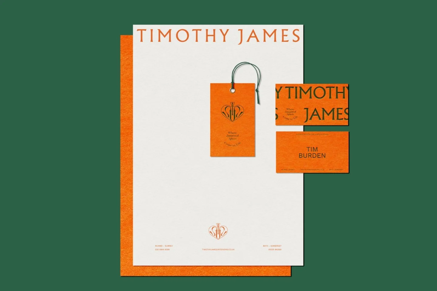
If you do go for green in your branding as a garden designer, make sure to use it consistently and cohesively, considering brochures, business cards and of course your websites so that every touchpoint in your brand reflects the natural aspect of your business
Don’t forget that you can use your brand photography as a garden designer to reinforce green in your branding: you can chose many hues in your photography depending on your branding; obviously images of lush gardens will immediately complement a green brand
Green in interior designers’ branding
As we’ve learned, green is an excellent colour that conveys balance and calm in branding, which is why businesses in the interiors space like interior designers often gravitate to it. Here are some considerations for interior designers considering green in their branding.
Incorporate green into your website design as an interior designer to convey feelings of freshness and innovation which you bring to your designs of interior spaces
Green is a good colour to utilise in your presentations to clients as it can evoke a sense of renewal and modernity, which is what good interior design is all about
As an interior designer soft green tones could work well in your branding, suggesting a modern, fresh and eco-friendly or sustainable approach to home interiors (as always, please avoid greenwashing your brand - it’s not worth it!)
In case you feel like green will overwhelm your branding as an interior designer, accent colours like white or beige can complement the green, providing a clean and sophisticated look
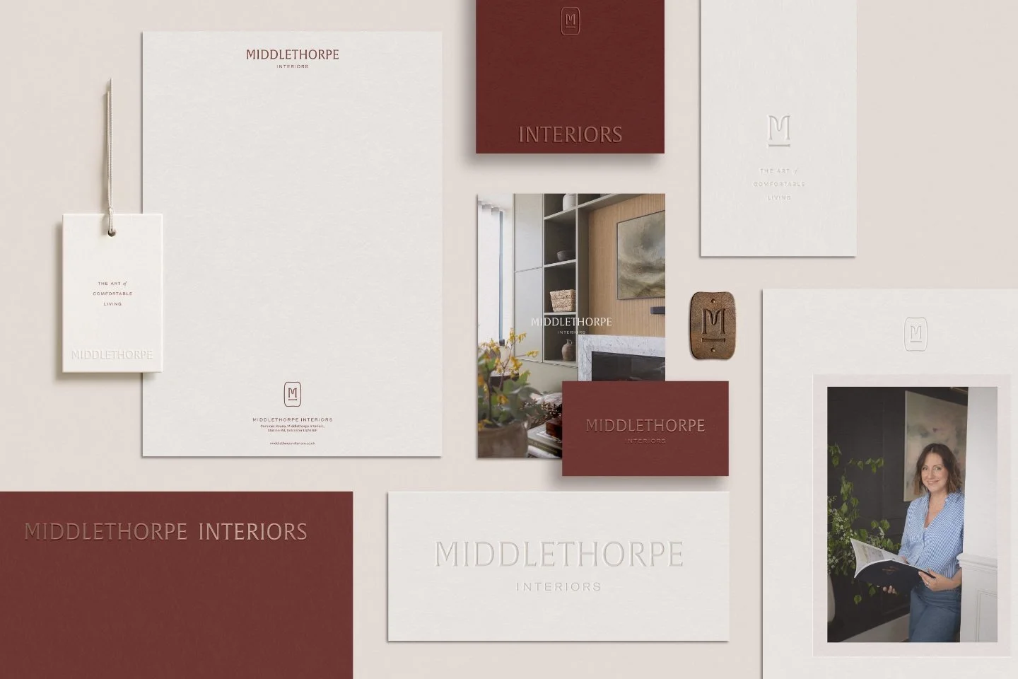
Green in interior architecture studios’ branding
interior architecture studios are closely linked with interior designers, so again, green is a good choice if you’re in this adjacent interiors space.
Again, by using green in your interior architecture studio branding (such as your primary logo), you can subtly emphasise your sustainable approach and innovative design solutions for clients
Green works well indoors because of its calming influence, so incorporate green elements into your office or studio décor to reflect your brand’s approach and values (whether that’s directly connected to the environment or not)
If you’re an interior architecture studio, consider using a muted green paired with grey in your branding to represent sustainability and modernity
Don’t forget that you can use physical props like green plants or sustainable fabrics in your office or studio space to backup the feelings you want to evoke through your digital branding or branded content on social media
Green in branding for luxury florists
Finally, luxury florists for whom green might be an obvious choice like garden designers, or one to avoid for that reason. Green in your branding can still deliver a huge amount of impact plus allow you to remain unique and with a clear brand personality.
Weave in green to your packaging materials or accessories to reflect the sense of freshness in your floral designs - if you use a subtle and sensitive approach, this can really elevate your brand impact
Considered use of green from your branding in your floral design studio’s interior design is another great way to signal an inviting and tranquil shopping experience for your clients
As a luxury florist you could use a rich, deep green in your branding to signify opulence and the natural beauty of your floral designs
Your studio could feature green velvet accents and gold detailing, creating a sophisticated and lush environment for clients when they come to see examples of your work or for consultations
Key points:
Garden designers can use green to nod to nature while pairing it with earth tones to remain unique
Interior designers often use soft green to suggest an eco-friendly, modern and innovative design approach
Luxury florists can use deep, rich greens like velvet emerald to signal opulence and high-end craft
6. Examples of brands using the colour green
There are lots of brands using green, ourselves included. But here are three brands using green quite differently to draw out their various qualities!
Alica Palmer & Co
An English homeware brand, founded by Alice Palmer. Known for her delightful lamp covers which are inspired by her love of traditional British homes, Moroccan riads and Andalusian haciendas.
INigo
Inigo is an estate agency for marvellous historic and beautiful homes from across the United Kingdom. They connect discerning individuals with extraordinary spaces, no matter the price or provenance.
House of Hackney
A luxury British interiors, fashion and lifestyle brand that reworks tradition for a new generation. Known for their maximalist prints and patterns.
Anything else I should know about the colour green in branding?
Using green in branding as a small business can be highly effective if your brand is related to design or nature. Green communicates growth, stability and a connection to the environment. By weaving green carefully and considerately across all the touchpoints of your brand you can create a strong, cohesive brand identity that appeals to your target audience.
If you were undecided about the colour green in branding as a small business, we hope this has helped give you a new perspective on it. Watch out for upcoming instalments on colour psychology and how it feeds into your branding or browse previous articles below.
Frequently Asked Questions
-
Green is positioned at the centre of the visible light spectrum which means the human eye requires little to no muscular adjustment to focus on it. This physiological ease translates into a psychological sense of calm and balance, making it a perfect choice for brands that want to appear stable, harmonious and stress-free.
-
To avoid the greenwashing cliché, focus on the specific temperature and saturation of your green. Instead of a standard leaf green, consider an olive or forest green paired with unexpected accents like terracotta, charcoal or gold. This shifts the narrative from generic nature to a more sophisticated and curated brand personality like heritage, innovation or luxury.
-
Red-green colour blindness (deuteranopia) is the most common form of visual deficiency. If your branding relies on green, ensure there is high contrast between your logo and the background. Avoid placing green text on red backgrounds and use distinct shapes or typography so your brand remains recognisable even if the specific hue cannot be distinguished.
Continue exploring colour psychology and brand strategy:
This series is inspired by Kassia St Clair’s excellent book, ‘The Secret Lives of Colour’. (The beautiful, sought-after hardback version is well worth getting hold of!). The best place to buy ‘The Secret Lives of Colour’ is direct from the publisher. Please support your local independent bookseller and avoid Amazon if possible. Amazon is not a force for good in the world of books and small business: Way past its prime: how did Amazon get so rubbish?
About the author:
Simon Cox is the co-founding director (along with his wife, Rachael Cox) at Wildings Studio, a branding, website design and content marketing studio in Torquay, UK. He’s the writer and editor of the Wildings Studio blog which you’re currently reading. Simon is also responsible for the Wildings Studio content marketing services. Simon blogs regularly on topics to do with the core Wildings Studio services on branding, website design and content marketing (blogging). He’s passionate about helping small business develop great content that answers the questions people type in Google in order to get found online (SEO).

About Wildings Studio
Thoughtful, beautiful branding and websites for design-led businesses
Wildings is a website designer for small business offering website design. Based in South Devon, UK, we deliver small business website design for design-conscious brands like garden designers, interior designers, architects, circular ethos restaurants, speciality coffee shops, organic cafés and boutique hotels.