Is pink branding a strong choice for my business?
Pink branding is a versatile choice for businesses looking to evoke feelings of youthfulness, femininity, or sophisticated luxury, depending on the specific tone used. While bright pinks convey energy and playfulness, more muted or darker shades suggest calm, confidence, and high-end elegance. Understanding these psychological associations allows a brand to intentionally align its visual identity with the specific emotions it wants to trigger in its target audience.
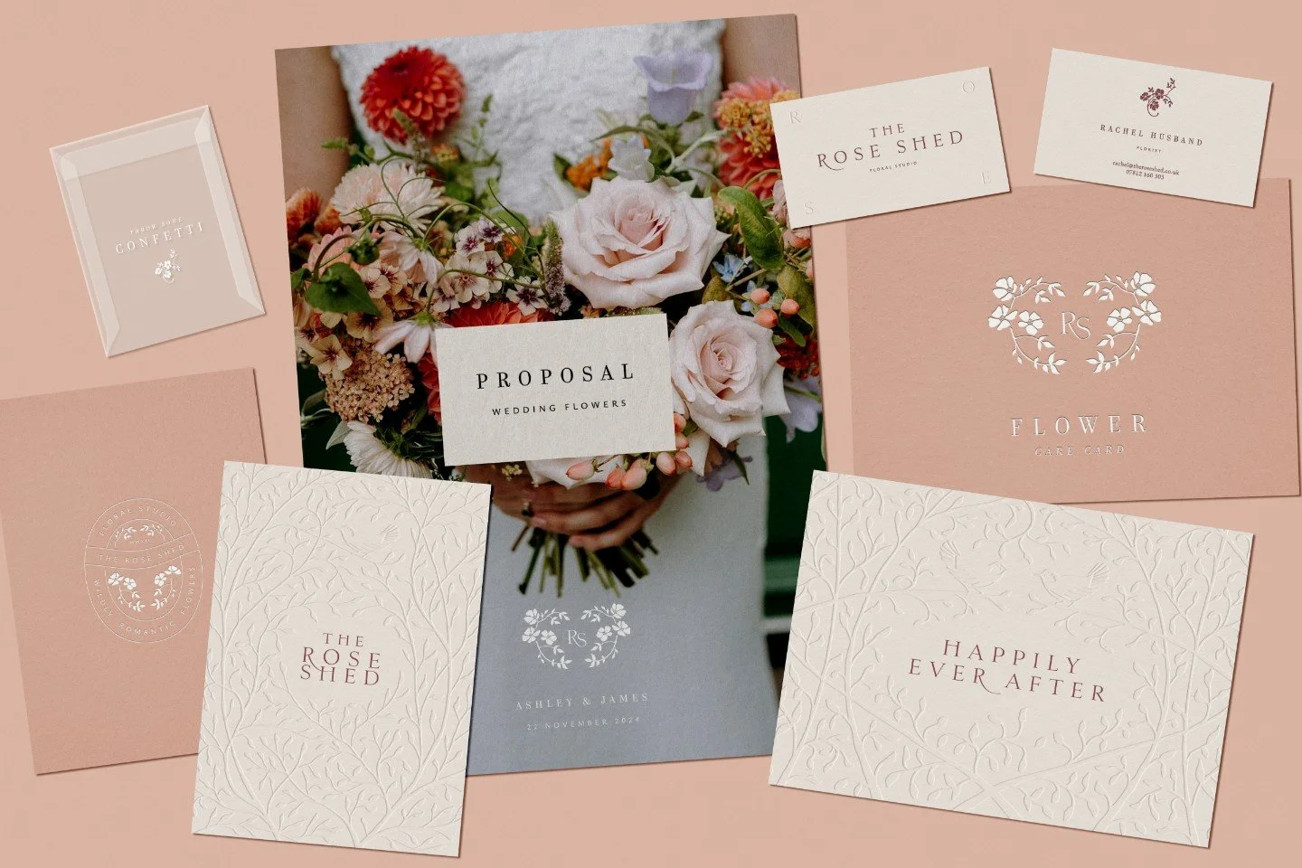
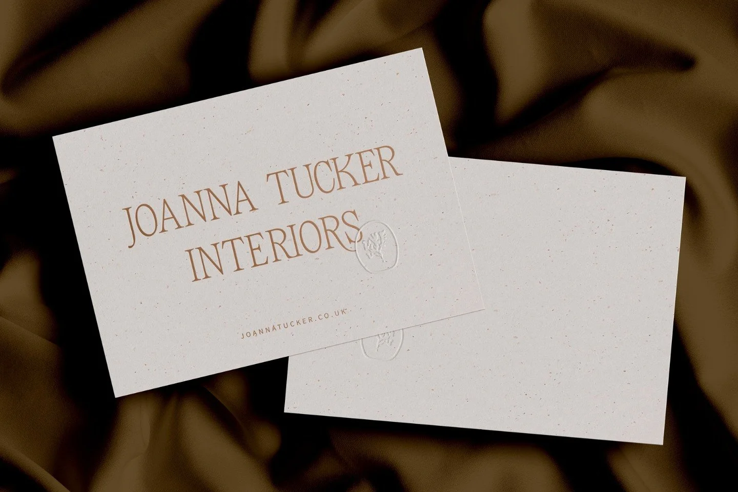
Branding for The Rose Shed floral studio
Why pink is a strategic choice for your business identity
The colour pink is a study in the art of reinvention: it started out for boys, now is associated with girls, but thankfully that is not where this story ends. And that’s not a bad thing, because in business, reinvention is a necessary way to grow and develop, whether through a full rebrand or evolving existing branding.
Branding requires bold, informed choices to engage with new audiences and to continue to resonate with existing ones, so never write off a colour, and certainly not pink. As you’ll find out, the key to using pink as a business in your branding is to understand how it makes people feel and the associations it evokes. To harness feeling and association is to wield power in the modern marketplace where it’s difficult to stand out.
Read on as we look at how pink started out in the work of branding and its twist and turns on the way to where it sits now as a choice for your business band.
“The colour [pink] flashed before my eyes. Bright, Impossible, impudent, becoming, life giving, like all the lights and the birds and the fish in the world together… a shocking colour, pure and undiluted.”
Top ten takeaways for using pink in branding
Reinvent your assumptions as pink has shifted from a masculine power colour to a feminine staple and is now a tool for modern brand rebellion
Match the tone to the energy by using bright pinks for fun and playfulness or darker shades for sophistication and calm
Leverage pink’s history of status and wealth by opting for understated, muted tones like puce to project luxury
Use bright pink sparingly because while shocking pink has high impact, its "shock value" can diminish if overused
Appeal to specific demographics by acknowledging that pink still carries a very strong association with female-led or female-focused brands
Subvert expectations like T-Mobile or Lyft to signal that your business is innovative, edgy, or forward-thinking
Embrace the youthful side if your brand values are centred around excitement, innocence, or being "edgy"
Consider the sophisticated side by exploring the muted end of the spectrum where pink meets grey and brown
Learn from independent successes by seeing how brands like Dahlia Beach or Projektityyny use pink to build community and nostalgia
Work with experts to ensure your choice of pink aligns with a broader brand strategy rather than just following a trend
1. How did pink become a brand colour (girls vs boys)?
If you think pink is for girls and blue for boys, be prepared to have your assumptions flipped on their head. Pink is a good example of a colour that has gone through a lot of change and been appropriated in modern times by businesses and culture to various ends.
“Pink was the ‘more decided and stronger colour’, while blue was ‘more delicate and dainty’”
Despite many languages deriving the word for pink from the rose flower (which may lead you to believe it originated as a feminine colour), pink was traditionally seen as masculine; blue being the feminine colour. Pink was essentially derived from red, the colour of power and prestige, so it adopted the qualities of red by default. The colour blue was instead associated with the Virgin Mary, perhaps the quintessential female, so inherited female qualities.
Pink took off as a feminine colour in high society in the eighteenth century through fashion choices in dresses, silks and design collections. Women of influence chose pink as a statement colour, specifically because of its close connection with red. In the same way that red was seen as a ‘daring and full-bodied’ colour, women capitalised on pink, seeking it out as a means to be noticed, both for their fashion choices, but also personally, as strong, powerful figures.
This set the trend for the modern associations of pink, flipping from ‘delicate and dainty’ to the ‘more decided and stronger colour’.
“Pink [became] the colour of choice for twentieth-century women who wanted to be both seen and heard.”
Key points:
Pink was originally considered a masculine colour derived from the power of red, while blue was seen as dainty and feminine
High society in the eighteenth century flipped this narrative as influential women chose pink to be seen and heard
Modern branding now navigates these shifted associations to capitalise on pink’s stronger and more decided qualities
2. What does the colour pink symbolise?
As with many colours, pink has been through several phases, starting out, as we’ve just seen, as a status symbol and way for the upper classes to derive a sense of belonging. However, modern female movements have driven a backlash against pink and its infantilising and sexualising connotations: the colour of female objectification.
Despite pink’s ups and downs through the centuries, it is possible to make some general comments about what it stands for and symbolises. Overall, the colour pink falls into three broad categories: youthful, feminine and sophistication.
The youthful side of pink
Firstly, youthful: pink carries a lot of energy, being the colour of bubblegum, flamingoes and rosé, so can happily be used to symbolise qualities such as: fun, innocence, edginess, playfulness, excitement.
The feminine side of pink
Secondly, femininity: no surprises here. The original softness of pink, through its connection with the flower and ladies’ fashion, captures evokes things like: romance, tenderness, affection, sweetness, flirtation, sentimentality and calmness.
The sophisticated side of pink
Thirdly, sophistication: pink has great versatility across its tones and shades, so can lend itself to qualities such as sophisticated, seduction and confidence. This is an area that can be explored through the darker, more muted side of its spectrum, which we’ll move onto below.
Key points:
The psychological impact of pink generally falls into three camps: youthfulness, femininity, and sophistication
It can evoke soft emotions like tenderness and romance or high-energy feelings like fun and playfulness
Versatility is pink’s greatest strength, allowing it to shift from sweet and sentimental to seductive and confident
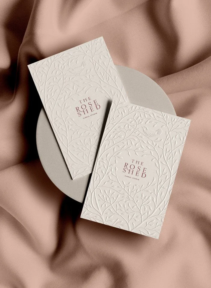
Two cream embossed business cards with a bird and branch motif for The Rose Shed floral studio
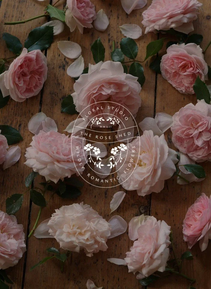
A white circular floral studio logo for The Rose Shed
3. How do businesses use the colour pink in branding?
Colour is incredibly powerful at evoking the senses and reinforcing associations, which is why businesses and brands have long sought to utilise colour in their branding. The colour pink is no different, and businesses have rallied around it, depending on the particular shade or tone. in essence, the lighter or brighter the pink tone, the more feminine the brand impact; whereas the darker the share of pink, the more calm and sophisticated its feel. Businesses that go for mid-tones of pink, tend to project a fun, energetic brand.
Think pink, think Barbie
A quintessential example of a brand that has embraced light, bright pink tones is Barbie, manufactured by Mattel. Barbie was originally designed by Ruth Handler and the children’s doll became a mid-century icon in the late 1950s. More recently it rebooted itself as a brand for the modern feminine movement via the Barbie Movie in 2023. Barbie is confident, edgy, flirty and undeniably feminine, which is reflected in its use of bright link in its branding.
How Adobe XD uses pink
Brands that opt for a darker shade of pink are often eclipsed by the fun, feminine ones, but Adobe XD is a good example of a business tapping into pink’s darker side. Adobe XD is part of the wider Adobe family of computer programmes (such as Photoshop or Lightroom) and used for designing website wireframes or the User Experience (UX) or User Interface (UI) of mobile phone applications. Its logo features pink on a park purple background. Given XD is all about creativity and innovation, by tempering the pink with purple, it taps into the dark side of pink to convey calm, confidence and sophistication.
Other brands using mid-pink
As for business that use the mid-tones of pink in their branding, there are many to choose from. Examples include:
Dunkin’ Donuts - Fast Moving Consumer Goods (FMCG, AKA junk food) brand
Cosmopolitan - women’s fashion and lifestyle brand
Johnson & Johnson - babycare brand
Victoria Secret Pink - women’s lingerie brand
Avon - skincare brand
All of these and more besides happily tap into the youthful, feminine side of pink to evoke energy, youthfulness, fun and excitement to one degree or another.
Key points:
Global brands use light or bright pinks (like Barbie) to project a confident, undeniably feminine identity
Darker tones are often paired with other colours (like Adobe XD) to communicate creativity and professional innovation
Mid-tones are the go-to for fun sectors, particularly in food, lifestyle, and skincare industries
4. Pink brands
There are a number of very famous pink brands - businesses that use the colour pink prominently in their branding. A quick rundown of the top pink brands would likely include (in alphabetical order):
Barbie
Benefit Cosmetics
Cosmopolitan
Dunkin’ Donuts
Flickr
Hello Kitty
Johnson & Johnson
LG
T-Mobile
Victoria’s Secret
An interesting exercise here is then to categorise these pink brands and examine what it tells us about pink brands using the colour.
At least six of the ten are outright feminine brands or aimed at girls or women (Barbie, Benefit Cosmetics, Cosmopolitan, Hello Kitty, Johnson & Johnson and Victoria’s Secret), which reinforces what we’ve said above that the colour pink carries a very strong female association for pink brands.
Three of the pink brands above (Flickr, LG and T-Mobile) are obviously wanting to emphasis their innovative side, so it’s no surprise to see technology and communications in this sub-group.
A minimum of three of the pink brands (Barbie, Dunkin’ Donuts and Hello Kitty) are highly playful, so are evidently tapping into the youthful side of pink.
Overall, from this very quick analysis of some of the most famous and well-known pink brands, we can see that one of the strongest associations with pink brands is the feminine and female side, appealing primarily to women.
That’s not to say that pink brands can’t get impact with other sections of the market, but it’s important to recognise the particular sway a colour can have because of its history.
As such, it’s important to work closely with a brand strategist and designer if you’re considering becoming a pink brand or reinforcing your credentials as a pink brand.
Key points:
A quick analysis of top pink brands shows a heavy lean towards feminine-targeted products like Benefit Cosmetics or Victoria’s Secret
Technology companies use pink to highlight their disruptive or innovative nature in a sea of corporate blues
Pink is a dominant choice for brands wanting to appear highly playful or approachable to a younger audience
Cultivating a brand through colour psychology
If you are curious about how these shades impact your business identity, our pillar page on how to use colour psychology in business branding is a great place to start. We help design-conscious brands—from interior designers and architects to garden specialists—move beyond pretty visuals to understand the deep psychological impact of their brand palette.
Whether you are looking to reveal a new look or refine your existing identity, our branding service is designed to help you find your footing. If you feel ready to align your business values with a more intentional aesthetic, get in touch to start a conversation.
5. How have businesses reinvented pink for their branding?
Pink provides another classic example of a colour that upends expectations, similar to the renegade side of purple. Because of pink’s female characteristics, it has inevitably garnered a childish reputation: weak, vulnerable, silly, girly and immature. Despite this, it possible for businesses to use pink as a strong positive brand colour, which we’ll touch on here.
As with many other colours, pink has different aspects, so modern brands have subverted the feminine facet of pink. They’ve used the very nature of its femininity to emphasise female strength. Good examples of this are survivors of breast cancer (Cancer Research UK or Breast Cancer Now).
The colour pink therefore becomes a rallying cry for defiant, rebellious and innovative brands that buck the trend and defy all expectations. We’ve mentioned cancer-related charities; other example of brands that seek to differentiate themselves as edgy or progressive include:
Music band Pink Floyd, which was very alternative in its era
T Mobile, the German telecommunications brand, which wants to underline it forward-thinking approach
Electronics manufacturer LG
Ride-sharing app Lyft and photo-sharing app Flickr all fit into this category too
Despite pink’s current image problem - being the colour of sexism; infantilising and sexualising women - it shows it still has the power to create a different narrative by brands that are able to handle it deftly.
No matter how chequered a journey a colour has been on in its history, it can always be resurrected and reinvented to underline strong, positive qualities that can enhance a brand.
Key points:
Modern brands have reclaimed pink to represent strength and defiance, such as in breast cancer awareness campaigns
Companies like Flickr and LG use pink to distance themselves from stiff corporate competitors and signal progressiveness
Even if a colour has a chequered past, it can be resurrected to underline positive, modern brand qualities
6. Is pink a good colour for small business branding?
If you’re a business considering pink for your branding, you need to handle it carefully.
On the one hand, pink has been used historically to signal status and wealth. Traditionally, it closely matched the expensive silk and satin fabrics used in women’s dresses and ribbons. This soft tone earned it the title puce (literally ‘flea’ in French), which became a byword in aristocratic French circles for an elevated colour worthy of the upper classes.
It’s important to note here that puce occupies a shade between brown, pink and grey; so if you want to project luxury and exclusivity, it’s pays to be understated and restrained.
On the other hand, pink reached extreme heights of fashion in the early 20th century in the guise of shocking pink (Pantone 17-2127). At the time, this was a scandalous shade of pink unleashed by fashion house Cartier. Socialise Daisy Fellowes, wearing a bright pink Cartier diamond, was spotted by fashion designer Elsa Schiaparelli, spawning a sub-set of neon pink designs and fashion collections.
The lesson for business brands here is that although pink can be used for shock value, this quickly dwindles with volume: bright pink is best used sparingly for maximum impact. The punk movement of the 1970s which commandeered fluorescent tones of pink, but as with all extreme movements, eventually fell by the wayside once it became normalised.
What is strident and brash one year can become irrelevant and pointless the next.
Which independent brands use pink?
There are lots of brands hat lean into pink in their branding. Here’s three of our favourite brands who use pink to its full advantage.
Peggy Porschen is a London based patisserie in Chelsea renowned for their pretty cupcakes and parlours. We visited the Belgravia parlour last summer and the cakes did not disappoint. The tea rooms feature iconic floral decorations that are widely shared on instagram.
Dahlia Beach is run by Andy McDowell and she’s making a name for herself in the horticultural world as a rebel florist. Known for her collections of dahlias, dahlia flower farm and not forgetting her instagram reels Andy’s passion for flowers and building community is inspiring.
Projektityyny is a Nordic home textiles brand based in West Dorset. They are known for their modern take on quilting using Liberty fabrics, needle cord, linens and other textural fabrics. The homewares have a distinct style that imbues quality, timelessness and nostalgia.
Key points:
For luxury brands, pink can signal elite status if used in restrained, puce tones that feel grounded and expensive
Shocking pink remains a tool for those wanting to make a scandalous or bold statement, though it requires careful handling
The success of a pink palette depends on whether you want to project aristocratic elegance or rebellious energy
Final thoughts on pink for businesses and in branding
The colour pink has had a wild ride since being adopted from the classic English cottage garden flower of the same name. It has had highs and lows , role-reversals and reinventions, but continues to be a viable colour within branding. The key to the colour pink, which applies to all colours, is to understand its associations, connotations and implications, using all those insights to put it to the best possible use. If you’ve done that, pink will no doubt serve you long and hard in your businss branding.
Frequently Asked Questions
-
While pink has strong cultural associations with femininity, its appeal is far broader. Many modern, gender-neutral brands use pink to signal innovation, creativity, or a rebellious spirit that defies traditional corporate norms.
-
Luxury brands often find success with puc" or dusty pinks—shades that sit between pink, grey and brown. These muted tones feel more grounded and sophisticated than bright neons, suggesting a sense of timelessness and exclusivity.
-
Yes, especially when used as an accent or in its darker, more sophisticated shades. Pink can help a professional brand feel more approachable and creative, helping you stand out from the cold blues and greys typically found in the industry.
Further reading on colour and branding:
This series is inspired by Kassia St Clair’s excellent book, ‘The Secret Lives of Colour’. (The beautiful, sought-after hardback version is well worth getting hold of!). The best place to buy ‘The Secret Lives of Colour’ is direct from the publisher. Please support your local independent bookseller and avoid Amazon if possible. Amazon is not a force for good in the world of books and small business: Way past its prime: how did Amazon get so rubbish?
About the author:
Simon Cox is the co-founding director (along with his wife, Rachael Cox) at Wildings Studio, a branding, website design and content marketing studio in Torquay, UK. He’s the writer and editor of the Wildings Studio blog which you’re currently reading. Simon is also responsible for the Wildings Studio content marketing services. Simon blogs regularly on topics to do with the core Wildings Studio services on branding, website design and content marketing (blogging). He’s passionate about helping small business develop great content that answers the questions people type in Google in order to get found online (SEO).

About Wildings Studio
Thoughtful, beautiful branding and websites for design-led businesses
Wildings is a website designer for small business offering website design. Based in South Devon, UK, we deliver small business website design for design-conscious brands like garden designers, interior designers, architects, circular ethos restaurants, speciality coffee shops, organic cafés and boutique hotels.