Colour blue: is it a safe bet for business branding?
Blue is the most popular colour for business branding because it instantly communicates trust, professional reliability and stability to your audience. This guide explores how to use blue colour psychology to create a dependable brand identity without falling into the trap of looking like a cold, soulless corporation. By understanding the historical and psychological roots of various blue hues, small businesses can balance authority with a personal, creative touch.

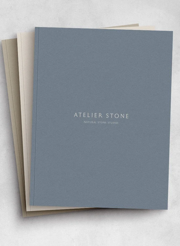
Atelier Stone Dublin brand stationery and packaging
Why blue remains the most effective colour for professional brand identity
Blue is the world’s favourite colour: across cultures and continents, blue comes top. It’s a colour we all engage with every day; it’s the colour of the sky and the seas around us. While it’s not a colour we see through trees and plants (there are relatively few true blue plants and no naturally occurring blue foods), it’s been used throughout human history in art and cultural ceremonies.
I had a conversation with my youngest daughter who has a favourite way of beginning a conversation: “Mummy, I have a question”. Her question on this occasion was: “Why are emergency service flashing lights blue?”. My initial thought was to do with its brightness and we don’t use blue in traffic lights. Actually, it’s because blue is the most visible colour at night. In part, I think there’s a secondary element: blue is a colour that tends to evoke feelings of stability and reliability. Key feelings when we’re in a crisis and might need help.
As part of our ongoing series on the Anatomy of Colour, we’re looking at how small businesses can harness the power of blue in their branding. Equally, we’ll help you avoid falling into the trap of boring blue: the go-to colour for soulless corporate branding!
Ten essential takeaways for using blue colour psychology in your branding
Blue is the most globally preferred colour, making it a reliable choice for reaching a broad audience
It is the most visible colour at night, which is why it is used for emergency services to signal authority and safety
In a business context, blue communicates security, order and dependability to your customers
Overusing generic blues can make a brand feel soulless, boring or risk-averse
Blue is known to boost motivation and promote a sense of internal peace and focus
Brands using blue are often perceived as more competent and sincere than those using high-energy colours
You don't need blue as your main hero; it works brilliantly as a subtle background hue to ground a palette
Using blue alongside more daring colours can make a brand feel more grown-up and serious
Look to historical pigments like woad or ultramarine for inspiration to find more unique, artisan shades
Avoid the default digital blues—like standard hyperlink blue—to keep your brand looking bespoke and high-end
1. Why does the colour blue have a cult following?
Blue has a long venerable past, which explains its popularity today.
The ancient Egyptians created beautiful opaque blue glass in their quest to recreate objects that resembled turquoise. Lapis Lazuli was valued for its rarity and vivid colour: it can only be found in a small handful of mines in North East Afghanistan, and when ground into a powder it forms a striking ultramarine hue. It was frequently used in its ultramarine pigment to adorn walls in tombs, paintings, statues and woven textiles.
Elsewhere, blue was used to smother Mel Gibson in the classic film Braveheart - he played William Wallace, who led the Scottish uprising. While there’s no historical information about Wallace painting himself blue, Boudicca the leader of the Iceni tribe in East Anglia is reputed to have painted her face blue using woad. The Romans referred to these Ancient Britons as ‘Picts’, Latin for painted.
Woad was a natural dye from a vibrant yellow plant which, when fermented and couched and mixed with potash and urine, turned into a blue dye. For centuries cloth was dyed blue using this plant until the 1930s.
(It was also a brand name we considered when we renamed ourselves from The Apple Yard.)
“Classical writers described the Celts making themselves blue, either daubing it on before battle or tattooing it directly into the skin. It has even been suggested that the word Briton derives from a Celtic one meaning ‘painted people’.”
Key points:
Blue has a prestigious history rooted in rare materials like Lapis Lazuli and ancient Egyptian glassmaking
The blue colour is tied to British identity, stemming from the Celtic tradition of using woad as a body dye and tattoo pigment
Blue’s popularity today is a result of its long-standing history and cultural associations
2. Why is blue is the colour king of corporate branding?
Sed at risus vel nulla consequat fermentum. Donec et orci mauris. Nullam tempor velit id mi luctus, a scelerisque libero accumsan. In hac habitasse platea dictumst. Cras ac nunc nec massa tristique fringilla.
Key points:
Large corporations favour blue because it projects an image of safety, reliability and institutional stability
The colour blue is pragmatic and useful in workspaces as it helps to foster focus and professional motivation
The main drawback of blue’s corporate dominance is the potential for it to appear unimaginative or clinical if not used carefully
A stack of Atelier Stone Natural Stone Studio catalogues
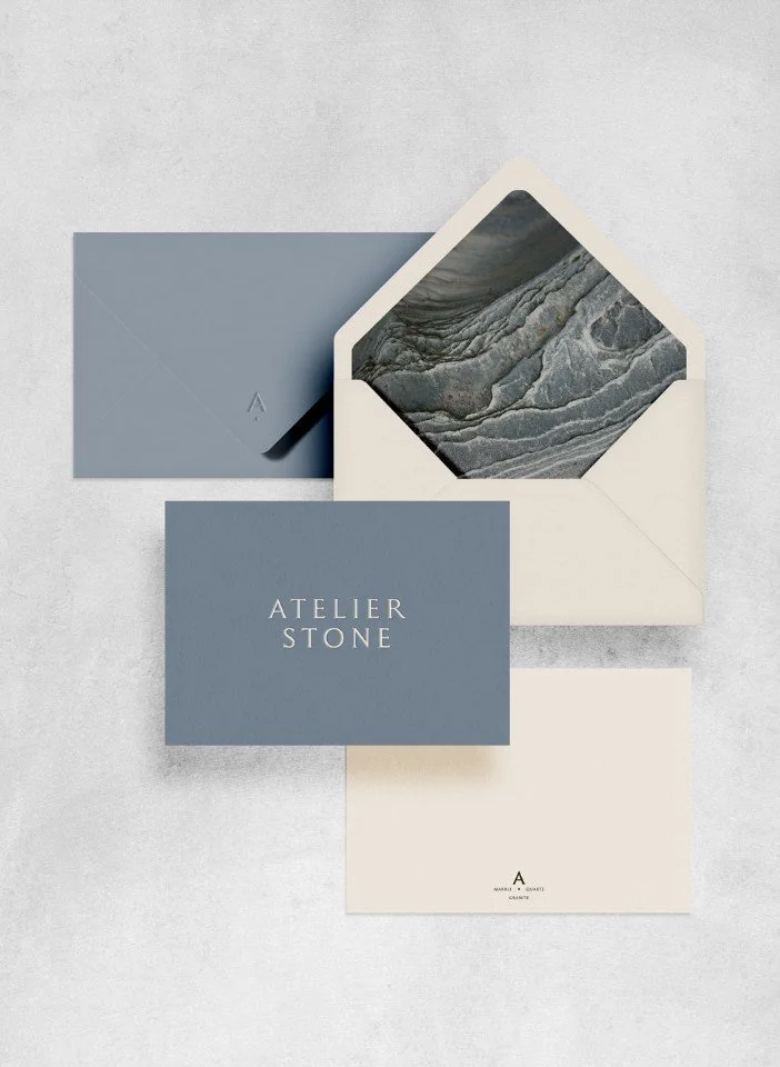
Atelier Stone stationery
3. How my branding can stand out when so many brands use the colour blue?
In case you’re tempted to throw blue out straight away, don’t! As a brand designer here at WiIdings Studio, I (Rach) often employ a subtle hue of blue in the background of many brand colour palettes.
The way to stand out when so many other business brands use blue is not to get rid of it completely but to think carefully about whether it reinforces your brand values or desired customer experience.
What feelings do you want your ideal customer to experience when they interact with your brand? What do you want to convey through your branding? If the colour blue evokes those feelings and associations, then deploy it carefully for maximum impact or as a strong supporting element in your branding.
Blue is quite rare in certain settings such as eye colour (only about 8% of the population worldwide have blue eyes) or the ultramarine pigment. By playing on some of these characteristics, you can deploy blue in an unusual or striking way.
To reiterate, don’t discount blue, but consider how you can use its valuable associations with trust, loyalty and integrity. For example, if you want to promote a fun, playful, frivolous brand, subtly incorporating blue in your branding can bring a hint of trust and dependability to proceedings.
I like to use blue tones alongside other hero colours, backing up more daring colours and having the blue to ground the palette and make it feel a bit more grown-up or serious if necessary!
“There are many tones of blue from light sky blue through to midnight blue and the many tones in between such as powder blue, duck egg blue, sapphire, royal blue, cornflower blue, indigo, navy and teal, just to name a few.”
Key points:
Stand out by using blue as a grounded supporting colour rather than the primary focus of your visual identity
Choose specific, rare hues that align with your unique brand values rather than reaching for standard navy or royal blue
Consider the emotional response you want to trigger; blue can add a layer of integrity even to a playful or frivolous brand
4. Independent brands using the colour blue
There are lots of brands using blue, and we’ll use it in branding projects too where appropriate. Here are three brands using blue quite differently to draw out their various qualities!
Farm Soap Co
A botanical skincare and wellbeing brand in Dorset. Using traditional artisan methods, they make botanical soaps and natural skincare products are handmade in small batches on the Jurassic Coast in Dorset.
Edward Bulmer Paint
A specialist brand in eco-friendly paint and natural heritage paint colours. A plant-based paint company with ethical and environmental practices. Breathable, non-toxic paints which are truly beautiful and responsive to light.
The Newt in Somerset
A boutique hotel brand in Somerset. The Newt in Somerset is a country estate with magnificent woodland and gardens. Members are invited to dine and stay on the estate.
Refining your brand with colour psychology
If you want to understand how specific shades can shift the perception of your business, check out how to use colour psychology in business branding. We work with design-conscious brands—from architects and interior designers to garden specialists—to move beyond surface-level aesthetics and find a palette that truly aligns with their values.
Whether you are starting from scratch or looking to refine your current look, our branding services are designed to help your studio feel more settled and professional. We believe your visual identity should be as rigorous as your craft.
Ready to give your brand a sense of clarity and purpose? Get in touch with us to start a conversation.
Final thoughts on blue for businesses and in branding
One blue to never use…
OK, this is a personal taste but I really, really hate the default blue used in hyperlinks on websites and comes as standard on all Microsoft word documents!
Frequently Asked Questions
-
Blue is the most common colour in professional branding because it triggers a psychological response associated with trust, logic and security. Since it is the colour of the sky and the sea, humans perceive it as a constant and reliable force. For businesses like law firms, banks or architects, blue helps establish a sense of authority and calm that reassures clients they are in safe hands.
-
While blue is generally positive, its safe reputation can be a downside. If used without thought, it can appear cold, unfriendly or predictably corporate. Many people associate standard shades of blue with boring bureaucracy or a lack of innovation. To avoid this, creative businesses should look for nuanced tones like teal, indigo or slate which feel more intentional and less like a default setting.
-
The key to using blue creatively is to vary the texture and tone. Instead of a flat royal blue, try using hues inspired by nature or historical pigments, such as duck egg or woad. You can also use blue as a grounding element in a more vibrant palette—pairing it with earthy ochres or soft terracottas—to maintain a professional edge while keeping the overall look soulful and distinct.
Further reading on brand strategy and colour psychology:
This series is inspired by Kassia St Clair’s excellent book, ‘The Secret Lives of Colour’. (The beautiful, sought-after hardback version is well worth getting hold of!). The best place to buy ‘The Secret Lives of Colour’ is direct from the publisher. Please support your local independent bookseller and avoid Amazon if possible. Amazon is not a force for good in the world of books and small business: Way past its prime: how did Amazon get so rubbish?
About the author:
Simon Cox is the co-founding director (along with his wife, Rachael Cox) at Wildings Studio, a branding, website design and content marketing studio in Torquay, UK. He’s the writer and editor of the Wildings Studio blog which you’re currently reading. Simon is also responsible for the Wildings Studio content marketing services. Simon blogs regularly on topics to do with the core Wildings Studio services on branding, website design and content marketing (blogging). He’s passionate about helping small business develop great content that answers the questions people type in Google in order to get found online (SEO).
In this article:
Why blue remains the most effective colour for professional brand identity
Ten essential takeaways for using blue colour psychology in your branding
Free brand colour strategy guide
How my branding can stand out when so many brands use the colour blue?
About Wildings Studio
Thoughtful, beautiful branding and websites for design-led businesses
Wildings is a website designer for small business offering website design. Based in South Devon, UK, we deliver small business website design for design-conscious brands like garden designers, interior designers, architects, circular ethos restaurants, speciality coffee shops, organic cafés and boutique hotels.